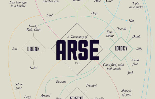
By designer Stephen Wildish, a taxonomy of arse. No comment necessary.
By designer Stephen Wildish, a taxonomy of arse. No comment necessary.
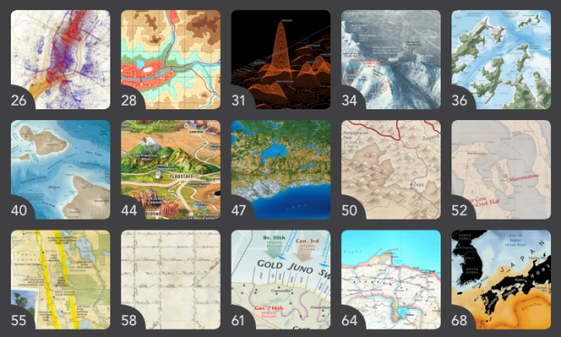
In the Atlas of Design, published by the North American Cartographic Information Society, Timothy Wallace and Daniel Huffman argue for beautiful maps that are a joy to examine.
Design and aesthetics matter, because form is not secondary to function; form is integral to function. A map cannot function if it remains unread. To truly engage map users requires that we present them with something worth looking at. Something that they will want to spend time studying. Something that acknowledges the human need for beauty. Something that causes the user to think about the map in terms beyond whether or not it simply “works.”
Yep.
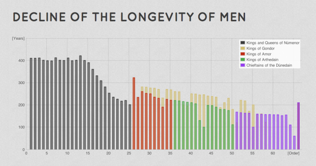
Driven by his love for Lord of the Rings, Emil Johansson explores the many facets of the world in charts and graphs. For example, the above chart is the declining lifespan of man.
It is explicitly stated by Tolkien that the longevity of Men once granted to the Númenóreans decreased over the years. In Letter 156 Tolkien writes that “a good Númenórean died of free will when he felt it be the time to do so”. With the Shadow and the Downfall of Númenor this grace was taken away from them and they died involuntarily with a decreasing lifespan.
The decreasing life span is seen clearly in the graph. The most dramatic change is shortly before the Downfall of Númenor. The rulers are shown in order. Their number should not be confused with how many generations from Elros Aragorn is since there were more than one line of rulers.
There’s also a geographic map of where characters traveled, a family tree, a timeline, and even an Android app. I think Johansson might be a superfan. A hunch.
USA Today launched a redesigned logo last month. It’s a circle that reflects the day’s news in each section. Stephen Colbert reports.
[via @albertocairo]
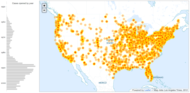
The Los Angeles Times released nearly 5,000 records of allegations from the Boy Scouts of America as a browseable map and searchable list. You can also download the data.
This database contains information on about 5,000 men and a handful of women who were expelled from the Boy Scouts of America between 1947 and January 2005 on suspicion of sexual abuse. The dots on the map indicate the location of troops connected in some way to the accused. The timeline below shows the volume of cases opened by year; however, an unknown number of files were purged by the Scouts prior to the early 1990s
The interactive map helps you narrow down by city, but it’s kind of hard to see cases on a country-wide perspective. Here’s a quick look.

The worst part is that a lot of the cases went unreported.
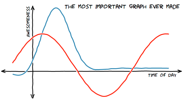
The ports and packages to make your charts look like they came from the web comic xkcd are coming out in rapid fashion. Dan Foreman-Mackey stylized charts in JavaScript using D3, Mark Bulling did the same in R (dead/spam link), Emilio Torres Manzanera made an xkcd package, and Jake Vanderplas described how he did in Python. Still waiting for a Gangnam theme.
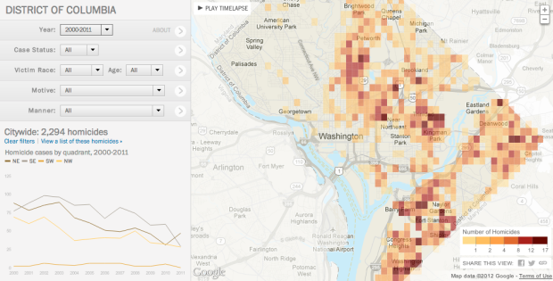
In a multipart special report, The Washington Post investigated homicides in the nation’s capital between 2000 and 2011.
A Washington Post review of nearly 2,300 slayings in the city between 2000 and 2011 found that less than a third have led to a conviction for murder or manslaughter, although the numbers have improved in the past few years. More than 1,000 cases remain unsolved.
In a 15-month study, The Post individually tracked every homicide in the District between 2000 and 2011 to learn what ultimately happened to each ensuing case. Such studies, known as longitudinal, are not generally produced by law enforcement, because they are considered to be too time-consuming.
The interactive portion of the report lets you see the data from a number of angles. The focus is on the map, which shows an overview of homicide count and then individual cases as you zoom in to neighborhoods. Navigation on the left lets you filter by case status, race, age, motive, and manner, and the display on the bottom left changes as you change queriers or select different parts of the map. You can also play a time lapse, and the map updates for each year.
There’s a lot to look at from different angles, and especially if you live in the area, the feature is worth a closer exploration.
As a side note: The Post graphics team seems to have upped their game as of late. I’m not sure what they put in the water over there, but I hope they keep drinking it. [via Source]
 Pilot Mark Vanhoenacker describes the history and careful design of the everyday baggage tag, from the synthetic material it’s printed on, to the information each modern tag contains.
Just as you can track, step-by-step, a package you’ve sent by FedEx, airlines use bar-coded tags to sort and track bags automatically, through the airport, and across the world. That’s a huge change from the old days, when bags were dropped into the “black box” of a manually sorted baggage system. But crucially, an ABT doesn’t just contain a bar code—it’s also custom-printed with your name, flight details, and destination. That made the global implementation of ABTs much easier, because early-adopters could introduce them long before every airport was ready—a huge advantage when it comes to seamlessly connecting the world’s least and most advanced airports. And of course, ABTs can still be read manually when systems break down.
It’s funny how something so commonplace like a sticky loop label goes through these iterations. There are people behind these things who think about the ins and outs of how something works, no matter how small they might seem, so that we don’t have to. We just tear them off, toss ’em in the trash, and move on to the next one, because that’s what they were made for.
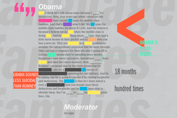
ReConstitution 2012, a fun experiment by Sosolimited, processes transcripts from the presidential debates, and recreates them with animated words and charts.
Part data visualization, part experimental typography, ReConstitution 2012 is a live web app linked to the US Presidential Debates. During and after the three debates, language used by the candidates generates a live graphical map of the events. Algorithms track the psychological states of Romney and Obama and compare them to past candidates. The app allows the user to get beyond the punditry and discover the hidden meaning in the words chosen by the candidates.
As you let the transcript run, numbers followed by their units (like “18 months”) flash on the screen, and trigger words for emotions like positivity, negativity, and rage are highlighted yellow, blue, and red, respectively. You can also see the classifications in graph form.
There are a handful of less straightforward text classifications for truthy and suicidal, which are based on linguistic studies, which in turn are based on word frequencies. These estimates are more fuzzy. So, as the creators suggest, it’s best not to interpret the project as an analytical tool, and more of a fun way to look back at the debate, which it is. It’s pretty fun to watch.
Here’s a short video from Sosolimited for more on how the application works:
 Visualize This: The FlowingData Guide to Design, Visualization, and Statistics (2nd Edition)
New tools, refined process.


