
Checking out for the year. I assume most of you have already, and if not, go on, get out of here. Shoo. Happy holidays. I tip my glass in your general direction.
Checking out for the year. I assume most of you have already, and if not, go on, get out of here. Shoo. Happy holidays. I tip my glass in your general direction.
Looking to get a jumpstart on that new year’s resolution to find a new job? I’ve got some listings for you.
Data Scientist at Thumbtack in San Francisco, CA.
Content Marketing Manager in New York, NY.
Data Analyst at Beats Music in San Francisco, CA.
Data Scientist/Statistician at WeddingWire in Chevy Chase, MD.
Software Engineer at Civis Analytics in Chicago, IL.
When you hear “piracy data” and “music” in the same sentence, it usually ends with exorbitant fines. Iron Maiden took a different route.
In the case of Iron Maiden, still a top-drawing band in the U.S. and Europe after thirty years, it noted a surge in traffic in South America. Also, it saw that Brazil, Venezuela, Mexico, Columbia, and Chile were among the top 10 countries with the most Iron Maiden Twitter followers. There was also a huge amount of BitTorrent traffic in South America, particularly in Brazil.
Rather than send in the lawyers, Maiden sent itself in. The band has focused extensively on South American tours in recent years, one of which was filmed for the documentary “Flight 666.” After all, fans can’t download a concert or t-shirts. The result was massive sellouts. The São Paolo show alone grossed £1.58 million (US$2.58 million) alone.
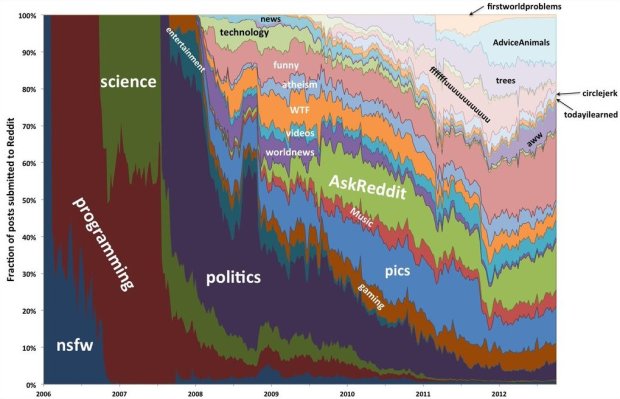
Computer science PhD student Randy Olson likes to analyze reddit in his spare time. We saw his network of subreddits already, but his look earlier this year at the evolution of reddit is more interesting. The yearly breakdowns and explanations are the best part. I’m relatively new to reddit (and totally feel like an old man when I visit), so it’s fun to see what the site used to be. More news and fewer Scumbag Steves, with a humble beginning in nsfw?
In the video above, filmmaker Cy Kuckenbaker reorganized midday traffic by color. No computer-generated elements required.
In this new video I took a four minute shot of state highway 163, which is San Diego’s first freeway then removed the time between cars passing and reorganized them according to color. I was curious to see what the city’s car color palette looked like when broken down. We are a car culture after all. I was surprised that the vast majority of cars are colorless: white, gray and black. The bigger surprise though was just how many cars passed in four minutes of what looked like light traffic: 462 cars.
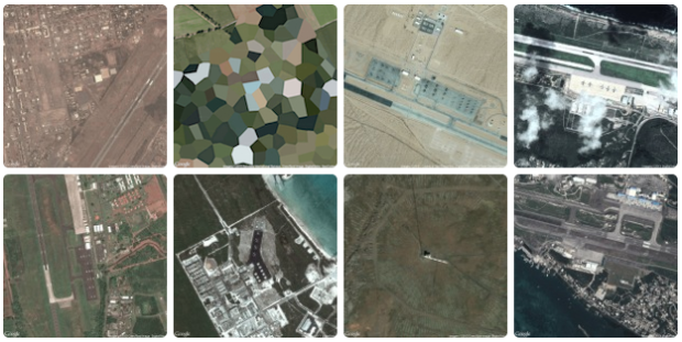
Similar to his collection of prison map snapshots, Josh Begley collected images of military bases around the world.
In addition to the map — which is built using MapBox, an open source and user-friendly publishing platform — I’ve included snapshots of the earth’s surface at various latitudes and longitudes. What does a military base look like from above? Which installations are secret and which can be viewed on the open internet? Running a small Processing sketch to query the Google Maps and Bing Maps APIs, I grabbed a satellite image for each point and am displaying the collection as a simple lightbox gallery.
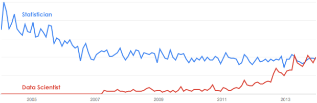
The relative interest in data scientist surpassed statistician this month. It was also higher in April and September of this year, so it’s not new, but it does seem like it’s ready to be a consistent thing, at least least for a little while. That said, it doesn’t seem like statistician is losing interest to data scientist, as the former has been fairly consistent for the past few years, so take that how you want.
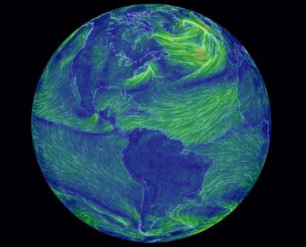
Remember the wind map of the United States by Martin Wattenberg and Fernanda Viegas? Cameron Beccario made one for Earth, based on data from the Global Forecast System.
There are over 5,000 subreddits with plenty of overlap and similarities. Randy Olson graphed them based on link activity and users and put them in an interactive. The overall view isn’t that useful (other than easily spotting the My Little Pony-themed outlier cluster in the top right), but if you use reddit and are familiar with the territory, it can be fun to browse.
Visualization continues to mature and focus more on the data first than on novel designs and size. People improved on existing forms and got better at analysis. Readerships seemed to be more ready and eager to explore more data at a time. Fewer spam graphics landed in my inbox.
So all in all, 2013 was a pretty good year for data and visualization. Let’s have a look back.
Read More
Airports conjure thoughts of security, bag checks, and cramped spaces, and flights are hardly something to look forward to. British Airways wants to bring the magic back with these real-time billboards. As a British Airway flight passes overhead, a child appears and points up to the plane in awe, along with text that says where the plane is from.
Read More
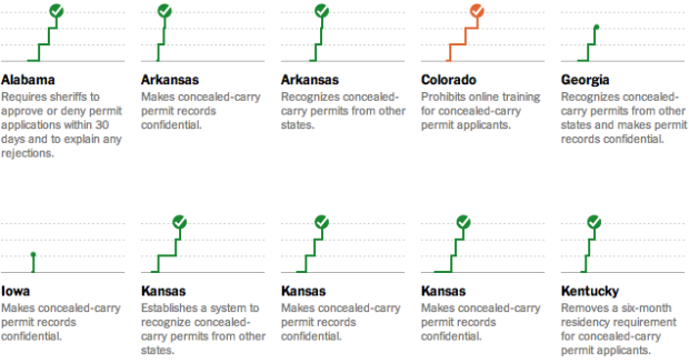
The New York Times explored state gun bills since Newtown.
In the 12 months since the mass shooting at Sandy Hook Elementary School in Newtown, Conn., almost every state has enacted at least one new gun law. Nearly two-thirds of the new laws ease restrictions and expand the rights of gun owners. Most of those bills were approved in states controlled by Republicans. Those who support stricter regulations won some victories — mostly in states where the legislature and governorship are controlled by Democrats — to increase restrictions on gun use and ownership.
Each chart shows the timeline of a bill and rounds of legislation. A law is signed when the line reaches the top, where green represents looser gun restrictions and orange represents tighter.

Most people know the layout of their neighborhoods and some are good with the roads in their town. Zoom out farther though — to your city, state, and country — and the landscape grows fuzzy in your imagination. Cartographer Chris McDowall redrew his uncertainty of his native New Zealand with interesting, fuzzy results.
The maps on this page are an attempt to translate my head landscapes into cartographic artefacts. I am trying to recreate of what I see when I close my eyes. They are rough approximations—the stuff in my head is far stranger and more difficult to pin down—but they feel honest. I share them because I find them beautiful and evocative.
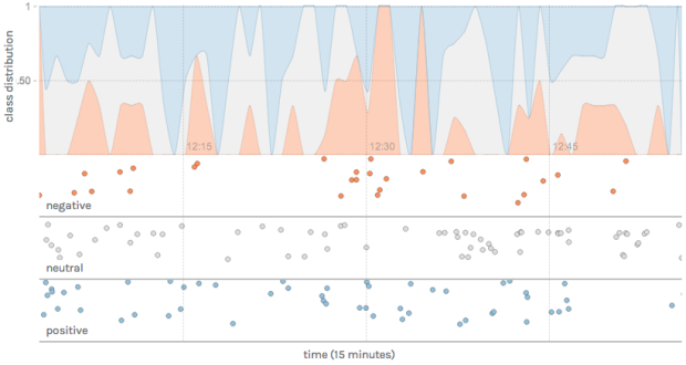
Text can be a great source of data, but it can be a challenge to glean information from an analysis standpoint. etcML can help you with that. Browse Twitter trends, classify your own text with existing machine learning classifiers, or upload your own training data.
But most importantly, you can use etcML to learn interesting new things about whatever text data you’re already working with in your job or research. Say you’re a social scientist with written and multiple-choice survey responses — you can quickly see how well participants’ written text allows you to guess their multiple-choice response. Or say you’re a literary scholar who wants to know what distinguishes an author’s early and late periods — you can train a classifier and visualize the most predictive words for each category.
Saved for later.
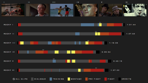
Fathom Information Design watched all six Rocky movies, classified segments into dialogue, training, montages, pre-fight, fight, and credits, and then visualized it. Rocky Morphology is the result.
It’s interesting to see the battle between dialogue, montage and fighting throughout each film. Dialogue beats out training and fighting in the first two Rocky films, but fighting and montage occupy the most time in Rocky III and Rocky IV. Rocky V favors dialogue over fighting — undisputedly slowing its pace next to the previous films. In the final round, Rocky sticks with dialogue over fighting but — “it ain’t over ’till it’s over” — Rocky delivers one last montage and fight scene to close out the series and complete the Rocky Morphology.
Needs more montage. Maybe we’ll get it in Grudge Match, because as we all know, that has instant classic written all over it.
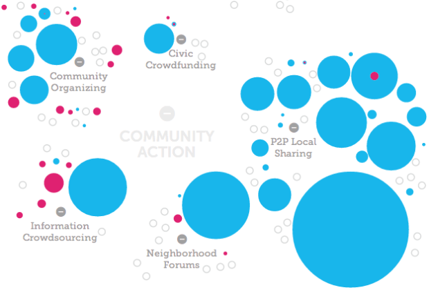
Fathom Information Design, in collaboration with the Knight Foundation and Quid, visualized the growth of civic tech based on an analysis of terms used to describe civic tech organizations and investments in them. The interactive accompanies a report, which describes the full findings.
A new report released today by Knight titled “The Emergence of Civic Tech: Investments in a Growing Field” aims to advance the movement by providing a starting place for understanding activity and investment in the sector. The report identifies more than $430 million of private and philanthropic investment directed to 102 civic tech organizations from January 2011 to May 2013. In total, the analysis identifies 209 civic tech organizations that cluster around pockets of activity such as tools that improve government data utility, community organizing platforms and online neighborhood forums.
Really like the transitions as you move through organizational breakdowns.
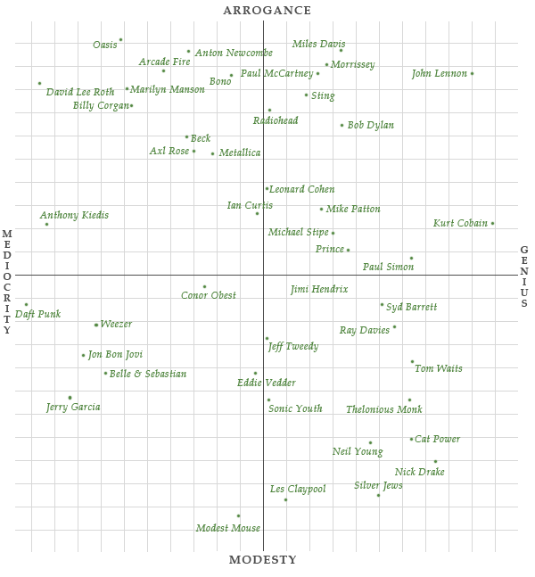
Just for kicks, Jimmy Chen plotted artists on a subjective arrogance-vs-genius scale. Above is the one for singers.
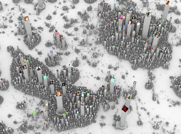
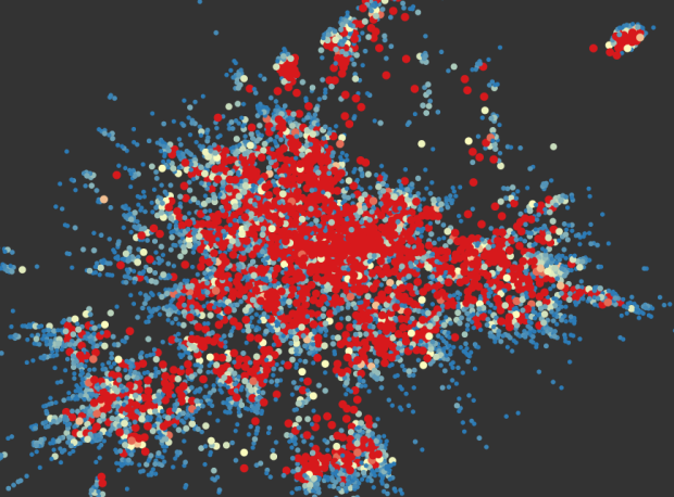
Ekisto, by visual artist Alex Dragulescu, is an experiment in visualizing online communities that provides an interesting city effect. So far there are views for StackOverflow, Github, and Friendfeed.
A graph layout algorithm arranges users in 2D space based on their similarity. Cosine similarity is computed based on the users’ network (Friendfeed), collaborate, watch, fork and follow relationships (Github), or based on the tags of posts contributed by users (StackOverflow). The height of each user represents the normalized value of the user’s Pagerank (Github, Friendfeed) or their reputation points (StackOverflow).
Also available in print.
Based largely on satellite data and the results of an airborne data collection mission compiled by the British Antarctic Survey, Bedmap2 by NASA Goddard is a construction of what Antarctica looks like underneath the giant sheet of ice. This iteration of the map used 25 million more observations than the original Bedmap1, which was released in 2001, and provides a more granular view.
[via Wired]
A video from the International Geosphere-Biosphere Programme explains global warming and projected changes in the near future. I wanted them to provide more contrast to the data they showed over the globe, but the story itself is an interesting one.
 Visualize This: The FlowingData Guide to Design, Visualization, and Statistics (2nd Edition)
New tools, refined process.


