Isoscope, a class project by Flavio Gortana, Sebastian Kaim and Martin von Lupin, is an interactive that lets you explore mobility around the world.
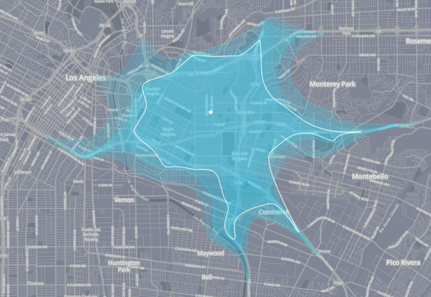
We drive to the closest supermarket, take the bike to the gym or walk to the cafe next door for a nice chat among friends. Getting around — thus mobility — is an essential part of our being. We were especially intrigued by those situations when our mobility is compromised such as in traffic jams or during tough driving conditions. How do those restrictions impact our journeys through the city and who is affected most? Obviously, a car can hardly bypass a traffic jam, whereas a bike is more flexible to continue its journey. Let alone the pedestrian who can stroll wherever he wants to. Isoscope tries to answer the questions above by comparing different means of transport and their sensitivity for disturbances.
Similar in flavor to the commute maps before it, Isoscope is a bit different in that it focuses on specific time frames, such as Fridays at 8am. Using data from the HERE API, a travel polygon is estimated for each hour of the day selected. Your initial result is an abstract blot overlaid on a map, but then use the menu to change days and highlight hours.


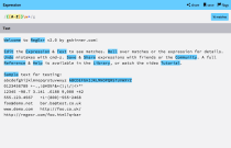 Learning regular expressions tends to involve a lot of trial and error and can be confusing for newcomers.


 Visualize This: The FlowingData Guide to Design, Visualization, and Statistics (2nd Edition)


