It’s an absolute myth that you can send an algorithm over raw data and have insights pop up.
— Jeffrey Heer in For Big-Data Scientists, ‘Janitor Work’ Is Key Hurdle to Insights by Steve Lohr
-
-
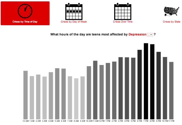
Crisis Text Line is a service that troubled teens can use to find help with suicidal thoughts, depression, anxiety, and other issues via text messaging. The long-term hope was to anonymize and encode these text messages so that researchers and policy-makers could better understand something typically kept private to the individuals.
Following through, the organization recently released a look into their data and a sample of encoded messages. (There’s a link to download the data at the bottom of the page.)
The visual part of the release shows when text messages typically come in, and you can subset by issue, state, and days. It could use some work, but it’s a good start. Hopefully they keep working on it and release more data as the set grows. It could potentially do a lot of good.
-
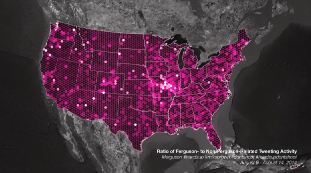
For trending topics, Twitter likes to show an animated map of how a lot of people talked about something at once. They pushed one out for Ferguson tweets. Naturally, the map looks a lot like population density. So instead, Eric Huntley aggregated and normalized for a more useful view.
Ultimately, despite the centrality of social media to the protests and our ability to come together and reflect on the social problems at the root of Michael Brown’s shooting, these maps, and the kind of data used to create them, can’t tell us much about the deep-seated issues that have led to the killing of yet another unarmed young black man in our country [5]. And they almost certainly won’t change anyone’s mind about racism in America. They can, instead, help us to better understand how these events have been reflected on social media, and how even purportedly global news stories are always connected to particular places in specific ways.
You won’t find answers to the more important questions on Twitter.
-
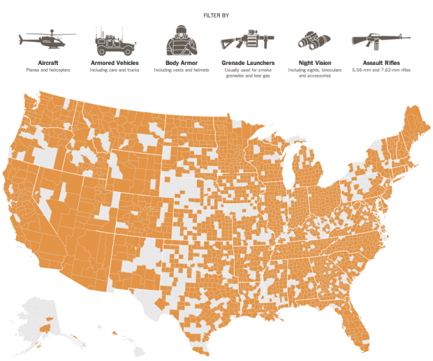
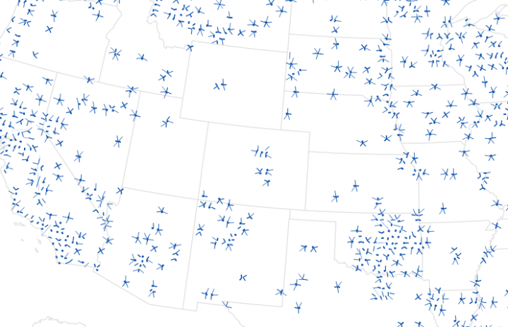
With the situation in Ferguson, the New York Times mapped the distribution of military surplus through Defense Department program. Equipment, especially assault rifles, have gone to most parts of the United States.
-

Leading up to a Nike women’s 10k run, design studio Variable made FuelBand Fibers, an artistic interpretation of a week of activity from seven individuals.
To celebrate effort of preparing for the run Nike has chosen 7 influential runners equipped with FuelBands. Up to the minute Nike Fuel data was then collected 24/7 and delivered to Variable to tranform into beautiful artworks. This is how Fibers were born. 7 digital fibers growing when the person is working out, one for each day of training, stylized uniquely for the given runner.
So each fiber represents a day, each essentially a timeline from bottom to top. Thickness represents activity, and colors represent times when a person led in the FuelBand community. The results: organic.
See more details on what the visuals show and how it was made on the project page.
Reminds me of Universal Everything, which also focused on individuals’ movements. [via Creative Applications]
-
Scott Harrison, the founder and CEO of charity: water, describes how the organization uses data to improve what they do, both on the ground and internally.
The first is program data, which is the information we collect on the water programs and projects we fund in 22 countries around the world. The second is data on our donors and supporters — for example, how much time or money they’ve given, which projects or aspects of our work they are most interested in and how they interact with our website. And finally, we collect internal data on our work in order to increase our effectiveness and efficiency as an organization.
-
Daniel Colman won $15.3 million in the The Big One for One Drop poker tournament, but he seems annoyed about it. What he had to say after the win:
First off, I don’t owe poker a single thing. I’ve been fortunate enough to benefit financially from this game, but I have played it long enough to see the ugly side of this world. It is not a game where the pros are always happy and living a fulfilling life. To have a job where you are at the mercy of variance can be insanely stressful and can lead to a lot of unhealthy habits.
Clearly we’re missing some details here — stuff that would make a person disgusted with winning — but how about that response. Stability and normality for the win. Or, well, in this case, variance for the win. Nevermind, forget it. [via Deadspin]
-
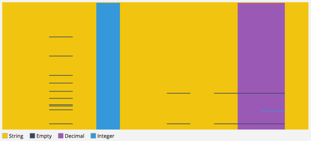
You get your CSV file, snuggle under your blanket with a glass of fine wine, all ready for the perfect Saturday night. Then — what the heck — there’s a bunch of missing data and poorly formatted entries. Don’t let this happen to you. CSV Fingerprint by Victor Powell provides a simple, wideout view of your CSV file, color-coded for quick quality control.
To make it easier to spot mistakes, I’ve made a “CSV Fingerprint” viewer (named after the “Fashion Fingerprints” from The New York Times’s “Front Row to Fashion Week” interactive ). The idea is to provide a birdseye view of the file without too much distracting detail. The idea is similar to Tufte’s Image Quilts…a qualitative view, as opposed to a rendering of the data in the file themselves. In this sense, the CSV Fingerprint is a sort of meta visualization.
Try it with your own CSV data. Never let a subpar CSV file ruin your Saturday night again.
-
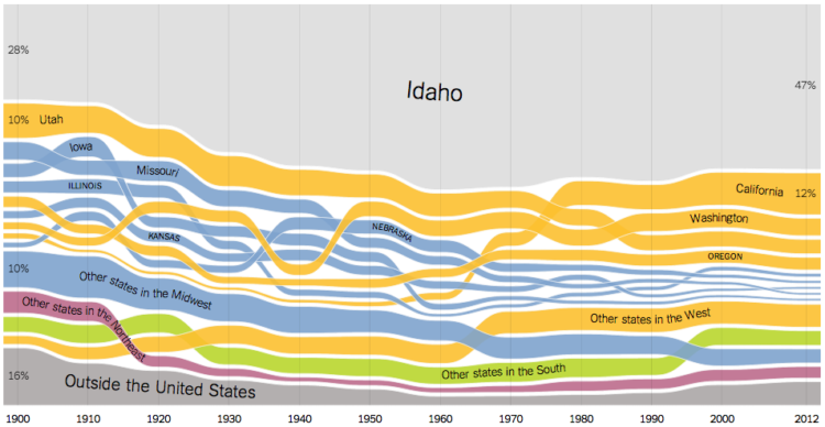
We’ve seen migration within the United States before, but Gregor Aisch, Robert Gebeloff, and Kevin Quealy for the Upshot take a more time-centric look at how people moved state to state, over the past century.
The following charts document domestic migration since the turn of the last century, based on census data. For every state, we’ve broken down the population by resident’s state of birth. The ribbons are color-coded by region, and foreign-born residents are included at the bottom, in gray, to complete the picture for each state.
The good thing about the ribbon approach, other than the flow-like aesthetic that lends well to the topic, is that you can see the change in order through the years. Unlike a stacked area chart, each layer isn’t restricted to an original ranking, so you can for instance, see that a lot of people born in California moved to Idaho starting in the 1960s.
On top of that, there are lots of nice details like ribbons move to the top when you mouse over, labels that follow the time series pattern, and a thicker highlight bar at each point in time. All of these make the data easier to read.
-
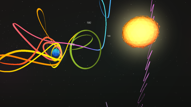
Impressive work in A Spacecraft for All:
This Chrome Experiment follows the unlikely odyssey of the ISEE-3, a spacecraft launched in 1978 to study the Sun, but better known for its amazing accomplishments beyond that original mission. “A Spacecraft for All” is an interactive documentary combining film and 3D graphics, allowing you to follow the spacecraft’s story as you trace it along its entire 36 year journey.
The combination of video and interactive sometimes feels gimmicky, but this feels like they belong together. The interactive portion lets you casually interact in space and look at orbit paths, and the video portion explains what you’re looking at. Guidance comes when necessary.
-
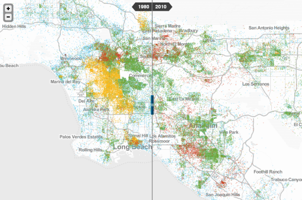
To better understand race and poverty, MetroTrends maps where people live whose income is below the poverty line.
The history, geography, and politics of individual metro regions all matter profoundly, and any serious policy strategy must be tailored to local realities.
To help take the policy conversation from the general to the specific, we offer a new mapping tool. It lets you explore changes from 1980 to 2010 in where poor people of different races and ethnicities lived, for every metropolitan region nationwide.
Each dot, color-coded by race, represents 20 people. So when you slide between views for 1980 and 2010, you see how areas have grown more or less diverse, increased or decreased in covered areas, and perhaps areas in need of more attention.
-
Casinos are everywhere. This interactive map tells you how close the nearest one is in sampled areas of the United States.
-
Online mapping just got an upgrade:
Announcing Mapbox GL JS — a fast and powerful new system for web maps. Mapbox GL JS is a client-side renderer, so it uses JavaScript and WebGL to dynamically draw data with the speed and smoothness of a video game. Instead of fixing styles and zoom levels at the server level, Mapbox GL puts power in JavaScript, allowing for dynamic styling and freeform interactivity.
For the non-developers: Online maps are typically stored pre-made on a server, in the form of a bunch of image files that are stitched together when you zoom in and out of a map. So developers have to periodically update the image files if they want their base maps to change. It’s a hassle, which is why base maps often look similar. With Mapbox GL, making changes is easier because the development pipeline is shorter.
-
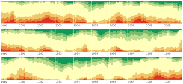
Although California has perhaps had it the worst, drought also affects other states, mainly the southwestern ones. Mike Bostock and Kevin Quealy for the New York Times have been updating an animated map weekly. It shows the spread of drought severity, across the United States. But, be sure to scroll down to also see drought levels over time, shown as stacked area chart.
-
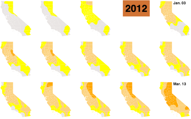
To show the increased levels of drought throughout the state of California, Kyle Kim and Thomas Suh Lauder for the LA Times showed weekly change in drought levels with 188 color-coded California maps. There’s also an animated version, but why do that when you can scrollllll?
A couple of years ago, the New York Times did something similar, but with a two-category color scale and on a national scale.
-

By way of David Kennerr, something in this CNN frame seems off.
-
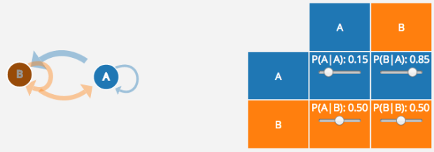
Adding on to their series of graphics to explain statistical concepts, Victor Powell and Lewis Lehe use a set of interactives to describe Markov Chains. Even if you already know what Markov Chains are or use them regularly, you can use the full-screen version to enter your own set of transition probabilities. Then let the simulation run.
Nice. Should be especially useful for educators.
-
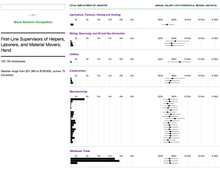
Salaries for occupations with the same job title can vary across industries. This interactive shows you by how much and who works where.
-
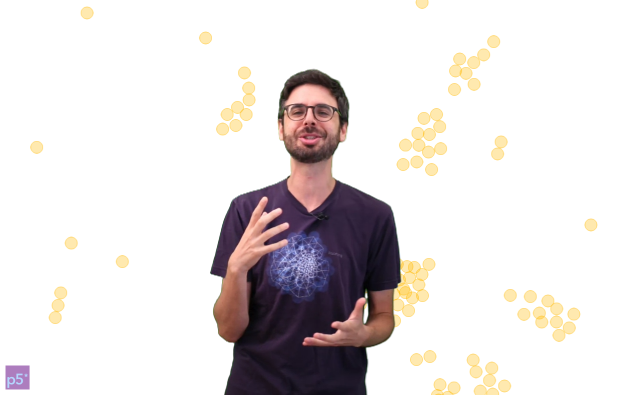
Visualization on the Web can be tricky for those unfamiliar with code. The new JavaScript library p5.js, developed by Lauren McCarthy and collaborators, aims to make your first steps easier and less painful.
Using the original metaphor of a software sketchbook, p5.js has a full set of drawing functionality. However, you’re not limited to your drawing canvas, you can think of your whole browser page as your sketch! For this, p5.js has addon libraries that make it easy to interact with other HTML5 objects, including text, input, video, webcam, and sound.
The library follows some of the same philosophy as Processing — that is, straightforward to get up and running — and reimagines the implementation and approach for recent web technology. Even if you’re not into programming, it’s worth visiting if just to watch, listen, and interact with Dan Shiffman as he enthusiastically talks about the library.
-

Digital Ethereal is a project that explores wireless, making what’s typically invisible visible and tangible. In the piece above, a handheld sensor is used to detect the strength of Wi-Fi signal from a personal hotspot. A person waves the sensor around the area, and long-exposure photography captures the patterns.
Reminds me of the Immaterials project from a while back, which used a light stick to represent signal strength rather than a signal light.
Recently for Members
Second Edition
 Visualize This: The FlowingData Guide to Design, Visualization, and Statistics (2nd Edition)
 Visualize This: The FlowingData Guide to Design, Visualization, and Statistics (2nd Edition)
New tools, refined process.
Browse by Chart Type See All →


