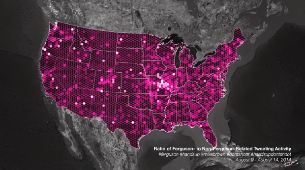
For trending topics, Twitter likes to show an animated map of how a lot of people talked about something at once. They pushed one out for Ferguson tweets. Naturally, the map looks a lot like population density. So instead, Eric Huntley aggregated and normalized for a more useful view.
Ultimately, despite the centrality of social media to the protests and our ability to come together and reflect on the social problems at the root of Michael Brown’s shooting, these maps, and the kind of data used to create them, can’t tell us much about the deep-seated issues that have led to the killing of yet another unarmed young black man in our country [5]. And they almost certainly won’t change anyone’s mind about racism in America. They can, instead, help us to better understand how these events have been reflected on social media, and how even purportedly global news stories are always connected to particular places in specific ways.
You won’t find answers to the more important questions on Twitter.


 Visualize This: The FlowingData Guide to Design, Visualization, and Statistics (2nd Edition)
