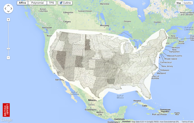
The British Library georeferencing project places old maps, as far back as the 16th century, on top of Google Maps for browsing and as a mode of comparison.
The British Library began a project to crowdsource the georeferencing of its scanned historic mapping in 2011 by partnering with Klokan Technologies to customise its online georeferencing tool. There have been five public releases of maps since 2012, all of which met with tremendous success. In total over 8,000 maps have been “placed” by participants and subsequently checked for accuracy and approved.
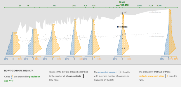
Has someone else done this? I feel like I’ve seen something like this project before, but the closest thing I can think of is Historypin, which overlaid images on top of Google Streetview.


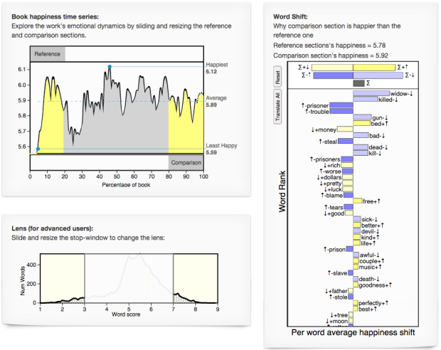

 Visualize This: The FlowingData Guide to Design, Visualization, and Statistics (2nd Edition)


