
The New York Times pushed out super-detailed, precinct-level maps for the Senate election. The maps are also interactive, work well, and don’t take forever to load. As my dad would say — holy moly.
The New York Times pushed out super-detailed, precinct-level maps for the Senate election. The maps are also interactive, work well, and don’t take forever to load. As my dad would say — holy moly.
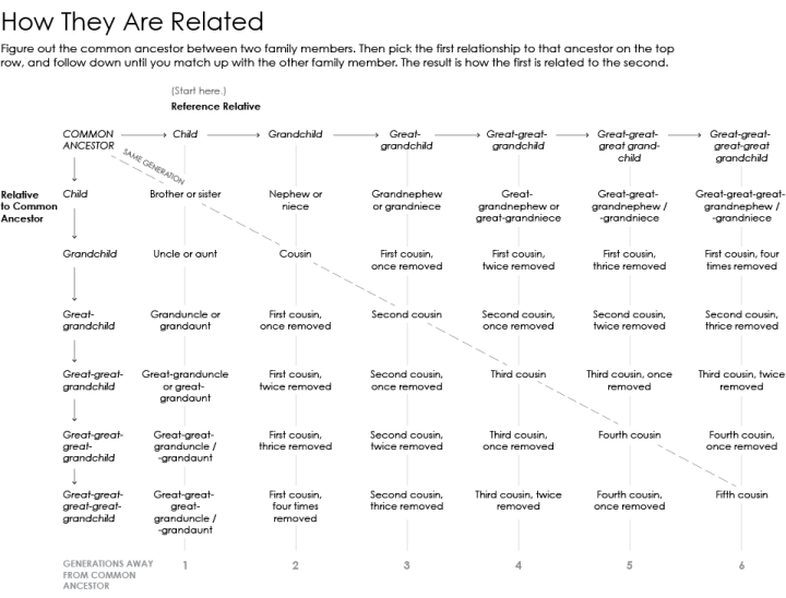
For every family get-together I go to, it seems there are more kids running around. I know that they are related to me somehow, but what do I call them? Maybe this chart will help next time.
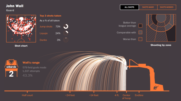
Todd Lindeman and Lazaro Gamio for the Washington Post explored shooting patterns for last year’s Washington Wizards.
Read More
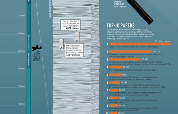
In the department of comparing large numbers to objects and situations that are slightly more relatable, this graphic from Nature explores citations in research.
The bar on the left shows the height of a theoretical stack of papers that represents the first page of every paper cataloged in Web of Science. It would almost reach the height of Mount Kilimanjaro. The breakout stack is a zoomed in view of the 14,351 paper pages with at least 1,000 citations, and finally, the magnified orange section represents the top 100 papers. Also a flying bug.

Look! More size of very big things with large numbers, compared against things that you’re kind of familiar with. Does this ever get old? The answer is no. Because measurements of planets might as well be random large numbers without anything to scale, John Brady placed things from space on Earth and vice versa.
Read More
David Spiegelhalter, professor of public understanding of risk, does some back-of-the-napkin math to describe why recent prostitution estimates for the UK are problematic.
As always, it’s best to do a simple reality check. The ONS assumptions come to around 61,000,000 visits a year. Let’s say 50,000,000 are from locals rather than foreign visitors. There are around 27,000,000 men between 18 and 50 in the UK (taking an arbitrary upper limit), so this would mean that on average each of them buys sex twice a year. In fact the latest Natsal survey found that 3.6% of men reported paying for sex in the last 5 years – let’s say that means that considerably less than 1,000,000 men a year pay for sex, maybe 500,000. So the ONS assumptions mean that men who pay for sex do so on average twice a week. This seems high.
The assumptions also mean that the average person working in prostitution is turning over nearly £100,000 a year, which Jolyon from Tax Relief 4 Escorts says is completely implausible, and he should know.
Spiegelhalter makes a few of his own assumptions in there, but you can see why estimating illegal activity and then using those numbers to calculate gross domestic product can be a challenge.
If you recall, the gross domestic product for the United Kingdom rose by 5 percent, largely in part due to estimates trying to account for drug sales and prostitution. Given that illegal activity and careful, public record-keeping typically don’t go together, the new numbers were rough at best. For prostitution in particular, the numbers from the Office of National Statistics estimated an extra £5.7 billion added to the GDP.
The problem now is that the United Kingdom, as a member of the European Union, apparently owes £1.7 billion. This is based on gross national income which uses gross domestic product in its equation. Ouch. Consequences.

NPR spent some time on the subject of the decline of women in computer science. Whereas the the percentage of women in other technical fields rose, the percentage of women in computer science declined, as shown in the chart above. Although it’s tough to pinpoint a single factor, the time of decline coincides with when computer were mostly marketed towards boys in the 1980s.
In the 1990s, researcher Jane Margolis interviewed hundreds of computer science students at Carnegie Mellon University, which had one of the top programs in the country. She found that families were much more likely to buy computers for boys than for girls — even when their girls were really interested in computers.
On Quora, someone asked, “What are the chances of survival of individual chess pieces in average games?” Oliver Brennan answered by looking at the moves from 2.2 million games.
The situation with the c-d-e pawns is very interesting. The most survivable central pawn is the White c-pawn (42%), while White’s d-pawn is the most doomed of all the chessmen (24%) – more so even than the knights (~26%). There’s a pleasing symmetry in the survival rates of the White and Black c- and e-pawns that suggests they’re frequently exchanged on the d-file. Bishops survive around 35% of the time, with the kingside bishops slightly more likely to survive than queenside ones.
Code available if you want to poke. [via Know More]
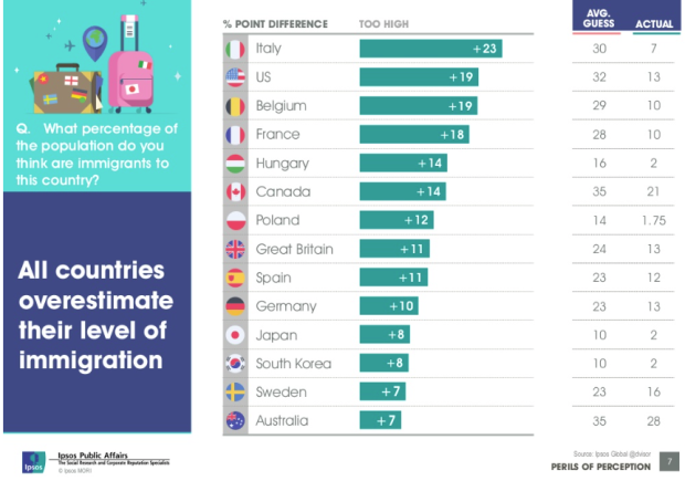
Ipsos MORI, primarily a marketing research group I think, released results of their study on public perception of demographics versus reality, on numbers such as immigration, religion, and life expectancy. The key takeaway is that out of the people they polled from fourteen countries, the average person typically over- or underestimated — by a lot.
Read More

Accompanying their segment on Halloween stores stocking costumes, NPR ranks bestsellers for the past four years, based on data from the National Retail Foundation. Note that these are rankings for adult costumes, so it’s safe to assume that all of these costume names are preceded by “sexy.” (Kidding.)
I’m surprised there aren’t more topical costumes towards the top. For example, the segment touches on Walter White costumes flying off the shelves last year, but I’m guessing the data probably only covers the pre-packaged stuff. Also guessing a similar reason for why Superman and Batman aren’t counted as generic superhero, or Dracula as vampire.

Say you have time series data and you want to detect significant changes, but there’s also a lot of noise to sift through. Twitter released an open source R package, BreakoutDetection, to help with that.
Our main motivation behind creating the package has been to develop a technique to detect breakouts which are robust, from a statistical standpoint, in the presence of anomalies. The BreakoutDetection package can be used in wide variety of contexts. For example, detecting breakout in user engagement post an A/B test, detecting behavioral change, or for problems in econometrics, financial engineering, political and social sciences.
Was a quick installation and worked as expected for me. Twitter has released plenty of open source projects, but I think this is the first R package. Nice.
Adam Cohen and his group are using genetically-modified neurons that light up when the cells activate to see the communication between neurons in high detail.
Cohen’s team is using the technique to compare cells from typical brains with those from people with disorders such as motor neuron disease or amyotrophic lateral sclerosis. Rather than taking a brain sample, they remove some of the person’s skin cells and grow them alongside chemicals that rewind the cells into an embryonic-like state. Another set of chemicals is used to turn these stem cells into neurons. “You can recreate something reminiscent of the person’s brain in the dish,” says Cohen.
Couple that with super slow motion video. Then patterns.

The New York Times takes a data-centric look at the progress of the Affordable Health Care Act here in the United States. It’s a team effort seven-parter describing changes in uninsured percentages, affordability, and changes to the health care industry as a whole. Probably want to save this one for later.
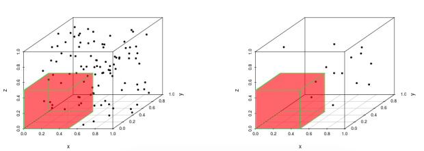
Jeff Leek was trying to explain the curse of dimensionality and realized that there had to be a better way! Leek’s student Prasad Patil cooked up an interactive to demonstrate the curse.
From Leek:
I recently was contacted for an interview about the curse of dimensionality. During the course of the conversation, I realized how hard it is to explain the curse to a general audience. One of the best descriptions I could come up with was trying to describe sampling from a unit line, square, cube, etc. and taking samples with side length fixed. You would capture fewer and fewer points. As I was saying this, I realized it is a pretty bad way to explain the curse of dimensionality in words.
Here’s the Wikipedia page on the curse, if you like. Or you can just give Patil’s interactive a whirl.
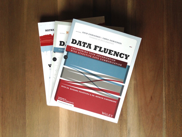
Data Fluency: Empowering Your Organization with Effective Data Communication, by Zach and Chris Gemignani, is the latest addition to the FlowingData book series.
You can order it now.
Read More
Looking for a job in data science, visualization, or statistics? There are openings on the board.
Business Intelligence Analyst for American Speech-Language-Hearing Association in Rockville, Maryland.
Front End Developer for Seed Scientific in New York.
Director of Visualization Services for North Carolina State University Libraries in Raleigh, North Carolina.
Middleweight Designer for Information is Beautiful Studio in Shoreditch, London.
When news breaks, maps often accompany stories (or the maps are the story), and cartographers and graphics people have to work quickly. The New York Times does this really well. Cartographer Tim Wallace of the New York Times describes some of the process for Wired. I like the bit about uncertainty.
They also have to deal with incorporating uncertainty into their maps. A recent map of territory held by ISIS in Iraq and Syria, for example, uses blurry red and yellow shading to indicate regions controlled by ISIS and areas of recurring attacks. The same map uses light grey hatching to indicate sparsely populated regions. “You don’t want to put a hard line around that,” Wallace said. “It’s not like you cross a river and all of a sudden it’s sparsely populated.”
When I was over there as a lowly graphics intern years ago, I was always impressed by the map department. Actually, I think the map department had just been combined with graphics to work more closely together. Maybe they split them back up again. Anyways, they sit next to each other, and I was impressed by everyone.
I’d occasionally make location maps — mostly small stuff with a few dots on them. Then I’d give it to the map department for checking. Their speed and accuracy was always top notch, which was a fine way for me to see how much I had to learn.
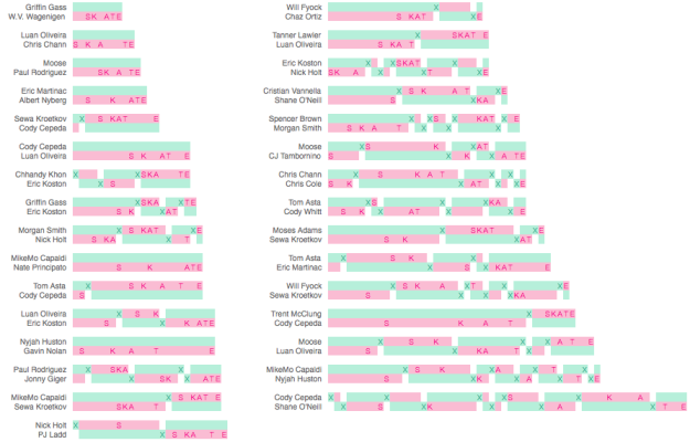
George Murphy visualized the results of this year’s skateboarding tournament Battle at the Berrics 7. Even if you don’t like or know anything about skateboarding, this is a fun one to scroll through.
Skaters match up head-to-head in a bracket format, and compete in a style similar to the basketball game of H-O-R-S-E. One person does a trick, and if completed cleanly, the other person has to match. If the second person fails to match, he or she receives a letter. The first person to S-K-A-T-E loses.
Murphy takes you through the tournament with video clips and transitions through a handful of charts. You see how a match plays out and what individual skaters did. Fun.

Customizing your charts doesn’t have to be a time-intensive process. With just a teeny bit more effort, you can get something that fits your needs.

So here’s a sport I don’t see or hear much about. F1 racing, which requires a different sort of strength and agility than say football or basketball, has a wide range of ages. Drivers can be in their teens. Some are in their late 40s (and successful). Peter Cook visualized the ages and races of drives through F1 racing history, since 1950.
Each row represents a driver’s career, and each color-coded dash in a row represents a race. Colors indicate wins, a trip to the podium, and a top 10 finish.
My favorite part is the tour on initial load. The interactive points out highlights in the data, such as the youngest, oldest, and drivers of interest.
 Visualize This: The FlowingData Guide to Design, Visualization, and Statistics (2nd Edition)
New tools, refined process.


