I’m glad podcasts are a thing right now. Talking Machines is a new podcast on machine learning, statistics, and data, hosted by journalist Katherine Gorman and computer science professor Ryan Adams. One “Hello, world” episode in, it seems promising. Sometimes these technical podcasts get lost in jargon, which gets old fast, but I think they’re working towards a good balance.
-

In Invasion of America, an animated map shows the loss of land.
Read More -
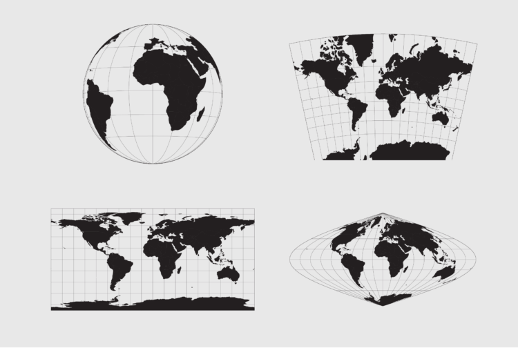
Working with Map Projections and Shapefiles in R
No need to settle for the mapping defaults in R. Apply map projections to show geographic data in a way most suitable for your work.
-
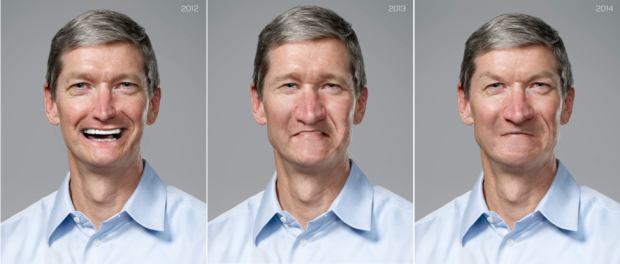
This amused me. By artist Christo Allegra.
-
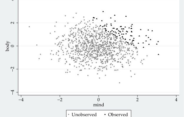
Gabriel Rossman, a sociology professor at UCLA, describes colliders — or when correlation does not equal causation and the former might not even exist either. Referring to the simulated plot above, Rossman uses Hollywood actor selection as an example:
For instance, suppose that in a population of aspiring Hollywood actors there is no correlation between acting ability and physical attractiveness. However assume that we generally pay a lot more attention to celebrities than to some kid who is waiting tables while going on auditions. That is, we can not readily observe people who aspire to be actors, but only those who actually are actors. This implies that we need to understand the selection process by which people get cast into films. In the computer simulation displayed below I generated a population of aspiring actors characterized by “body” and “mind,” each of which follows a normal distribution and with these two traits being completely orthogonal to one another. Then imagine that casting directors jointly maximize talent and looks so only the aspiring actors with the highest sum for these two traits actually get work in Hollywood. I have drawn the working actors as triangles and the failed aspirants as hollow circles. Among those actors we can readily observe there then will be a negative correlation between looks and talent, even though there is no such correlation in the grand population. If we see only the working actors without understanding the censorship process we might think that there is some stupefaction of being ridiculously good-looking.
-
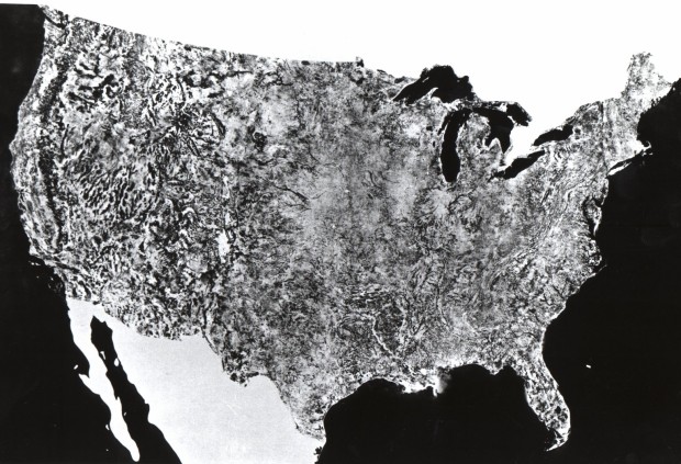
In 1974, NASA published their first satellite photo of the contiguous United States by stitching together a bunch of individual images.
A giant photo map of the contiguous 48 states of the United States, the first ever assembled from satellite images, completed for NASA by the U.S. Department of Agriculture Soil Conservation Service Cartographic Division. The map is 10 by 16 feet, is composed of 595 cloud-free black-and-white images returned from NASA’s first Earth Resources Technology Satellite (ERTS-1). The images were all taken at the same altitude (912 kilometers: 560 miles) and the same lighting angle. The images were produced by the spacecraft’s Multi-spectral Scanner System (MSS) in Band 5, or the red portion of the visible spectrum, during the period July 25 to October 31, 1972.
-
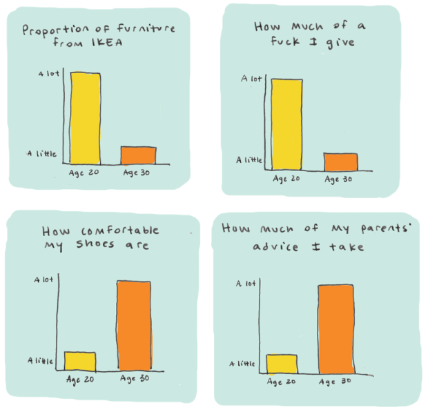
You get older as time passes. (That’s how age works last time I checked.) You change, the people around you change, and you care more about different things and less about others. Cecilia Rabess describes the difference a decade makes in a series of humorous charts.
It’s funny because it’s true.
Excuse me while I get an IcyHot pack for my lower back and schedule an eye appointment. And why do they have to play that music so darned loud? [via @albertocairo]
-
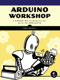 I started working through Arduino Workshop by John Boxall over the holidays, and it’s a lot of fun so far. I highly recommend it if you’re thinking about getting into Arduino projects and you’re brand new to this stuff.
 From the book description:
You’ll start off with an overview of the Arduino system but quickly move on to coverage of various electronic components and concepts. Hands-on projects throughout the book reinforce what you’ve learned and show you how to apply that knowledge. As your understanding grows, the projects increase in complexity and sophistication.
I’m a little under halfway through, but that sounds right so far. I’ve been able to do all the projects with the hardware that came with the official Arduino Starter Kit, with a small adjustment for one project.
Read More -

It’s hard to predict the future, especially when humans are involved. Oftentimes, there are just too many variables to control for to estimate accurately. In the chart above from the Washington Post Wonkblog, Japan’s fertility rate is plotted against various forecasts over the years, and you see forecasts headed upwards, but in reality it decreased consistently since the 1970s. This is based on work from Katagiri, et al (pdf).
See also a similar porcupine chart from Amanda Cox in 2010 that compared US deficit against forecasts.
-
All ten seasons of Friends are currently available on Netflix, but watching shows episode-by-episode is for chumps and people stuck in second gear. We Used to Be Friends is a straightforward mashup that plays all episodes from the first season at once, overlaid on each other. Enjoy below.
Read More -
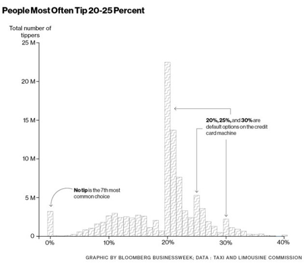
A few months ago BusinessWeek ran an article on how much people tip New York cab drivers. There are bumps in 20%, 25%, and 30%, which is expected because those are preset values in the payment interface. However, a much lower percentage of people tipped 19% than they did 21%. Peculiar.
Ben Wellington, a visiting statistics professor at Pratt Institute, did some digging. It turns out it’s not some glitch in human generosity but a difference between two payment softwares used by New York cabs. One calculates tip value taking a percentage of fare plus taxes and tolls. The other only calculates based on the fare.
That’s an extra $5.2 million in tips from the former in 2013. Yowza.
-
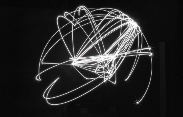
Maximum Distance. Minimum Displacement. by Tahir Hemphill explores rappers’ geographic mentions in their lyrics.
Geographic mentions from the complete bodies of work of 12 rappers were extracted using the language analysis database invented by Hemphill — the Rap Almanac. These locations were translated into geographic coordinates, which were then made into points used to plot the movements of an industrial robot arm.
For several minutes at a time, the robot arm drew the paths while holding a light pen producing sculptural forms made with light. Each unique shape represents the global distance travelled by the lyrics in each artist’s career.
The above is the result for Kanye West.
-
R continues its growth, and usage in the sciences is no exception. Nature describes some of the applications along with links to getting started with the statistical computing language.
Besides being free, R is popular partly because it presents different faces to different users. It is, first and foremost, a programming language — requiring input through a command line, which may seem forbidding to non-coders. But beginners can surf over the complexities and call up preset software packages, which come ready-made with commands for statistical analysis and data visualization. These packages create a welcoming middle ground between the comfort of commercial ‘black-box’ solutions and the expert world of code. “R made it very easy,” says Rojo. “It did everything for me.”
For me, R used to be a traditional analysis tool that I made graphs with occasionally. But at some point it became more about the data graphics, and these days that’s about all I do. That’s the great thing about R. You don’t have to learn everything about the language to get a lot out of it. Just take in bits at a time to suit your needs, and before you know it:
learning <- function(time) {
    return("easy");
}
Here are a handful more resources to get you started:
-
The Economist recounts the stories of statisticians who solved problems during wartime. Although they weren’t called that until after.
“Peace finally returned, and the statistical scene in the United Kingdom had been completely transformed,” wrote Barnard and Plackett. “No other method would have produced these changes in only six years.” Dozens of clever young people had been taught a fast-changing new subject—and in many cases done original research. Even routine work was elevated by the urgency and camaraderie of the war effort—and even the fact that they were new to the field. “A lot of the work was statistically boring,” Sir David says now. “But the point is that I didn’t really know anything.”
“After the war the section exploded like a London bomb into missionary statistical occupations all over the country,” wrote Geoffrey Jowett, one of the SR 17 alumni, in 1990. “In convincing others that we had a good product to sell we convinced ourselves.”
See also George E.P. Box’s recollection of accidentally becoming a statistician.
-
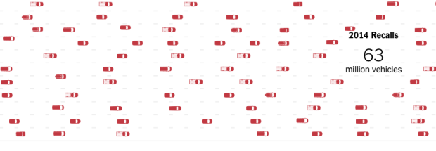
There were a lot of auto recalls — 62 million of them — in the US this year, based on data from the National Highway Traffic Safety Administration. A large portion of them were related to faulty airbags or ignition switches. To compare, there were 20 million in 2013. Still though, we’re not good at picturing big numbers, so Wilson Andrews and Gregor Aisch for the New York Times try to provide a sense of frequency and scale.
Read More -
If you logged into Facebook the past couple of weeks, you saw your friends’ automatically generated year-end reviews. Estimated events and popular pictures appear in chronological order. Facebook eventually pinned your own year in review at the top of your feed for perusal. Seems harmless — until you realize there are people who don’t want to look back, like Eric Meyer, whose daughter died this year.
And I know, of course, that this is not a deliberate assault. This inadvertent algorithmic cruelty is the result of code that works in the overwhelming majority of cases, reminding people of the awesomeness of their years, showing them selfies at a party or whale spouts from sailing boats or the marina outside their vacation house.
But for those of us who lived through the death of loved ones, or spent extended time in the hospital, or were hit by divorce or losing a job or any one of a hundred crises, we might not want another look at this past year.
See also Meyer’s follow-up. While many took the original post as a way to hate on Facebook, Meyer didn’t mean it like that.
-
Eric Rodenbeck is the founder and creative director for Stamen. No doubt you’ve seen their stuff over the years, ranging from client work, art pieces, to open source projects. At Eyeo 2014, Rodenbeck talked about some of that work, but more significantly, what it’s like running such a studio in an environment where visualization needs and wants change often and quickly.
Read More -
For the holiday cookie makers, this one from Tessa Arias is for you. Merry Christmas.
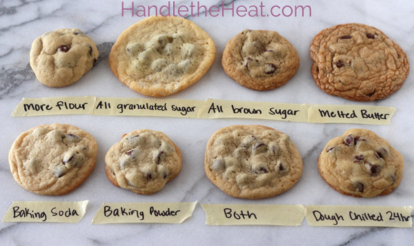
I’m tempted to try this by varying single ingredients at a time.
-

You’ve likely seen the classic globe image that shows Earth at night. It’s a composite image using data collected over a nine-day period, so you kind of see what the planet looks like if it were night at the same time everywhere. While interesting in its own right, it lacks a time component. The researchers are on it and noticed an increase in light during the holiday months.
Read More

Recently for Members
Second Edition
 Visualize This: The FlowingData Guide to Design, Visualization, and Statistics (2nd Edition)
 Visualize This: The FlowingData Guide to Design, Visualization, and Statistics (2nd Edition)
New tools, refined process.
Browse by Chart Type See All →


