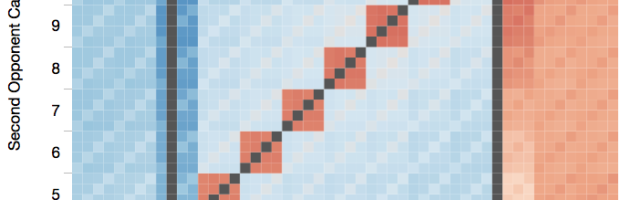
Software engineer Chris Beaumont visualized the strength of opponent hands in Texas hold ’em, given any other hand. This is based on counting about 1.3 trillion possible combinations.
Read More
Software engineer Chris Beaumont visualized the strength of opponent hands in Texas hold ’em, given any other hand. This is based on counting about 1.3 trillion possible combinations.
Read More
Michael Beuoy’s win probability model plotted on FiveThirtyEight starts all NBA teams at a 50% chance of winning. Then the probability of winning a game increases and decreases from there. However, practically speaking, we know something about the teams before each game, and we don’t give even chances to the worst and best team at the zero-minute mark.
So Todd Schneider took a different approach to minute-by-minute win probability — from a gambling perspective. Each line in the time series starts closer to the end probability as gamblers wager based on what they think the final outcome will be.
Read More
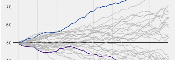
Michael Beuoy made a win probability model for NBA teams and games, based on play-by-play data from 2000 to 2012. The basic calculator lets you punch in the game state, such as time left and the score difference, and it spits out the probability of a win.
Or, for a team-centric view, you can see the chart from Beuoy and Allison McCann for FiveThirtyEight, which plots the average probability using the same model. Steady rise means a steady pull towards a win, whereas spikes and steeper, positive slopes mean a tendency towards scoring spurts.
Jonathan Dushoff had issues with students in his population biology class cheating on his exams. One year there was suspicious behavior, but Dushoff and the proctors weren’t able to prove the students cheated as it happened. So he looked closely at the test results to find the guilty students.
Read More

Bayes’ theorem is covered in introduction to statistics and probability courses, but I think a lot of people starting out don’t understand it conceptually. They see a formula that you plug numbers into. Here’s an example using LEGO bricks that clarifies the confusion, hopefully.
Did you hear the news? The White House officially appointed DJ Patil as the federal government’s first ever Chief Data Scientist. Awesome.
Here’s Patil, with an introduction by President Barack Obama, on what’s in store and a recruitment note for the US Digital Services.
Read More
Artist Alberto Frigo took a picture of every object he used with his right hand for the past 11 years. Averaging 76 photos per day, the project — Images of the artifact used by the main hand — is low-tech, with just a small, hand-held camera. No internet connection, tagging, or documentation. Just a stream of photos.
Frigo aims to do this until age 60, so he has only 25 more years to go. Yep.
Quoctrung Bui for Planet Money plotted average income for the top one percent of earners against the average income of the bottom 90%, from 1920 to 2012. Through the 1970s, the animation shows rising income for the bottom and relatively static for the top and then vice versa after that.
Read More
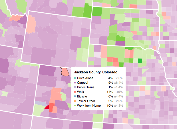
Let readers focus on the regions they care about to make their own comparisons and conclusions.
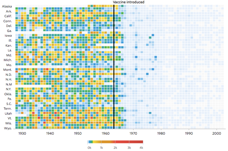
Not that anyone who does not vaccinate their kids cares, but Tynan DeBold and Dov Friedman for the Wall Street Journal show the change in number of cases for various diseases after a vaccination is introduced.
Read More
It might not be sexy, but you have to load your data and get it in the right format before you can visualize it. Here are the basics, which might be all you need.
Because using Tinder takes up oh so much time swiping, swiping, and swiping, Justin Long made a bot that swipes and starts conversations for him. Step 1: Use his existing preferences to create two Eigenfaces, commonly used in face recognition, that represent a yes and a no. Step 2: Automate everything else with the Tinder API.
Read More

Watch one bird fly around, and it’s hard to make out its flight pattern. Time shift multiple copies of that bird, creating an echo effect, and it’s easy. Parker Paul did this with seagulls flapping around at the beach and After Effects.
Read More
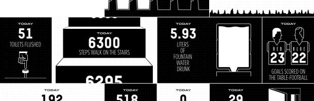
The Sid Lee agency in Paris has Arduino-powered sensors hooked up throughout their office, and they brought the data together in a single dashboard. The result is a fun look into the inner workings of the agency in real-time.
Read More
Audio Landscape is a novel music visualizer that constructs a landscape based on the MP3 that you give it. As you fly overhead, you can see the mountains constructed in the distance. (You probably want to open Chrome for this one. Safari kind of buckled for me.)
There is no more reason to expect one graph to “tell all” than to expect one number to do the same.
—John Tukey, Exploratory Data Analysis, 1977.

In the first song of his music experiment Data-Driven DJ, visual artist Brian Foo used median household income data to create a song that represents a ride on a New York subway.
Read More
In a discussion of context and visualization, Jen Christiansen pulls out a good snippet from Jacob Bronowski’s The Observer (1952) on design constraints.
Read More
The most recent episode of RadioLab is on social experimentation and social networks. More specifically, Facebook and their timeline tinkering.
Read More

Mosaic provides a simple comparison of brain size in a handful of animals so that you can compare to the average human. Select among several measures such as actual weigh, percent of body mass, or number of neurons. These measures don’t seem to say much about smarts.
Absolute brain size clearly isn’t what really matters, otherwise people would be cognitive pygmies compared to whales and elephants. But brain size relative to body size doesn’t seem to be a particularly informative measure either. Marmosets — diminutive monkeys that are not thought to be among the brightest of primates — have brains that tip the scales at around 2.7 per cent of body mass, easily beating our own 2.0 per cent.
 Visualize This: The FlowingData Guide to Design, Visualization, and Statistics (2nd Edition)
New tools, refined process.


