-
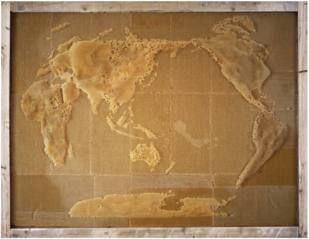
In an exploration of the connection between humans an nature, artist Ren Ri uses beeswax as his medium and the bee colony as the builder. Yeah.
Because a colony will follow the queen bee and build a hive based on the pheromones that she releases, Ri is able to move the queen such that the others in the colony act accordingly.
Read More -
The Citizen Ex browser extension guesses where you’re geographically located on the web. That is, it guesses where the server — the one you just pulled that website from — is in the world. It also guesses where you are physically located. The extension keeps track of these locations and computers something called Algorithmic Citizenship.
Read More -
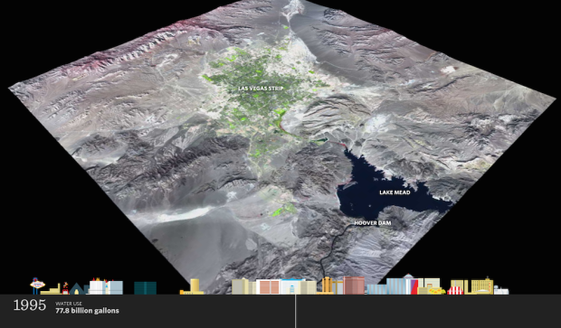
Western cities are growing but water supplies are decreasing. That’s not good. ProPublica, as part of their series Killing the Colorado, focuses on the fastest growing Western city: Las Vegas.
Read More -
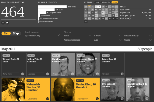
The US government doesn’t keep a complete record of fatal shootings by police, but with recent events, it’s become increasingly obvious why such data is important. So instead of waiting, the Guardian built their own database.
Read More -
-

Million Base is a database of 2.2 million chess games. Steve Tung visualized chess piece journeys based on this data, for each piece on the board. Above is the footprint for the white knight. Each thin line represents 500 moves, and from what looks like a little bit of random noise to offset each line, you see a more prominent path for more frequent hops.
Read More -
After seeing an isochrone map drawn by Francis Galton, Peter Kerpedjiev was curious if he could apply the method to travel times in Europe.
Read More -
You’re headed to the subway platform and you hear a train coming. The warm musty air that blows directly into your nostrils is near. So you speed up your steps. Oh forget it, who are you trying to impress? You run to make sure you get to the platform. Yes, you made it! You hop on with your heart rate up a few beats. Nice.
But the doors stay open.
The train isn’t moving.
What gives? ARGH.
Of course, there’s a perfectly logical explanation. The Metropolitan Transportation Authority provides a scenario in 8-bit format.
Watch the video -
I tried playing Minecraft a couple of times but quickly lost interest. Clearly not the case for millions of others. Wired did a bunch of back-of-the-napkin math on how big Minecraft is and put it in an 8-bit video. Find answers to such burning questions such as the volume of the Minecraft world or the time it would take to explore the entire world in real life.
Watch the video -
Last week, graduate student Michael J. LaCour was in the news for allegedly making up data. The results were published in Science. LaCour’s co-author Donald Green requested a retraction, but the paper stayed while the request was considered. Today, Science formally fulfilled the request.
Read More -
Those who grow up in poorer families are less likely to go to college, and those who grow up in richer families are more likely. The question is: How much does the likelihood of college attendance increase as family income increases? Gregor Aisch, Amanda Cox, and Kevin Quealy for the Upshot ask you this question. Draw a curve on a blank chart, and then compare your guess to reality and other readers’ guesses.
Read More -

It’s difficult to grasp the severity of homicide around the world. Homicide Monitor attempts to at least provide a little bit of sense of what’s going on.
Read More -
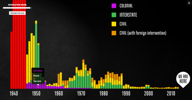
Millions of peopled died during World War II, but it’s difficult to grasp what all the big numbers associated with the war mean. Neil Halloran explains in The Fallen of World War II, a hybrid between interactive visualization and documentary.
Read More -

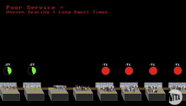
Maybe you’ve waited at a bus stop for longer than usual, and your bus finally shows up. And then, immediately after, a second bus on the same route pulls up right behind. What gives? Why can’t they stay evenly spaced to improve everyone’s waiting time? Lewis Lehe provides an explanation in a small interactive game.
Read More -
I usually don’t read much into job and degree rankings. The criteria are often arbitrary based simply on data that happens to be available. Or, a bulk of the rankings are based on survey answers where the population is questionable or there is a strong bias towards a specific field. But Fortune got PayScale to rank the top graduate degrees and Statistics PhD came out as the best. So boom. I’ll take it.
The pay is similar to other STEM degrees but it’s the lower-than-average stress that puts Statistics at number one.
Woo hoo. Statistics doesn’t suck.
Maybe this is a good time to revisit my PhD survival guide. [Thanks to my ever so proud wife, Bea]
-
Which NBA basketball team is the greatest ever? Instead of a circular debate at the bar, Reuben Fischer-Baum and Nate Silver at FiveThirtyEight used the Elo rating system to rank teams over time.
Read More -

If you read the books or watched the movies, you get the sense that Frodo and Sam walked pretty far to toss that ring in the fire. Imgur user mattsawizard compared the journey distance with some rough real-life geography. The journey was 1,350 miles, which is kind of like walking from Los Angeles, California to Austin, Texas.
Read More -
Data art is on the rise. Jacoba Urist for the Atlantic gets into the beginnings and its current prevalence.
Art is a constant march of expansion, according to Harvey Molotch, a professor of sociology and metropolitan studies at New York University, whose research includes the sociology of art. Pop art incorporated comic books and ordinary soup cans. Edvard Munch’s expressionist painting, The Scream captured the anxiety and isolation of modern life. “Now there’s the digital self, the newest kid on the block and so of course, artists are there,” he explained. “Art and environment are very much in cahoots.”
A lot of good stuff and worth the read.
Although I’m not sure about the categorization of data artists in either the scientific data arena or quantified self one. I’m pretty sure it’s a much wider and continuous spectrum.
-
Hannah Fairfield, who does graphics at the New York Times, talks about using visualization to show specific narratives. Something more than just “here’s some data.”
Watch the talk
Recently for Members
Second Edition
 Visualize This: The FlowingData Guide to Design, Visualization, and Statistics (2nd Edition)
 Visualize This: The FlowingData Guide to Design, Visualization, and Statistics (2nd Edition)
New tools, refined process.
Browse by Chart Type See All →


