Based on data from the CITES Trade Database, “more than 27 million animals were traded internationally in 2013 for purposes ranging from garment production to traditional Chinese medicine, trophies, and scientific testing.” This National Geographic interactive by Fathom Information Design shows the various species that were traded and to what extent.
Read More
-
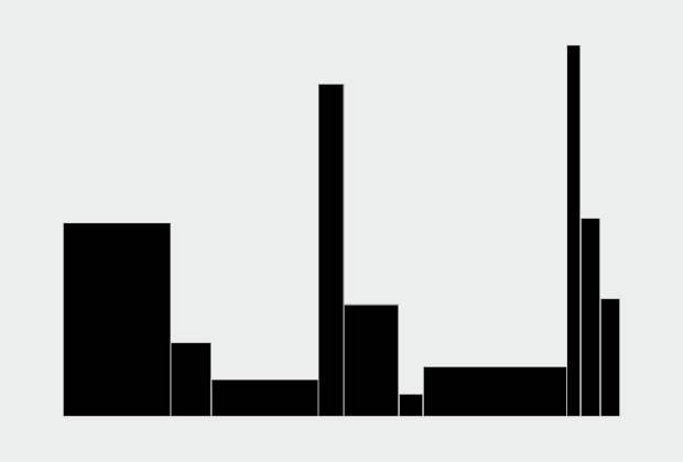
How to Make Variable Width Bar Charts in R
The code to create these bar chart variations is almost the same as if you were to make a standard bar chart. But make sure you get the math right.
-
-
Leading up to the release of Super Mario Maker, which lets you create your own Mario world, Miyamoto and Tezuka talked about their own process while creating the original video game, Super Mario Bros. They drew their designs on graph paper and then handed the drawings to developers for implementation.
Watch the video -
I knew I had seen another automated video game thing before. Tom Murphy published work a couple of years ago on creating a computer program that learns how to play classic Nintendo games.
Watch the video -
-
Due to budget cuts, there is no plan for an updated atlas. So I recreated the original 1870 Atlas using today’s publicly available data.
-
Seth Bling made a bot — MarI/O — that automatically learns how to play Super Mario World. It’s based on research by Kenneth O. Stanley and Risto Miikkulainen from 2002 that uses neural networks that evolve with a genetic algorithm. MarI/O starts out really dumb, just standing in place, but after enough simulations it get smart enough to navigate the world.
Watch the video -
Mapping data is so much about subtleties. The little things add up to make a full map exponentially better than one that wasn’t given the proper attention. But in case you don’t have the time to earn a cartography degree or simply need a quick reference, Axis Maps wrote one you can refer to.
Read More -
 Last year Tyler Vigen put together a fun project that found strong correlation between random things, such as divorce rate and cheese consumption or honey production and political action committees. The continuously running script has found over 30,000 ridiculous correlations to date. Now it’s a book. It fits well in your hands as you go number two.
 -
 On Writing Well by William Zinsser is a bestselling guide on writing well. Yep. Ben Jones parallels some of the principles in the book to visualization, seven principles in particular.
As I read On Writing Well it struck me that his advice for communicating well with words applies directly to the craft of communicating visually with data. His seven principles in Part I — The Transaction, Simplicity, Clutter, Style, The Audience, Words, and Usage — could be written about visualizing data as well.
Makes sense.
-
Most people who use R on the regular learned the language in the context of a subject outside of programming. They learned R as they learned statistical methods, or they picked up bits of R as they learned about visualization. However, if you learn R purely as just a language — without the domain-specificity — or you already program in a different language, R might seem strange at times.
In this talk, John D. Cook explains some of the “quirks” in R and why, maybe, they’re not so strange.
Watch the talk -
Gertrude Weaver, 116 years old, was the oldest person in the world for five days before she passed. These short tenures have grown more common in recent years. David Goldenberger for FiveThirtyEight looks at the tenure of previous record holders.
Read More -
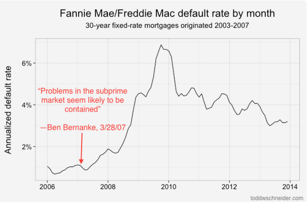
Under the directive of the Federal Housing Finance Agency, started to release detailed loan-level data in 2013. Todd W. Schneider looked at the data recently, evaluating default rates — the proportion of loans that fell into deliquency — with a bit of geography.
Read More -
On April 1, Reddit posted a simple button with a 60-second timer that counted down to zero. Every time the button was pressed by a unique Reddit user, the timer reset to 60 seconds. Yesterday, more than two months and 1,008,316 presses later, the timer finally made it to zero seconds without a press.
It was the social experiment that just kept on going, and Reddit released the click data — a timestamp for each click. Could be fun if you’re looking for a time series to play with.
-
The Washington Post has a straightforward calculator to figure out how much it will cost you to cut out cable television and replace it with streaming services. Just select the features you want, and the cost on the right tells you how much. Kind of fun to click at.
Read More -
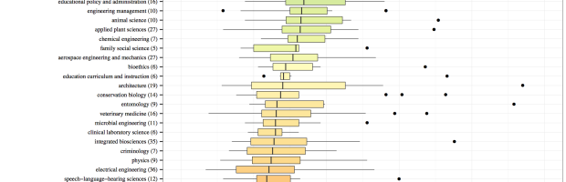
A while back beckmw found the average length of a dissertation for various fields of study, based on digital archives at the University of Minnesota. Here’s a follow-up to that data scrape with average lengths of masters’ theses, again for various fields. Medical Chemistry wins this round.
By the way, the colors don’t mean anything. They’re just there for flourish.
On the upside, the R code for scraping along with the resulting data is available for download.
-
“If it seems as if the list of presidential candidates for 2016 is growing by the day, that is because it is, at least on the Republican side.” Alicia Parlapiano for the New York Times charts the changing campaign calendar with more candidates and earlier starts. Because you know, we’re not even halfway through 2015 yet.
On the upside: more charts.
-

Kevin Ferguson examined color usage in Western films from various angles. One of those was the sum image using the movie frames every ten seconds.
These shapes and colors are evocative in a way that tea leaves and tarot are: they don’t actually tell you much about what you’re looking at, but they allow you an emotional response confirmed or denied once you come to discover what the image “really” is.
The methods themselves you’ve seen before, but probably not used in this way.
-
There is a realtime feed for the location of Los Angeles buses. It’s a bit messy. Morgan Herlocker made it straightforward to aggregate. Have at it. [Thanks, @augustjoki]
-
Iowa released liquor sales data for weekly purchases at the store level.
This dataset contains the spirits purchase information of Iowa Class “E” liquor licensees by product and date of purchase from January 1, 2014 to current. The dataset can be used to analyze total spirits sales in Iowa of individual products at the store level.
There are over three million rows that contain a store name, address, liquor category, liquor vendor, and cost. I imagine this could be a fun spatial time series dataset to play with. Look for seasonal trends, when stores expect to sell more rum or vodka, brand bestsellers, or regional favorites. Even though it’s just for Iowa, there’s probably a close relationship to national sales.
See some preliminary documentation by Dan Nguyen on how to get started.
Recently for Members
Second Edition
 Visualize This: The FlowingData Guide to Design, Visualization, and Statistics (2nd Edition)
 Visualize This: The FlowingData Guide to Design, Visualization, and Statistics (2nd Edition)
New tools, refined process.
Browse by Chart Type See All →


