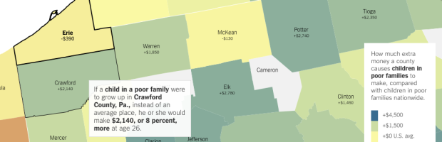
• Membership
  • Newsletter
  • Projects
  • Learning
  • About
  • Member Login
  • Basic chart, wrong conclusions

    January 15, 2015

    Topic

    Mistaken Data  /  Bloomberg, income

    A short post on Bloomberg from 2013 describes the fall of U.S. mens’ income for the past forty years. To illustrate, the author uses the chart above, and we’re like, “Oh gee willikers, that sure is a big drop in income. I guess mens’ income is well on its way to zero dollars. Gosh darn it to heck.”

    But maybe we’re riled up for nothing.

    Eric Portelance takes a small step back to see what’s going on in this simple chart. It’s the classic case of cherry-picked data points, less attention to axes, and ignoring the details.

  • Translating images to words

    January 15, 2015

    Topic

    Statistics  /  Google, language, neural networks

    With Google’s image search, the results kind of exist in isolation. There isn’t a ton of context until you click through to see how an image is placed among words. So, researchers at Google are trying an approach similar to how they translate languages to automatically create captions for the images.

    Now Oriol Vinyals and pals at Google are using a similar approach to translate images into words. Their technique is to use a neural network to study a dataset of 100,000 images and their captions and so learn how to classify the content of images.

    But instead of producing a set of words that describe the image, their algorithm produces a vector that represents the relationship between the words. This vector can then be plugged into Google’s existing translation algorithm to produce a caption in English, or indeed in any other language. In effect, Google’s machine learning approach has learnt to “translate” images into words.

  • One animated art piece per day, with D3.js

    January 14, 2015

    Topic

    Data Art  /  animation, d3js

    Data-Driven Documents, or D3.js, is a flexible JavaScript library that lets you draw and move things in the browser. If it isn’t yet, it’s on its way to becoming the tool of choice for visualization on the web. It’s important to remember though that the library isn’t just for charts, graphs, and maps (although those things are nice). Case-in-point is John Firebaugh’s new project to make one animated art piece a day.

    Playful, mesmerizing, and a total time suck.

  • 3-D model to show free-climb route

    January 14, 2015

    Topic

    Maps  /  3-d, climbing, New York Times

    Tommy Caldwell and Kevin Jorgeson are free-climbing almost 3,000 feet up El Capitan, basically with their fingers. The New York Times shows the ascent with a route placed on top of a 3-D model. Scroll in a WebGL-enabled browser on the biggest screen possible for a smidgen of feeling for what the climb is like.

    See also Caldwell’s Facebook page for some amazing pictures of what they’ve experienced so far.

    Update: The Times just published a high-res image of the wall. Click on the links in the caption to see Jorgeson, but a tiny speck.

  • Machine learning podcast

    January 13, 2015

    Topic

    Statistics  /  lunch talk, podcast, Talking Machines

    I’m glad podcasts are a thing right now. Talking Machines is a new podcast on machine learning, statistics, and data, hosted by journalist Katherine Gorman and computer science professor Ryan Adams. One “Hello, world” episode in, it seems promising. Sometimes these technical podcasts get lost in jargon, which gets old fast, but I think they’re working towards a good balance.

  • Mapped history of how Native American land was taken

    January 13, 2015

    Topic

    Maps  /  history, land

    In Invasion of America, an animated map shows the loss of land.
    Read More

  • Working with Map Projections and Shapefiles in R

    No need to settle for the mapping defaults in R. Apply map projections to show geographic data in a way most suitable for your work.

  • Tim Cook Chernoff Face

    January 12, 2015

    Topic

    Data Art  /  Chernoff, humor, Tim Cook

    This amused me. By artist Christo Allegra.

  • Fake correlation

    January 9, 2015

    Topic

    Statistics  /  correlation, sampling

    Gabriel Rossman, a sociology professor at UCLA, describes colliders — or when correlation does not equal causation and the former might not even exist either. Referring to the simulated plot above, Rossman uses Hollywood actor selection as an example:

    For instance, suppose that in a population of aspiring Hollywood actors there is no correlation between acting ability and physical attractiveness. However assume that we generally pay a lot more attention to celebrities than to some kid who is waiting tables while going on auditions. That is, we can not readily observe people who aspire to be actors, but only those who actually are actors. This implies that we need to understand the selection process by which people get cast into films. In the computer simulation displayed below I generated a population of aspiring actors characterized by “body” and “mind,” each of which follows a normal distribution and with these two traits being completely orthogonal to one another. Then imagine that casting directors jointly maximize talent and looks so only the aspiring actors with the highest sum for these two traits actually get work in Hollywood. I have drawn the working actors as triangles and the failed aspirants as hollow circles. Among those actors we can readily observe there then will be a negative correlation between looks and talent, even though there is no such correlation in the grand population. If we see only the working actors without understanding the censorship process we might think that there is some stupefaction of being ridiculously good-looking.

  • The first photo of the United States by NASA satellite

    January 9, 2015

    Topic

    Maps  /  NASA, satellite

    In 1974, NASA published their first satellite photo of the contiguous United States by stitching together a bunch of individual images.

    A giant photo map of the contiguous 48 states of the United States, the first ever assembled from satellite images, completed for NASA by the U.S. Department of Agriculture Soil Conservation Service Cartographic Division. The map is 10 by 16 feet, is composed of 595 cloud-free black-and-white images returned from NASA’s first Earth Resources Technology Satellite (ERTS-1). The images were all taken at the same altitude (912 kilometers: 560 miles) and the same lighting angle. The images were produced by the spacecraft’s Multi-spectral Scanner System (MSS) in Band 5, or the red portion of the visible spectrum, during the period July 25 to October 31, 1972.

  • Turning 30, explained with charts

    January 8, 2015

    Topic

    Infographics  /  age, humor

    You get older as time passes. (That’s how age works last time I checked.) You change, the people around you change, and you care more about different things and less about others. Cecilia Rabess describes the difference a decade makes in a series of humorous charts.

    It’s funny because it’s true.

    Excuse me while I get an IcyHot pack for my lower back and schedule an eye appointment. And why do they have to play that music so darned loud? [via @albertocairo]

  • Arduino Workshop, a good book for getting started

    January 8, 2015

    Topic

    Coding  /  Arduino, book review

    Arduino Workshop coverI started working through Arduino Workshop by John Boxall over the holidays, and it’s a lot of fun so far. I highly recommend it if you’re thinking about getting into Arduino projects and you’re brand new to this stuff.

    From the book description:

    You’ll start off with an overview of the Arduino system but quickly move on to coverage of various electronic components and concepts. Hands-on projects throughout the book reinforce what you’ve learned and show you how to apply that knowledge. As your understanding grows, the projects increase in complexity and sophistication.

    I’m a little under halfway through, but that sounds right so far. I’ve been able to do all the projects with the hardware that came with the official Arduino Starter Kit, with a small adjustment for one project.
    Read More

  • Japan fertility rate forecasts versus reality

    January 8, 2015

    Topic

    Statistical Visualization  /  birth, forecast, Japan, Washington Post

    It’s hard to predict the future, especially when humans are involved. Oftentimes, there are just too many variables to control for to estimate accurately. In the chart above from the Washington Post Wonkblog, Japan’s fertility rate is plotted against various forecasts over the years, and you see forecasts headed upwards, but in reality it decreased consistently since the 1970s. This is based on work from Katagiri, et al (pdf).

    See also a similar porcupine chart from Amanda Cox in 2010 that compared US deficit against forecasts.

  • Every episode of Friends season 1, played simultaneously

    January 7, 2015

    Topic

    Data Art  /  average, Friends

    All ten seasons of Friends are currently available on Netflix, but watching shows episode-by-episode is for chumps and people stuck in second gear. We Used to Be Friends is a straightforward mashup that plays all episodes from the first season at once, overlaid on each other. Enjoy below.
    Read More

  • $5.2 million in extra cab tips, found in public data

    January 7, 2015

    Topic

    Statistics  /  taxi, tips

    A few months ago BusinessWeek ran an article on how much people tip New York cab drivers. There are bumps in 20%, 25%, and 30%, which is expected because those are preset values in the payment interface. However, a much lower percentage of people tipped 19% than they did 21%. Peculiar.

    Ben Wellington, a visiting statistics professor at Pratt Institute, did some digging. It turns out it’s not some glitch in human generosity but a difference between two payment softwares used by New York cabs. One calculates tip value taking a percentage of fare plus taxes and tolls. The other only calculates based on the fare.

    That’s an extra $5.2 million in tips from the former in 2013. Yowza.

  • Rapper travels and a robot arm

    January 6, 2015

    Topic

    Data Art  /  long-exposure, music

    Maximum Distance. Minimum Displacement. by Tahir Hemphill explores rappers’ geographic mentions in their lyrics.

    Geographic mentions from the complete bodies of work of 12 rappers were extracted using the language analysis database invented by Hemphill — the Rap Almanac. These locations were translated into geographic coordinates, which were then made into points used to plot the movements of an industrial robot arm.

    For several minutes at a time, the robot arm drew the paths while holding a light pen producing sculptural forms made with light. Each unique shape represents the global distance travelled by the lyrics in each artist’s career.

    The above is the result for Kanye West.

    See also: area codes in which Ludacris claims to have hoes.

  • Rising R usage in the sciences

    January 5, 2015

    Topic

    Software  /  R, science

    R continues its growth, and usage in the sciences is no exception. Nature describes some of the applications along with links to getting started with the statistical computing language.

    Besides being free, R is popular partly because it presents different faces to different users. It is, first and foremost, a programming language — requiring input through a command line, which may seem forbidding to non-coders. But beginners can surf over the complexities and call up preset software packages, which come ready-made with commands for statistical analysis and data visualization. These packages create a welcoming middle ground between the comfort of commercial ‘black-box’ solutions and the expert world of code. “R made it very easy,” says Rojo. “It did everything for me.”

    For me, R used to be a traditional analysis tool that I made graphs with occasionally. But at some point it became more about the data graphics, and these days that’s about all I do. That’s the great thing about R. You don’t have to learn everything about the language to get a lot out of it. Just take in bits at a time to suit your needs, and before you know it:

    learning <- function(time) {
        return("easy");
    }
    

    Here are a handful more resources to get you started:

    • R for cats and cat lovers
    • Learn R interactively with Swirl package
    • Introduction to R, a video series by Google

    Plus lots more.

  • Statisticians in World War II

    January 2, 2015

    Topic

    Statistics  /  war

    The Economist recounts the stories of statisticians who solved problems during wartime. Although they weren’t called that until after.

    “Peace finally returned, and the statistical scene in the United Kingdom had been completely transformed,” wrote Barnard and Plackett. “No other method would have produced these changes in only six years.” Dozens of clever young people had been taught a fast-changing new subject—and in many cases done original research. Even routine work was elevated by the urgency and camaraderie of the war effort—and even the fact that they were new to the field. “A lot of the work was statistically boring,” Sir David says now. “But the point is that I didn’t really know anything.”

    “After the war the section exploded like a London bomb into missionary statistical occupations all over the country,” wrote Geoffrey Jowett, one of the SR 17 alumni, in 1990. “In convincing others that we had a good product to sell we convinced ourselves.”

    See also George E.P. Box’s recollection of accidentally becoming a statistician.

  • Auto recalls for the year set record

    December 31, 2014

    Topic

    Infographics  /  big numbers, New York Times, recalls

    There were a lot of auto recalls — 62 million of them — in the US this year, based on data from the National Highway Traffic Safety Administration. A large portion of them were related to faulty airbags or ignition switches. To compare, there were 20 million in 2013. Still though, we’re not good at picturing big numbers, so Wilson Andrews and Gregor Aisch for the New York Times try to provide a sense of frequency and scale.
    Read More

  • Site News  /  annual review

    Annual Performance Review

    I love my work. However, I miss out on great things as a…

    Read More
  • Page 207 of 392
  • <
  • 1
  • ...
  • 204
  • 205
  • 206
  • 207
  • 208
  • 209
  • ...
  • 392
  • >

Analyze, visualize, and communicate data usefully, beyond the defaults.

Become a member →

Recently for Members

May 8, 2025
When the data is not what it seems

May 1, 2025
Finding the Right Charts

April 24, 2025
Visualization Tools, Datasets, and Resources – April 2025 Roundup

April 17, 2025
Breaking Out of Chart Software Defaults

April 15, 2025
Line Chart with Decorative Neon Accents

Browse by Chart Type See All →

Square Pie Chart Radar Chart Donut Chart Voronoi Diagram Grid Map Bubble Chart Dot Map Step Chart Word Cloud Packed Bubble Chart

Browse By Topic

  • Visualization

    Seeing data

  • Maps

    Seeing geographic data

  • Infographics

    Explaining data

  • Networks

    Connecting data

  • Statistics

    Analyzing data

  • Software

    Working with data

  • Sources

    Getting data

  • Design

    Making data readable

Get the Book

Visualize This: The FlowingData Guide to Design, Visualization, and Statistics

Available now.

Order: Amazon / Bookshop

Made by FlowingData

  • The Process

  • Data Underload

  • Chart Everything

  • Guides

  • Books

  • Shop

  • About
  • Contact
  • Newsletter
  • LinkedIn
  • Instagram
  • Bluesky
  • RSS
Copyright © 2007-Present FlowingData. All rights reserved.