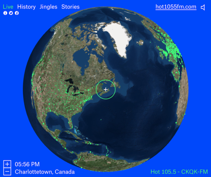
Here’s a fun piece called Radio Garden. It’s exactly what the title says. Pan the globe and listen to live radio at all the green dots.
Here’s a fun piece called Radio Garden. It’s exactly what the title says. Pan the globe and listen to live radio at all the green dots.
The Beer Judge Certification Program lists 100 styles of beer. Here’s a chart for all of them.
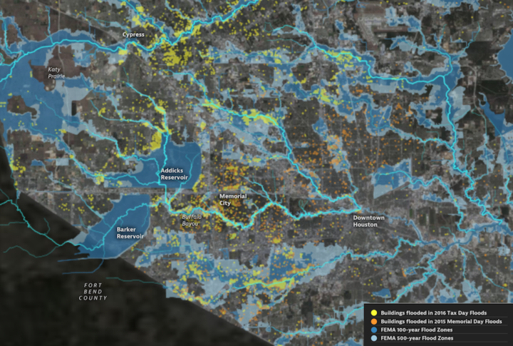
Climate change is doing some weird stuff. What were once rare weather events could grow more common. ProPublica and The Texas Tribune zoom in on Houston, where there’s likely to be much more flooding than usual and not enough residents prepared for the rise.
scientists say climate change is causing torrential rainfall to happen more often, meaning storms that used to be considered “once-in-a-lifetime” events are happening with greater frequency. Rare storms that have only a miniscule chance of occurring in any given year have repeatedly battered the city in the past 15 years. And a significant portion of buildings that flooded in the same time frame were not located in the “100-year” floodplain — the area considered to have a 1 percent chance of flooding in any given year — catching residents who are not required to carry flood insurance off guard.
It’s a scroller with detailed maps of what’s happened in terms of flooding over the past decade or so. “I’m not a scientist” but this seems serious.
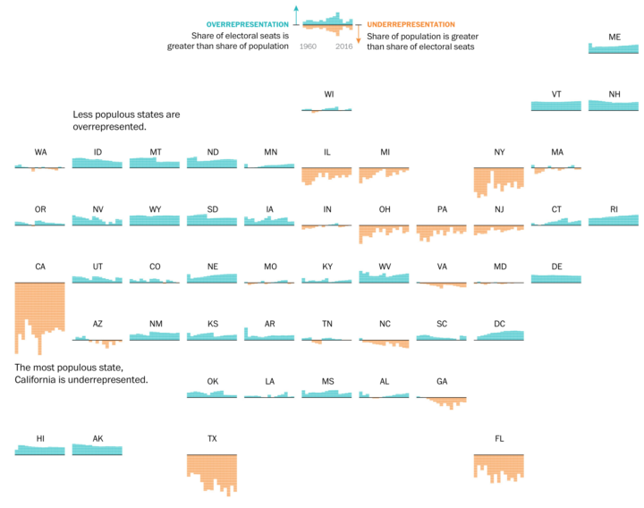
By design, the electoral college and population don’t quite match up state-by-state. This results in a lower ratio of electoral seats to people for the higher populated states and a higher ratio for the lower populated states. Denise Lu for The Washington Post provides a small multiples state grid to show the differences.
These charts show the difference between each state’s share of the national population and its share of votes in the electoral college since 1960. If the bars are above the line, the state has a greater share of electoral votes than it does population, meaning it is overrepresented. If the bars are below the line, the state is underrepresented.
Geography and state borders play a big part in how elections play out and where candidates campaign. Neil Freeman demonstrates with a map that generates random state boundaries.
This interactive map creates randomly-generated state boundaries for the United States, and see who would recent presidential elections under the map. Under different combinations of states, different regions become the deciding factor, and even broad popular support can be overturned by the specific state boundaries.
I think to really drive the point home, Freeman could highlight the elections that shift in final result instead of relying on just the 270 mark.
Update: Freeman applied the method to boundaries formed by various aspects of our lives.

Continuing the neural network explorations, Shan Carter and team of Google Brain and Cloud, look at how a network deals with handwriting by placing them in the same space.
The black box reputation of machine learning models is well deserved, but we believe part of that reputation has been born from the programming context into which they have been locked into. The experience of having an easily inspectable model available in the same programming context as the interactive visualization environment (here, javascript) proved to be very productive for prototyping and exploring new ideas for this post.
Side note: Been seeing a lot of Google experiments the past couple of weeks. I like it. Is it because it’s December, or are they just feeling more experimental these days?
Geographers Alasdair Rae and Garrett Nelson used commuting data from the American Community Survey to identify “megaregions” in the United States:
The emergence in the United States of large-scale “megaregions” centered on major metropolitan areas is a phenomenon often taken for granted in both scholarly studies and popular accounts of contemporary economic geography. This paper uses a data set of more than 4,000,000 commuter flows as the basis for an empirical approach to the identification of such megaregions.
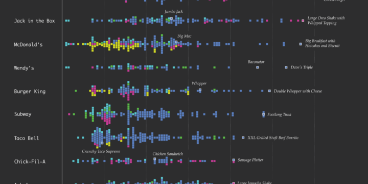
How does the distribution of calories vary by fast food restaurant? Here’s a chart that shows all the menu items for ten of the biggest national fast food chains.
BuzzFeed used interpretive dance to describe the average age of the milestones in our lives, from birth, losing the first tooth, marriage, and death. The data points serve more as background, as a way to provide a timeline of events, and the dancing is the primary focus.
I found myself drawn to the comments on YouTube. Typically a cesspool of idiocy and more idiocy, the comment section in this case might be a good representation for how a (younger) general audience interprets averages. All of the top comments are basically, “I guess I’m not average” and “There’s no way that’s the average. [Insert comparison to self.]”
This of course is because averages are just that. They’re the sum of all individuals divided by the total population, and average values represent one aspect of a range or distribution of things.
So in the case of these average ages, most people either fall below or above instead of right in the middle.
But I digress.

Separately, we looked at marrying age, divorce rates, and those who never married. Now let’s look at marital status all together, with the addition of the widowed status.
We’ve seen many one-off projects that show the distortions you get when you project a map. There’s just no avoiding them, when you convert a 3-D object onto a two-dimensional plane. Vox demonstrates and explains with an inflatable globe.
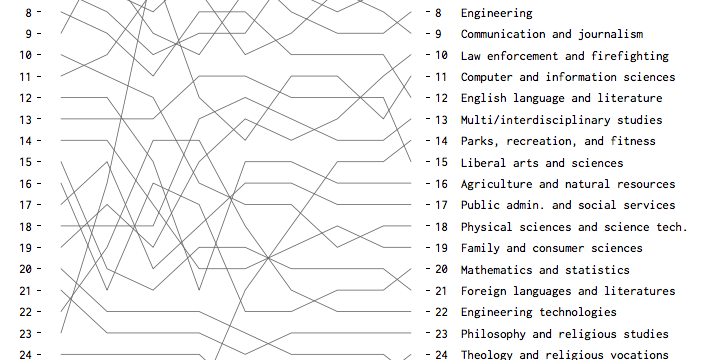
Based on bachelor’s degrees conferred, here are the fields that were and are currently popular.
Looking at American time use for various combinations of sex, age, and employment status, on weekdays and weekends.
A few years back, Google released a time-lapse feature in Google Earth that let you see change through satellite imagery. They updated the feature last week. It’s more detailed and higher resolution than the first version, based on the pixels from about five million images.
We took the best of all those pixels to create 33 images of the entire planet, one for each year. We then encoded these new 3.95 terapixel global images into just over 25,000,000 overlapping multi-resolution video tiles, made interactively explorable by Carnegie Mellon CREATE Lab’s Time Machine library, a technology for creating and viewing zoomable and pannable timelapses over space and time.
Pretty cool to see my own neighborhood develop into what it is today.
Update: See also The New York Times’ take on some of the water bodies around the world, using the same data.
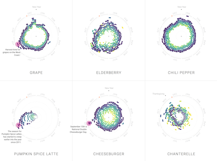
Food trends come and go. Some stay longer than expected, and others come back a certain time every year. With their new project, The Rhythm of Food, Google News Lab and Truth & Beauty explore these patterns through twelve years of search trends.
Read More
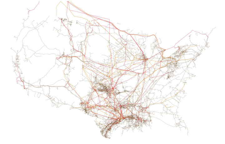
I can always find time to enjoy me some minimal maps. Tim Meko for The Washington Post visualized American infrastructure in a series of six maps, from the electric grid to bridges and railroads. The above is pipelines.

Datalegreya is a new typeface by Fig that lets you intertwine a graph into the words.
Datalegreya can be used in all contexts where small space is available to synthetically display graphical data: connected objects, embedded displays, annual reports, weather report, stock prices, etc. It doesn’t need any specialized software: users just have to install it in the operating system and launch any software able to display OpenType fonts, such as Microsoft Word, Apple TextEdit, Adobe Suite etc. Standards compliance makes it equally available on the web or software embedded.
I rarely find myself searching for more space on the computer screen, and on the phone, I’d rather just scroll further down. Maybe useful on a smartwatch? Dashboard?
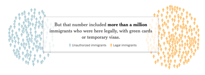
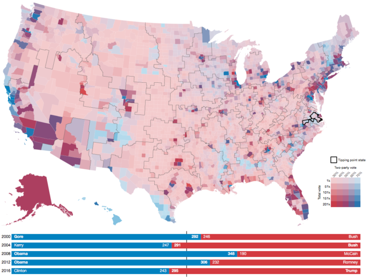
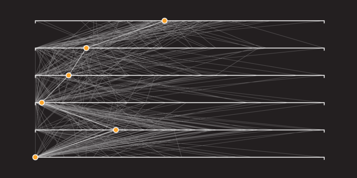
There was a lot of talk about deporting millions of illegal immigrants immediately, but as The New York Times shows, the actual number that could be deported is much less. Haeyoun Park and Troy Griggs use a clustered, force-directed graph to show the pool of 11 million immigrants and then filter down as you scroll. The transitions are key.
Here’s a short illustrated animation on introverts and extroverts by Julia Rodrigues.
This is basically me. I enjoy the company of friends and family, but I do feel like I need to recharge my battery at times with some alone-time.
 Visualize This: The FlowingData Guide to Design, Visualization, and Statistics (2nd Edition)
New tools, refined process.