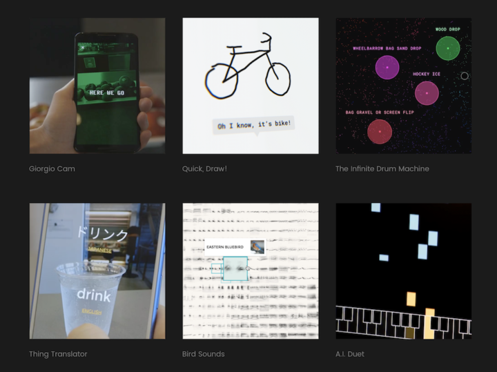
• Membership
  • Newsletter
  • Projects
  • Learning
  • About
  • Member Login
  • Gender equality in the movies, a screenplay analysis

    June 27, 2016

    Topic

    Statistics  /  gender equality, movies

    Hollywood has been talking gender equality in the movies more than usual lately, so Hanah Andersen and Matt Daniels for Polygraph looked into the matter from a data perspective.

    We didn’t set out trying to prove anything, but rather compile real data. We framed it as a census rather than a study. So we Googled our way to 8,000 screenplays and matched each character’s lines to an actor. From there, we compiled the number of words spoken by male and female characters across roughly 2,000 films, arguably the largest undertaking of script analysis, ever.

  • Another Data Point On the Way

    June 26, 2016

    Topic

    Site News

    We have another data point on the way, so it might suddenly go silent around these parts soon. There was a sursprising amount of downtime with the first data point, with naps and feeding and such, so I was able to keep going. But I expect my hands to be more full this time, because, well, two data points.

  • Procedurally generated spaceships

    June 24, 2016

    Topic

    Data Art  /  Blender, procedural, spaceship

    Video game developer Michael Davies provides a Blender script to procedurally generate pretty 3-D spaceships. Enter your parameters, such as number of hull segments, scaling, and rotation, and you’ve got a new vehicle for the stars. [via @albertocairo]

  • Sci-Fi short film scripted by machine learning algorithm

    June 23, 2016

    Topic

    Data Art  /  machine learning, movie

    Filmmaker Oscar Sharp and technologist Ross Goodwin fed a machine learning algorithm with a bunch of Sci-Fi movie scripts to see what new script it would spit out. A script for Sunspring is the result, and this is the film, starring Thomas Middleditch. Riveting.
    Read More

  • Emoji semantic space

    June 22, 2016

    Topic

    Statistics  /  emoji, neural network

    Dango is an Android app that predicts relevant emojis as you type. Xavier Snelgrove, the CTO for the group, explains how they use neural networks to make that happen.

    Recently, neural networks have become the tool of choice for a variety of tough computer-science problems: Facebook uses them to identify faces in photos, Google uses them to identify everything in photos. Apple uses them to figure out what you’re saying to Siri, and IBM uses them for operationalizing business unit synergies.

    It’s all very impressive. But what about the real problems? Can neural networks help you find the ? emoji when you really need it?

    Why, yes. Yes they can. ?

  • What happened at Pulse in Orlando

    June 21, 2016

    Topic

    Infographics  /  narrative, Orlando, Pulse

    The Tampa Bay Times takes you through a 3-D model of Pulse Nightclub in Orlando, driven by the narratives of those who were there at night. Heartbreaking.

  • Data Underload  /  health, smoking

    Who Still Smokes?

    Two decades out from the first statewide ban on smoking in enclosed workplaces, here’s who still smokes.

    Read More
  • We spend more at restaurants than at grocery stores

    June 17, 2016

    Topic

    Statistical Visualization  /  eating, Quartz, spending

    For decades, Americans spent more money at the grocery store than at eating and drinking establishments. It’s not like that anymore, Quartz reports.

    Restaurant spending

  • Motion capture dance

    June 16, 2016

    Topic

    Data Art  /  dance, motion capture

    Really fun. “Motion capture, procedural animation and dynamic simulations combine to create a milieu of iconic pop dance moves that become an explosion of colorful fur, feathers, particles and more.”

  • Nearly impossible to predict mass shootings with current data

    June 15, 2016

    Topic

    Statistics  /  probability, shootings

    Even if there were a statistical model that predicted a mass shooter with 99 percent accuracy, that still leaves a lot of false positives. And when you’re dealing with individuals on a scale of millions, that’s a big deal. Brian Resnick and Javier Zarracina for Vox break down the simple math with a cartoon.

  • U.S. gun deaths rate is an outlier

    June 15, 2016

    Topic

    Statistical Visualization  /  guns, mortality

    If you look at gun death rates for other western countries and adjust for population, the United States is a sore-thumb outlier. Kevin Quealy and Margot Sanger-Katz for the Upshot report.

    Gun death rates

    Be sure to look at the headline for a few seconds (if you’re on a desktop). It changes to provide different baselines to compare the US rate against.

  • Data Underload  /  firearms

    Firearms Dealers vs. Burgers, Pizza, and Coffee

    As of May 2016, there were 64,432 licensed firearms dealers and pawnbrokers, which got me wondering how that compares to other businesses.

    Read More
  • Data Underload  /  health, nutrition, obesity

    Americans are Growing Bigger

    We keep getting bigger. Watch overweight and obesity rates move up over several decades.

    Read More
  • Voting habits for various demographic groups

    June 13, 2016

    Topic

    Infographics  /  demographics, election, Upshot

    Voter turnout and political leanings for various demographic groups play an important role on the campaign trail. Candidates can’t go everywhere and talk to every single person, so they pick and choose. From the voter perspective, turnout feeds into an indicator for influence. In this interactive by Nate Cohn and Amanda Cox for the Upshot, Democrat percentage is plotted against turnout.

    Each bubble represents a demographic — such as Asian women between 45 and 64 years old with college degrees living in California — and size represents number of votes in 2012 or 2004. See the big picture at first, and then use the dropdown menus to filter down to your group of interest.

  • A map about the people who live there

    June 10, 2016

    Topic

    Visualization

    Geographers Seth Spielman and Alex Singleton used something called “geodemographic classification” to classify small areas based on demographic averages.

    [F]or example, we can identify places dominated by small apartments occupied by single city dwellers from those family residences and larger detached homes. The techniques are very popular in industry for customer segmentation – with logic following that our purchasing behaviour is influenced by where we live.

    So it’s not just mapping race, age, or housing individually. Instead, the method provides much more detailed and descriptive clusters. Then, CartoDB recently made an interface to search and browse the data.

  • Guides  /  d3js, process, R

    5 Tips for Learning to Code for Visualization

    Here are some tips to get you started, based on my own experiences with R, and more recently, the JavaScript library d3.js.

    Read More
  • A Course for Visualizing Time Series Data in R

    Learn to visualize temporal patterns in a couple of days.

  • Play chess against the machine and see what it’s thinking

    June 8, 2016

    Topic

    Network Visualization  /  chess, Martin Wattenberg

    The Thinking Machine, by Martin Wattenberg and Marek Walczak, shows you the thought process of a computer trying to win at chess. There have been several iterations that date back to 2002, but the most recent iteration was built for modern browsers and you can play against the computer.

  • Data Underload  /  calories, diet

    How Much We Eat vs. How Much We Need

    On average, we use less energy as we age, and so we should eat less. We don’t always adjust soon enough though.

    Read More
  • Where people go to and from work

    June 6, 2016

    Topic

    Maps  /  commute

    With an animated take on the commute map, Mark Evans shows where people commute to work.

    The resulting animations are somewhat hypnotic (even my dog seemed to go into a trance watching them leading to minutes of human amusement) but also provide a visual way of quickly seeing the distribution of workers into a given city. The points are sized based on the number of commuters, so a large dot indicates a higher relative number of commuters moving from the same tract to the same tract. The dots are also color coded to see which counties are most represented in the commuter sample.

    Just select a county to see. [Thanks, @Mikey_Two]

  • Page 178 of 392
  • <
  • 1
  • ...
  • 175
  • 176
  • 177
  • 178
  • 179
  • 180
  • ...
  • 392
  • >

Analyze, visualize, and communicate data usefully, beyond the defaults.

Become a member →

Recently for Members

May 8, 2025
When the data is not what it seems

May 1, 2025
Finding the Right Charts

April 24, 2025
Visualization Tools, Datasets, and Resources – April 2025 Roundup

April 17, 2025
Breaking Out of Chart Software Defaults

April 15, 2025
Line Chart with Decorative Neon Accents

Browse by Chart Type See All →

Voronoi Diagram Heatmap Mosaic Plot Density Plot Donut Chart Parallel Sets Radar Chart Baseline Chart Area Chart Chord Diagram

Browse By Topic

  • Visualization

    Seeing data

  • Maps

    Seeing geographic data

  • Infographics

    Explaining data

  • Networks

    Connecting data

  • Statistics

    Analyzing data

  • Software

    Working with data

  • Sources

    Getting data

  • Design

    Making data readable

Get the Book

Visualize This: The FlowingData Guide to Design, Visualization, and Statistics

Available now.

Order: Amazon / Bookshop

Made by FlowingData

  • The Process

  • Data Underload

  • Chart Everything

  • Guides

  • Books

  • Shop

  • About
  • Contact
  • Newsletter
  • LinkedIn
  • Instagram
  • Bluesky
  • RSS
Copyright © 2007-Present FlowingData. All rights reserved.