• Membership
  • Newsletter
  • Projects
  • Learning
  • About
  • Member Login
  • Virtual reality map to show Google Trends

    July 22, 2016

    Topic

    Maps  /  Brexit, Google, VR

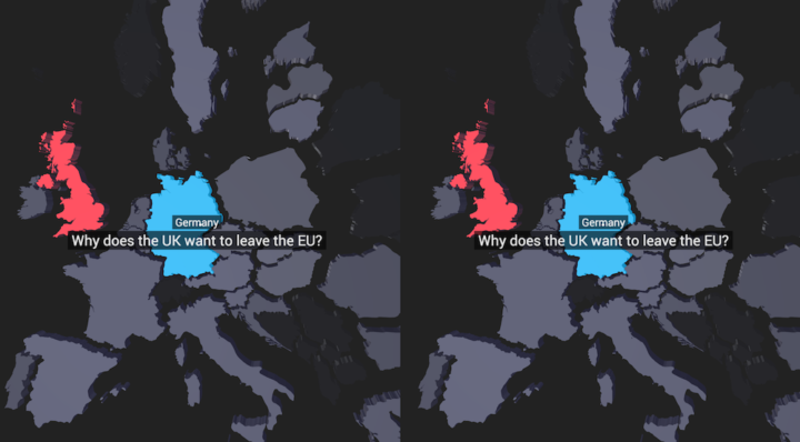
    More of an experiment, this VR map, by the Google Trends Lab in collaboration with Pitch Interactive, shows what people asked about Brexit leading up to the vote. It’s basic data-wise, but you can see potential for more details and get a feel for how virtual reality data visualization might work.

    And besides, I’ll accept any excuse these days to bust out the Google Cardboard. Even if it’s basic visually, it’s easy to see how this point of view might bring you closer to the data.

    See also the details on what the makers learned from the experiment.

  • Grace Hopper explains a nanosecond with a visual aid

    July 21, 2016

    Topic

    Visualization  /  Grace Hopper, nanosecond

    A nanosecond is a billionth of a second, but we’re not very good with really big or tiny numbers. So, Grace Hopper, the inventor of “the first compiler for a computer programming language”, explains to some eager, young minds with a piece of wire.

  • Data Underload  /  family

    Most Common Family Types in America

    Nuclear is still the most common, but there are millions of households in the United States with a different family structure.

    Read More
  • Piecing together satellite images

    July 19, 2016

    Topic

    Maps  /  Quartz, satellite

    You might think piecing together satellite imagery is a straightforward task of lining up latitude and longitude points. But if you think that, you haven’t actually worked with these things. David Yanofsky, part of the Quartz Things Team, describes how he processes satellite images for one coherent image and how you can to.

    He starts at downloading the data, moves into stitching together a mosaic, and then adjusting the color so that everything is smooth and continuous.

    Finished workflow on GitHub.

  • Charting all the Pokemon

    July 18, 2016

    Topic

    Statistics  /  clustering, Pokemon

    Pokemon is everywhere these days. I think it’s just something the world really needs right now. I know very little about the universe, but I do like it when people analyze fictional worlds and characters. Joshua Kunst grabbed a data dump about all the Pokemon (seriously, I don’t even know if I’m referring to them/it/thing correctly) and clustered them algorithmically. The t-Distributed Stochastic Neighbor Embedding (t-SNE) algorithm to be specific.

  • How to Make Square Pie Charts in R

    Instead of traditional pie charts that rely on angles and arc lengths to show parts of a whole, try this easier-to-read version.

  • Square pie chart beats out the rest in perception study

    July 15, 2016

    Topic

    Statistical Visualization  /  perception, pie chart

    Many hate pie charts. Others love them. I think they’re useful but have limitations. Most of these are just feelings though, maybe accompanied by an Edward Tufte quote. We need facts. Robert Kosara and Drew Skau provide some in their recent studies on how we read pie charts. There appears to be a good chance people don’t read the things correctly.

    But I found Kosara’s follow-up more interesting. He dug up a paper that he and his student Caroline Ziemkiewicz wrote a few years ago on square pie charts. Instead of filling a circle to represent proportion, the square pie chart fills a — wait for it — square.
    Read More

  • Gun deaths

    July 14, 2016

    Topic

    Infographics  /  FiveThirtyEight, guns, mortality

    As an introduction to a series on gun deaths in America, FiveThirtyEight uses a straightforward grid view to show the breakdowns. Each square represents a single gun death, and as you click through, the squares are colored to show various groups. For example, the above represents gun deaths from homicide in blue, about half of which are young men and two-thirds of that subgroup are black.

    Sometimes it’s more useful to break the data down to its elements.

  • Sketchy summary statistics

    July 13, 2016

    Topic

    Statistics  /  humor

    Ben Orlin of Math With Bad Drawings explains the pitfalls of using summary statistics — mean, median, and mode — to make decisions in life. Aggregates like these are meant as wideout overviews. Look deeper for details.

  • Cross-country road trip at a constant 70 degrees

    July 13, 2016

    Topic

    Maps  /  road trip, weather

    Road trips are fun, but it can be hard to enjoy yourself when you end up in a place during its hottest or coldest day of the year. Wouldn’t it be nice to travel across the country and have nice weather every single day? This road trip is for you.
    Read More

  • R in the data journalism workflow at FiveThirtyEight

    July 12, 2016

    Topic

    Software  /  FiveThirtyEight, lunch talk, R

    R has found its way into a good number of news groups who do data journalism. Andrew Flowers for FiveThirtyEight talks about how they use the statistical computing language throughout their workflow.

    R is used in every step of the data journalism process: for cleaning and processing data, for exploratory graphing and statistical analysis, for models deploying in real time as and to create publishable data visualizations. We write R code to underpin several of our popular interactives, as well, like the Facebook Primary and our historical Elo ratings of NBA and NFL teams. Heck, we’ve even styled a custom ggplot2 theme. We even use R code on long-term investigative projects.

  • Data Underload  /  alcohol, health

    How Much Alcohol Americans Drink

    Most people have one or two drinks on average, but some consume much more.

    Read More
  • History lesson on data visualization

    July 8, 2016

    Topic

    Infographics  /  history

    Clive Thompson for Smithsonian Magazine gives a quick history lesson on infographics.

    [D]ata visualization was rare because data was rare. That began to change rapidly in the early 19th century, because countries began to collect—and publish—reams of information about their weather, economic activity and population. “For the first time, you could deal with important social issues with hard facts, if you could find a way to analyze it,” says Michael Friendly, a professor of psychology at York University who studies the history of data visualization. “The age of data really began.”

    Thompson uses “infographic” but really means “data visualization” most of the time, but still a good overview.

    And while we’re on the topic of old visualization stuff, you should also check out Scott Klein’s newsletter, Above Chart. The history provides fine context for where visualization is at now.

  • Making the Seinfeld theme song with Bieber, Diplo, and Skrillex

    July 8, 2016

    Topic

    Miscellaneous  /  humor, music

    Last year the New York Times interviewed Justin Bieber, Diplo, and Skrillex about how they put together their song Where Are Ü Now. NYT coupled the video with data visualization elements that helped you understand what the artists talked about. Pretty great.

    Now here’s what happens when you switch out the original song and insert the Seinfeld theme song.

    what if Bieber diplo and skrilex created the seinfeld themehttps://t.co/BUTOrNDwGQ

    — Seinfeld Current Day (@Seinfeld2000) July 4, 2016

    Also pretty great.

  • Moving drought boundaries

    July 7, 2016

    Topic

    Maps  /  drought, John Nelson

    Drought continues to trudge along. My grass is just about dead, save a few hearty patches clinging on to the last few drops in the soil. Sad state of affairs it is. Drought is not static though. The boundaries move and the levels change, which is what John Nelson mapped in an overlay of five years of drought in the United States, based on data from the Drought Monitor.

    We’ve seen this as small multiples and animated maps, but I like how this static boundary version gifts a sense of shift without actually moving.

    Grab the aggregated data here.

  • Charted history of music, from its origins to present

    July 6, 2016

    Topic

    Network Visualization  /  music

    Musicmap is an attempt to show the history of music over time and how it came to be what it is today.

    Musicmap attempts to provide the ultimate genealogy of popular music genres, including their relations and history. It is the result of more than seven years of research with over 200 listed sources and cross examination of many other visual genealogies. Its aim is to focus on the delicate balance between comprehensibility, accuracy and accessibility.

    Be sure to zoom in for the details of how genres and sub-genres are connected. Click on any group for samples, playlists, and written history.

  • Annotating Charts in R

    Let the data speak for itself they say. That doesn’t work a lot of the time, and when that happens, you need to explain.

  • Graphing all the music

    July 5, 2016

    Topic

    Statistics  /  music, Spotify

    Glenn McDonald attempts to graph the musical space in its entirety on a two-dimensional scale. He calls it Every Noise at Once.

    This is an ongoing attempt at an algorithmically-generated, readability-adjusted scatter-plot of the musical genre-space, based on data tracked and analyzed for 1491 genres by Spotify. The calibration is fuzzy, but in general down is more organic, up is more mechanical and electric; left is denser and more atmospheric, right is spikier and bouncier.

    Click on the genres for music samples, if you are like me and are not sure what rap metalcore or ghettotech sounds like. [Thanks, Namir]

  • Election forecast tracker

    July 1, 2016

    Topic

    Statistics  /  election, FiveThirtyEight

    FiveThirtyEight published their election forecast tracker this week, and it’s a beaut. It starts with the standard state map and most importantly the probability of each candidate winning the presidency. But after that, you can look into much detail on a state-by-state basis.

    They currently give Hillary Clinton a 79 percent chance of winning and Donald Trump a 21 percent chance. I think many interpret this as Clinton is practically a lock, but it’s actually far from it. That 21 percent is freakin’ high.

    As much as I want to forget, let’s remember that the Cleveland Cavaliers only had an 11 percent chance of winning the title, and I think we know what happened there.

    In any case, check out the tracker. I like it. And find more details on where the numbers come from in the user’s guide.

  • Page 177 of 392
  • <
  • 1
  • ...
  • 174
  • 175
  • 176
  • 177
  • 178
  • 179
  • ...
  • 392
  • >

Analyze, visualize, and communicate data usefully, beyond the defaults.

Become a member →

Recently for Members

May 15, 2025
Step Chart, Enhanced

May 8, 2025
When the data is not what it seems

May 1, 2025
Finding the Right Charts

April 24, 2025
Visualization Tools, Datasets, and Resources – April 2025 Roundup

April 17, 2025
Breaking Out of Chart Software Defaults

Browse by Chart Type See All →

Timeline Barcode Chart Spike Map Alluvial Diagram Choropleth Map Mosaic Plot Line Map Venn Diagram Frequency Trails

Browse By Topic

  • Visualization

    Seeing data

  • Maps

    Seeing geographic data

  • Infographics

    Explaining data

  • Networks

    Connecting data

  • Statistics

    Analyzing data

  • Software

    Working with data

  • Sources

    Getting data

  • Design

    Making data readable

Get the Book

Visualize This: The FlowingData Guide to Design, Visualization, and Statistics

Available now.

Order: Amazon / Bookshop

Made by FlowingData

  • The Process

  • Data Underload

  • Chart Everything

  • Guides

  • Books

  • Shop

  • About
  • Contact
  • Newsletter
  • LinkedIn
  • Instagram
  • Bluesky
  • RSS
Copyright © 2007-Present FlowingData. All rights reserved.