When you search for datasets on The White House site, you get nothing. So yeah. That’s where we’re at.
When you search for datasets on The White House site, you get nothing. So yeah. That’s where we’re at.
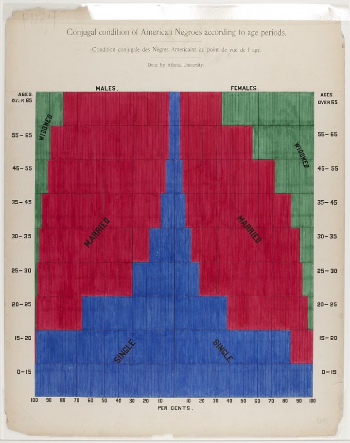
In 1900, W. E. B. Du Bois and his students drew a series of charts for The Exhibit of American Negroes. They’re not all winners, but these were hand-drawn in 1900, so there’s some leeway there. There are also a handful of graphics that use graphic devices that we sometimes mistake for modern methods, like cartograms to compare values and a bent bar graph to allow smaller values some space on a zoomed-in axis.
The stacked bar graph above, which shows marital status by age, struck me especially because I made a similar chart for the current population. I am like, so 1900. [via @michalmigurski]
Facebook logs data about you and how you use their application. I know this. You know this. From there, Facebook makes inferences and serves you ads that might be relevant. Data Selfie is a Chrome extension that attempts to log similar data about you so that you can see what Facebook sees.
The data stays local on your computer, and you can export it or delete it. You also get a dashboard view of the data with what you liked, viewed, and inferences based on a combination of machine learning algorithms.
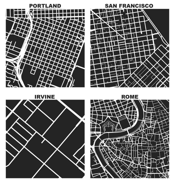
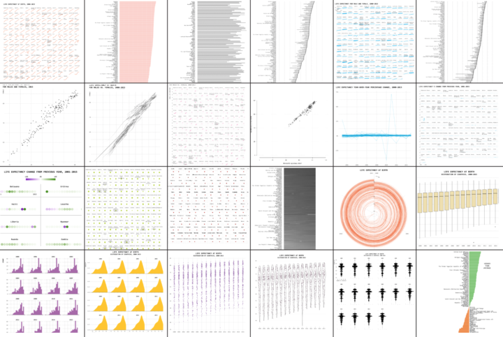
As part of his dissertation, Geoff Boeing generated these maps that show one square mile of road network in select cities.
To compare urban form in different kinds of places, these visualizations have depicted some downtowns, some business parks, and some suburban residential neighborhoods. These patterns also vary greatly within cities: Portland’s suburban east side looks very different than its downtown, and Sacramento’s grid-like downtown looks very different than its residential suburbs. These visualizations, rather, show us how different urbanization patterns and paradigms compare at the same scale.
Roll your own using Boeing’s OpenStreetMap-based Python package, OSMnx. Just one line of code.

Many charts don’t tell the truth. This is a simple guide to spotting them.
My son used to watch Daniel Tiger’s Neighborhood (a modern take on Mister Rogers’ Neighborhood) a lot, and one song’s chorus goes like, “In some ways we are different, but in so many ways we are the same.” This commercial from TV2 in Denmark is the grown-up, categorical version of that message.
Hans Rosling passed away this morning. The man. The legend.
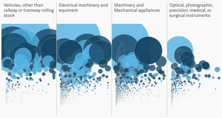
Most goods imported from Mexico are untaxed under the North American Free Trade Agreement. The Administration wants to tax those billions of dollars of goods coming in. David Yanofsky for Quartz plotted the imported products.
Read More
A detailed guide for R users who want to polish their charts in the popular graphic design app for readability and aesthetics.
Enrico Bertini, who has taught information visualization at New York University for the past few years, put up his class materials for open use. There are lecture slides, exercises, and a course diary of his own teaching experiences. Should be useful if you want to teach or learn on your own.
Back in my day, I didn’t have formal visualization courses. I checked out paper books from the library, pieced together tidbits of Flash tutorials meant for games, and walked in the snow for five miles to and from school. Consider yourself lucky.
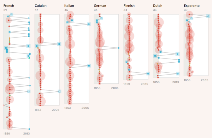
Christian Laesser takes an abstract look at how different languages represent Vincent van Gogh through various Wikipedia pages.
The visualization explores how different languages present Van Gogh’s work and life by images. Inspired by Geolinguistic Contrasts in Wikipedia. The viz tries to show different narative strategies by showing the image type, origin date and authorship. You can reveal the connections between languages by hovering the images.
I’m not quite convinced this helps with understanding, but I appreciate the experimentation.
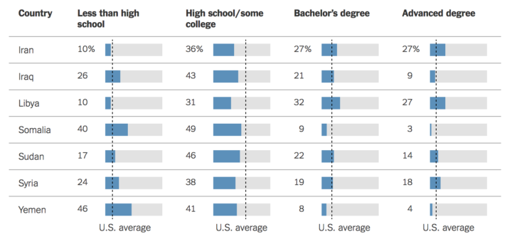
As I’m sure you know, the current administration banned immigrants from seven countries recently. The New York Times looks at immigrants from these countries who already settled in the United States — their education, salaries, and where they live.
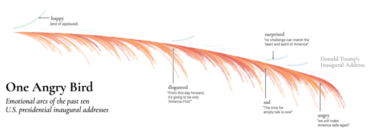
Inaugural addresses come in different flavors, with different messages and purpose. Periscopic passed video of the ten most recent speeches through the Microsoft Emotion API to estimate emotion from each speaker’s facial expressions. Then they used a feather metaphor to visualize the results.
Shown here in the form of collected emotion arcs, each “feather” represents an inaugural address. Each barb of the feather is a moment during the speech where the president displayed an emotion — positive emotions are drawn above the quill, negative emotions below. The length of each barb represents the intensity of the emotion. The curve of the feather itself indicates the overall positivity or negativity of the speech.
As you might expect, the feather for Donald Trump weighs predominantly downward in red and orange.
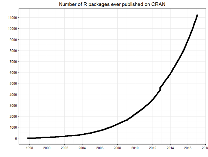
There are a lot of R packages, which is why before I implement any chart type myself, I look to see if someone already did it. Recently, the official R package repository surpassed the 10,000 mark.
Why so many packages? R has a very active developer community, who contribute new packages to CRAN on a daily basis. As a result, R is unparalleled in its capabilities for statistical computing, data science, and data visualization: almost anything you might care to do with data has likely already been implemented for you and released as an R package.
That’s quite the feat for a language only statisticians knew about not that long ago.
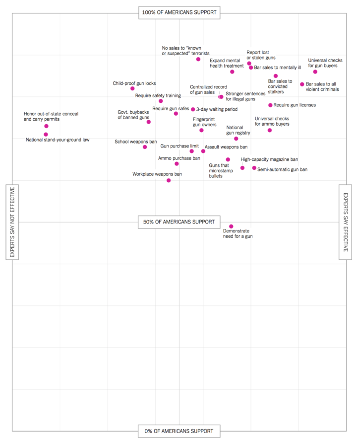
With this scatterplot, Quoctrung Bui and Margo Sanger-Katz for The Upshot describe where experts and the public agree and disagree on gun control. Basically, whether it’s the best or not, the top right is what policymakers are looking for. Make sure to check out the breakdowns for various groups of people.
FLOW is an interactive art installation by Maotik that represents real-time weather data in the form of digital tides and waves that fill a room.
I used 11 parameters to define the ocean form, we connect ourselves to a database and retrieve data such as sea levels, tide coefficient, humidity, weather cast, wind force, wind direction, weather cast, moon cycle, location, time of the day. When parameters such as wind force or sea levels will affect the movement of the sea others such as weather cast or humidity will change the colors.
How do I install this in my garage?
BBC Radio 4 looks at algorithms in our everyday lives and why we should care what goes on in the black box.
Algorithms are the powerful mathematical tools which shape so much of modern life, from the news which appears in our timelines to the adverts which pop up on our computer. But with algorithms now assessing CVs for jobs, or mortgage applications, the need to understand what they do, and if necessary challenge them is greater than ever before. So how do we exert legal or democratic control over the Unaccountable Algorithm? Emily Bell investigates.
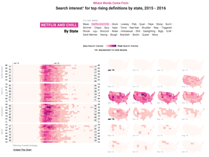
People go to Google to find information about things, and when new words appear or grow popular in a language, search trends typically reflect the growth. This scrolly and interactive collaboration between the Google News Lab and Polygraph shows you the words that surged the most, their geography, and where they fit in with past words such as “selfie” and “slay.” [Thanks, Jenn]
Statistics took a hit this election season, and it could be a slow trek to get back to where we once were. William Davies for The Guardian discusses the current feelings towards data and provides some history of how we got here.
In many ways, the contemporary populist attack on “experts” is born out of the same resentment as the attack on elected representatives. In talking of society as a whole, in seeking to govern the economy as a whole, both politicians and technocrats are believed to have “lost touch” with how it feels to be a single citizen in particular. Both statisticians and politicians have fallen into the trap of “seeing like a state”, to use a phrase from the anarchist political thinker James C Scott. Speaking scientifically about the nation – for instance in terms of macroeconomics – is an insult to those who would prefer to rely on memory and narrative for their sense of nationhood, and are sick of being told that their “imagined community” does not exist.
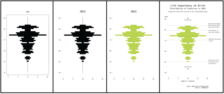
But maybe this is an opportunity for data folks. Maybe people are ready for more data and more distributions and ready to look past averages and values without uncertainty.
“Let the data speak” they say. But what happens when the data rambles on and on?
 Visualize This: The FlowingData Guide to Design, Visualization, and Statistics (2nd Edition)
New tools, refined process.


