I check out Claude, a generative AI assistant to see if, how, and when such a tool could fit into an analysis and visualization workflow.
I check out Claude, a generative AI assistant to see if, how, and when such a tool could fit into an analysis and visualization workflow.
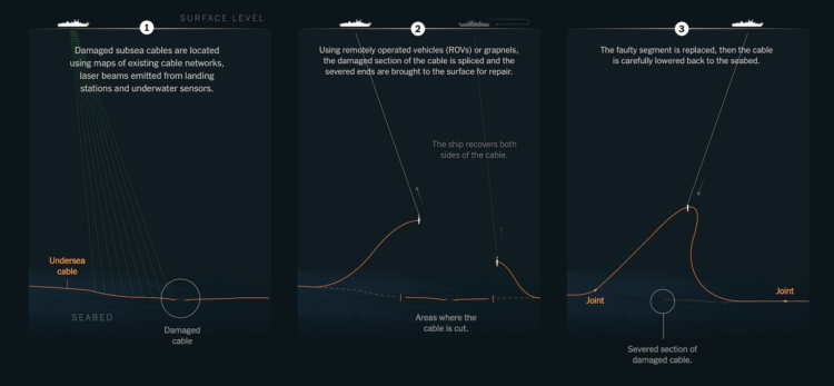
The network that connects the world still relies on surprisingly thin wires that run miles down on the ocean floor. Sometimes those wires break. For The New York Times, James Glanz, Elian Peltier, and Pablo Robles show the repair process and what happens when the internet doesn’t work.

Add another graphic to the baby name genre of visualization. Karim Douïeb put a spin on name trends by shaping the actual name to the line. Enter your name and see how many babies were given the name over time. Sometimes parents name their kid Santa.
Only the top of the vertically-sized letters represent the trend, with the bases below the zero-axis. I’m guessing that’s to keep names readable. Fun either way.
For Bloomberg, Jeannette Neumann describes the accounting error:
For years, Macy’s Inc. touted its ability to boost profits by cutting delivery costs and trimming other expenses on calls with Wall Street analysts. Then on Monday, the department store chain surprised investors by revealing that those very costs had become the source of an internal investigation into what the company has described as a multimillion-dollar employee plot to manipulate the metrics.
The retailer said the incident involved only one former employee, who had hidden as much as $154 million of delivery expenses since 2021. Cash was not taken from the company and the amount of hidden expenses is a small portion of the $4.36 billion of overall delivery costs incurred during that time.
The purpose behind the mistake is still under investigation, but I often wonder how many rounding errors in big companies were inspired by the movie Office Space.
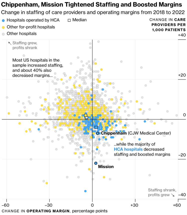
Many hospitals in the United States are for-profit, which itself is not a bad thing, but problems arise when patient care suffers because of profit optimizations. For Bloomberg Businessweek, Caleb Melby and Noah Buhayar turn their attention to HCA Healthcare, the country’s largest hospital chain, and how staffing choices appear to appear to over-prioritize margins.
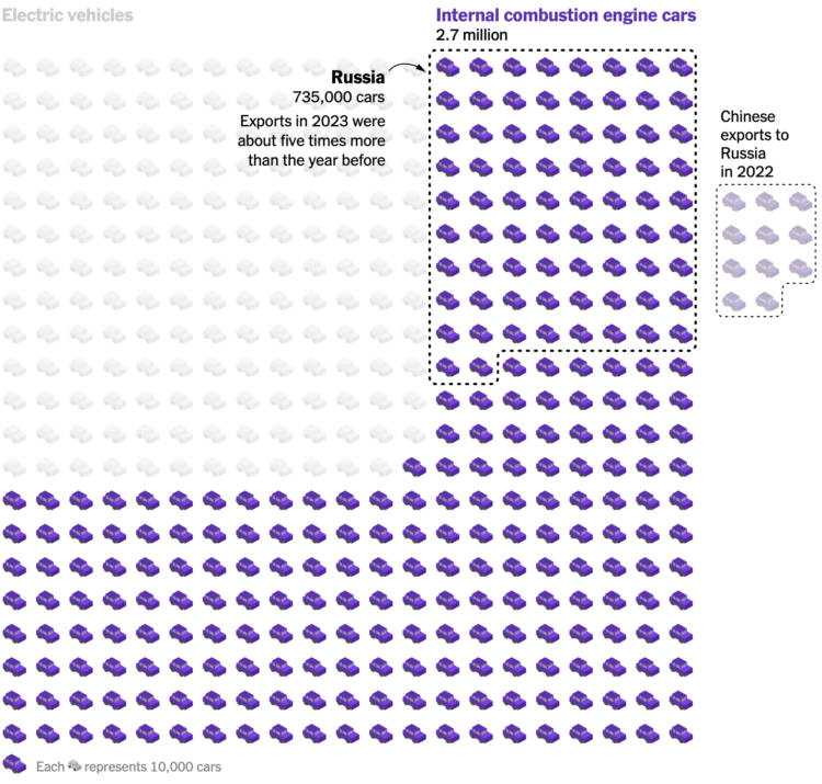
China exported next to zero vehicles in 2010, but from 2020 to 2024, China leapfrogged all other other countries to become the leading exporter, by a lot. For The New York Times, Agnes Chang and Keith Bradsher show the rise over time and the breakdown with unit charts.
Each car represents 10,000 exported cars in the above graphic. I like the 2022 Russia comparison for scale.
![]() Is there a better gift than the gift of knowledge? No, there is not. It is the greatest gift that lasts a lifetime. Speaking of, you can gift a FlowingData membership to your friends, family, colleagues, and cats, and they’ll gain access to said knowledge from tutorials, courses, and a members-only newsletter. Or, treat yourself — an equally excellent idea.
Is there a better gift than the gift of knowledge? No, there is not. It is the greatest gift that lasts a lifetime. Speaking of, you can gift a FlowingData membership to your friends, family, colleagues, and cats, and they’ll gain access to said knowledge from tutorials, courses, and a members-only newsletter. Or, treat yourself — an equally excellent idea.
Plus it’s Small Business Saturday Cyber Monday, which is totally a real thing and not made up at all, so you’ll be able to check multiple boxes off your list.
It’s super easy. Go to the membership page and select “Give as Gift” at the end of the page. You can schedule the gift arrival and include a message.
There are two options:
Thanks for considering this very small cyber business on this Saturday Monday. Your cat will love it.
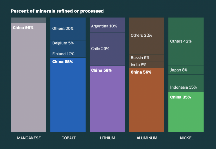
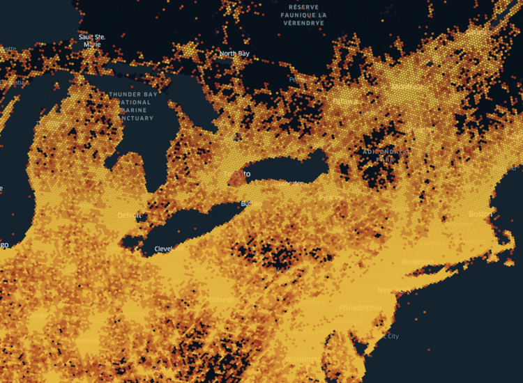
To make batteries for electric vehicles, manufacturers require materials from all over the world. It’s not always clear how these materials are obtained. The Washington Post provides insights into the where and how with a set of maps and charts.
One of the highlights of Thanksgiving in the United States is the food, as seen through the lens of Google Trends.
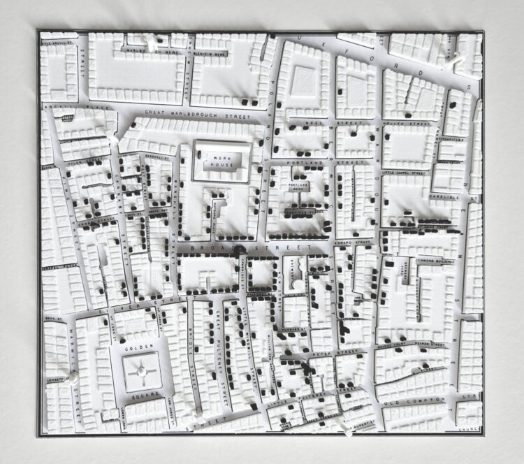
You know the John Snow map that highlights a cholera outbreak in London, from 1854. Alex Selby-Boothroyd made a 3-D-printed version that brings the stacked counts out of the map.
Daren Jannace animated 30 frames per day for one year and then put it all together at 30 frames per second. The full video, with audio captured on Daren’s phone during the year, is a 365-second video that represents a year in his life. It’s called 10,946.
[via kottke]
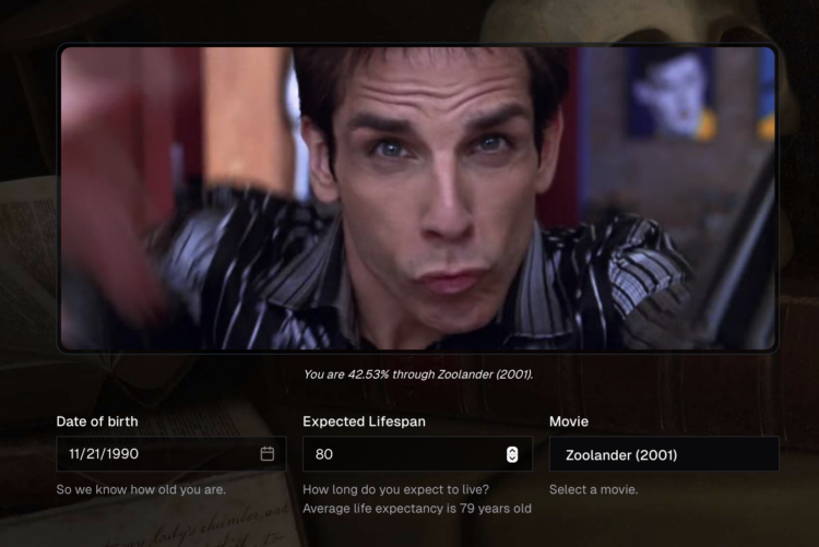
Memento Movi, a mini-app by Michael Condouris, is what you get when you use movies as a progress bar for life expectancy. Enter your birthdate and expected lifespan. Then select a movie from the list. The percentage of your life that you’ve lived is translated to the percentage through the movie you would be, which gives you the frame in the movie.
I swear this was made just for me. [via Waxy]

Martin Wattenberg drew up a live visualization that shows colors mentioned in Bluesky posts, via the firehose. Just let the wave of calm wash over you.
I’m sure there are many more mashups to come, but I’ll probably shift anymore sharing to Bluesky itself, so as not to inundate you with a firehose about using the firehose. It’s just refreshing to see data flowing freely after companies moving the other direction over the past several years.

Here’s the good stuff for the month: things to use, things to poke at, and things to learn from.
Our World in Data is a hub for research and reliable data to measure the progress of the world. You’ve always been able to download data from the site, but they just made it easier with more detailed exports and an API:
For users who work with automated workflows, computational notebooks, or custom applications, we now offer direct URLs to access data in CSV format and comprehensive metadata in JSON format. This is the same data and metadata included in the zip file download package described above.
Just like with the download package, you can fetch the complete data or only the subset of the data currently displayed in the chart. You can also choose between longer column names that are easier to read for humans or shorter column names that are often more convenient to use in code.
Great news.

We like to imagine a world of autonomous robots that take care of tedious tasks so that we don’t have to. Chris Fenton likes to imagine robots made of garbage that roam around his backyard, and Grasso was born:
Who says AGI has to be super intelligent just to be A, G and I? Grasso is driven by a kind of python ‘madlib’ wrapped around two LLMs (one multi-modal, one text-only). The outer loop takes a photo with its webcam and feeds it into a multi-modal LLM to generate a scene description. That scene description is then inserted into a prompt (“This is what you currently see with your robot eyes…”) that ends with “Choose your next action” and presents a list of actions the robot can take, some of which are ‘direct’ commands, and others that are ‘open ended’ and let Grasso finish the action prompt however it chooses.
Foursquare, which I thought was still a location sharing app but is a data platform now, open sourced a layer of 100 million points of interest in an effort to build and maintain a global database:
[L]et’s now consider the challenge of creating and maintaining a real-world-synced place database. As our CTO Vikram Gundeti detailed in a recent blog on our newly re-launched Place Engine, to do this well requires an operating system powered by human-in-the-loop confirmations harmoniously orchestrated with cutting edge digital discovery systems to actively curate a database representative of the current world. In short, building an accurate global database of POI is an extraordinarily difficult task both from a technical perspective and from a capital resource perspective.
This leads to our belief that, absent a global proprietary distribution platform like Google Maps, building a comprehensive and accurate base layer of place data is indeed a problem best solved by an open source community.
You can access the dataset now.
![]() Speaking of data blankets, the knitting club in the area I live has an annual tradition of making sweaters for trees in their downtown. One of the trees was wrapped with a temperature blanket.
Speaking of data blankets, the knitting club in the area I live has an annual tradition of making sweaters for trees in their downtown. One of the trees was wrapped with a temperature blanket.
Each color corresponds to a temperature range. Each knitted row reflects the high temperature for each day throughout the past year. The bottom starts with September 1, 2023.
Let’s get more data into the physical world.
Jesse Gwinn, from NOAA, was at sea on a mapping expedition and to pass the downtime between tasks, she crocheted a bathymetry blanket:
I assigned 11 colors to different depth ranges: reds and yellows for shallower waters (~2,000-4,000 meters/1.2-2.5 miles), blues and purples for deeper areas (~4,000-6,000 meters/2.5-3.7 miles). Each vertical row contains two colors, illustrating the deepest and shallowest points recorded in a 6-hour period. The relative location of the color change is positioned to represent the average depth of the seafloor for that timeframe. […] The finished blanket contains 97 rows, representing 582 hours (a little more than 24 days) worth of bathymetry data collected using multibeam sonar.
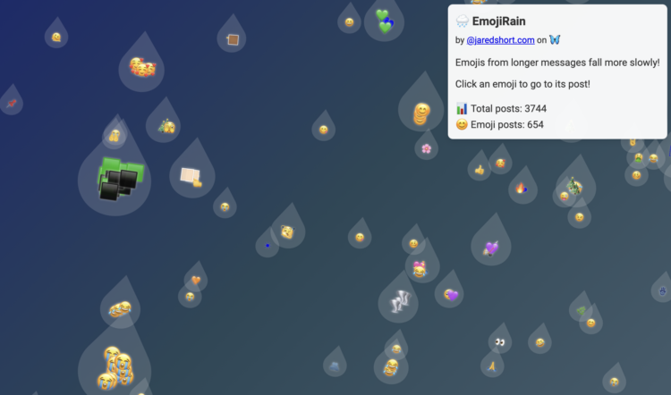
Bluesky firehose fun continues. Jared Short shows emoji usage as rain drops that fall down the screen. Larger drops represent longer posts.
Or, if the Matrix aesthetic is your thing, Short did that too:

 Visualize This: The FlowingData Guide to Design, Visualization, and Statistics (2nd Edition)
New tools, refined process.


