
Emily Baumgaertner reporting for The New York Times:
But critics of the change and experts in the Census Bureau itself have said that, amid a fiery immigration debate, the inclusion of a citizenship question could prompt immigrants who are in the country illegally not to respond. That would result in a severe undercount of the population — and, in turn, faulty data for government agencies and outside groups that rely on the census. The effects would also bleed into the redistricting of the House and state legislatures in the next decade.
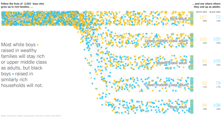
Welp.
Justin Elliot reporting for ProPublica:
The full census, however, hasn’t included questions about citizenship since 1950. The Census Bureau has gathered such data in other surveys. The bureau switched the method of those surveys after the 2000 census. Today, it conducts the American Community Survey every year, which includes questions about citizenship, along with many other questions. The survey covers a sample of residents of the United States.
Experts said the Justice Department’s letter was misleading. And they questioned the Justice Department’s explanation in the letter, noting that the American Community Survey produces data on citizenship that has been used in Section 2 cases.
Welp.
WELP.

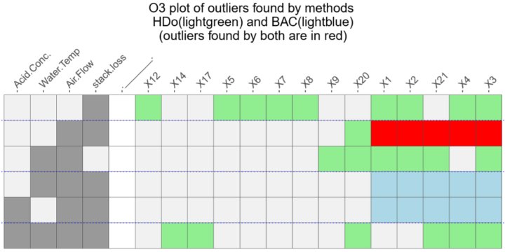


 Visualize This: The FlowingData Guide to Design, Visualization, and Statistics (2nd Edition)


