Constructed Career Paths from Job Switching Data

“It means your future hasn’t been written yet. No one’s has. Your future is whatever you make it.” —Emmett Brown
People switch jobs all of the time. Oftentimes the switch is to something related, and other times the career path swerves in a completely different direction.
We saw the former when we looked at the most common jobs people switched to, given their current occupation. For example, computer programmers most often switched to computer systems analysts. This was based on several years of data from the Current Population Survey.
I was curious. What if you consider this a connection — like in a network graph — between two occupations? More specifically, I wondered if, given that you already have a job, what is the shortest path to get to another job?
The chart below, mostly for fun, shows the shortest path for all of the jobs using the same dataset.
For example, for a statistician to become a chef, one could become an operations research analyst, then a manager, and into that head chef spot.
This path comes about because a surveyed person from the CPS was a statistician who became an operations research analyst. At some point during the sampled period, an operations research analyst became a manager. And finally, a manager became a head chef. Easy peasy.
So in forming these connections, I imagine the occupation switches belong to one person, when of course, I’m looking at a group of people. That means these are imaginary paths rooted in reality. But you know, if you’re a mortician who dreams of being an artist, you don’t actually have to become an elementary school teacher first. You can probably strive for the direct path.
What path will you take?
 Shifting Jobs
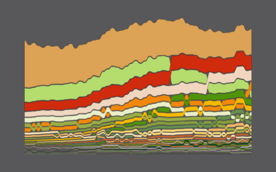
These are the most common jobs that people switched to.
Notes
- The source data comes from the Current Population Survey, 2011 through 2016. I downloaded the microdata using the IPUMS CPS extraction tool. The survey asks people what their current occupation is and what it was the previous year. I looked at the people who had different answers.
- This interactive only shows the shortest path for each pair of occupations. Many occupation pairs had several paths between them.
- I analyzed and prepared the data in R. I made the interactive with d3.js.
Become a member. Support an independent site. Make great charts.
See What You Get