• Membership
  • Newsletter
  • Projects
  • Learning
  • About
  • Member Login
  • AI-generated celebrity faces look real

    October 31, 2017

    Topic

    Statistics  /  AI, faces

    Researchers from NVIDIA published work with artificial intelligence algorithms, or more specifically, generative adversarial networks, to produce celebrity faces in high detail. Watch the results below.

    [arve url=”https://www.youtube.com/watch?v=XOxxPcy5Gr4″ /]

    Nutty.

  • Visual explainer for hierarchical modeling

    October 31, 2017

    Topic

    Statistical Visualization  /  model, scrollytelling, teaching

    Hierarchical models, or multilevel models, are used to represent data that might vary on, you guessed, different levels. Michael Freeman, from the University of Washington Information School, provides an introduction to the method using a scrolling format. The transitions give a good sense of how the model can change, depending on your approach.

  • Charts show time between assaults and public allegations

    October 30, 2017

    Topic

    Statistical Visualization  /  assault, Axios, Harvey Weinstein

    As the list of sexual assault allegations grows for Harvey Weinstein (and many others who abused their power), Axios charted the time between events and public allegations. Painful decades.

  • Project Lincoln from Adobe aims to reverse data visualization workflow

    October 30, 2017

    Topic

    Design  /  Adobe, prototype

    With data visualization, you start with the data and let it guide geometry, colors, etc, and from there, you work on aesthetics, readability, and usability. The data informs the design. Project Lincoln is an experiment from Adobe that flips this. You draw shapes and illustrations first and then bind data to them.

    Here it is in action:

    [arve url=”https://www.youtube.com/watch?v=lX1BBMyY1bc” /]

    My brain was confused. Something about this order of things doesn’t feel right. You go in with design first and then bring in the data, and then you edit again? Maybe this would be useful for quick prototypes or visual experiments? It’s hard to say how this would go in practice without actually trying it out, but my gut says no.

  • Data journalism lessons available from ProPublica Data Institute

    October 30, 2017

    Topic

    Statistics  /  data journalism, learning, ProPublica

    ProPublica runs a small annual workshop to teach journalists a bit about data and how it can be used to report. The training materials and some of the lectures are online now.

    Though more than a thousand people have applied to ProPublica’s Data Institute, we’ve only been able to accept about 24 in the two years it’s been running. Faced with such a high demand, we’ve looked for ways to help more journalists trying to learn data journalism and interactive database design. In past years, we’ve put our slides and homework assignments online (here’s 2016 and 2017 ), but we also know how valuable it is to be able to see and hear what’s happening in the classroom.

  • Sorting algorithms visualized with animated color palette

    October 26, 2017

    Topic

    Statistical Visualization  /  algorithm, sorting

    I bet you woke up this morning thinking, “I haven’t seen a good visualization of sorting algorithms in at least a week. I wish someone would get on that.” Well here you go. Wish granted.

    See also sorting algorithms explained with dance, books, and sound. And while we’re at it, don’t forget Mike Bostock’s visual essay on visualizing algorithms.

    [Thanks @SimStolz]

  • How to Make a Semicircle Plot in R

    It’s the half cousin of the bubble plot with less overlap and more straight edges.

  • Heart rate during layoff

    October 26, 2017

    Topic

    Self-surveillance  /  heart

    Add another chart to the genre of heart rate during a significant event. Reddit user failian had an Apple Watch on when he was laid off, so he exported his heart rate data for the day and made this graph.

    See also heart rates for a marriage proposal and during sex.

  • Visualizing fertilization of egg by sperm at the atomic level, with a Star Wars theme

    October 25, 2017

    Topic

    Data Art  /  fertilization, Star Wars

    [arve url=”https://vimeo.com/218527594″ /]

    Don Ingber and Charles Reilly of the Wyss Institute used data at the atomic level to visualize the simulation of sperm fertilizing an egg. The researchers used a Star Wars theme.

    To see if entertainment could offer a solution to this challenge, Ingber teamed up with Charles Reilly, Ph.D., a molecular biophysicist, professional animator, and Staff Scientist at the Wyss Institute who previously worked at movie director Peter Jackson’s Park Road Post film studio, to create a film that would capture viewers’ imaginations by telling the story of a biological process that was accurate down to the atomic level.

    Ingber notes a concern that non-scientists have grown skeptical of science. I’m not sure entertainment in this form is the way to fix that, but at least it was fun to watch. [via Co.Design]

  • 4 Tools to Pick Your Chart Colors

    October 24, 2017

    Topic

    Guides  /  color, resources

    I used to manually select my color schemes with trial and error, but these days, there are a lot of tools to help you pick colors for your charts. The motivation for most of them is to help you visualize your data in a way that is perceptually correct. That is, perceived differences translated between your eyeballs and your brain match the actual quantitative differences.

    While there are new tools released fairly often, I tend to stick to these four simple and quick ones. Here they are by purpose.
    Read More

  • CARTOColors is a quick set of color schemes to copy

    October 23, 2017

    Topic

    Apps  /  color

    Picking colors is one my favorite things to do with visualization when I’m not in a rush for time. But when I can spare the minutes to pick and choose, it’s useful to have a quick reference. ColorBrewer is the go-to, but CARTOColors is a simpler take. It just shows you a bunch of schemes at once for sequential, diverging, and qualitative data. [via @maartenzam]

  • A study of the geographic forms in cartography

    October 20, 2017

    Topic

    Maps

    Cartographer Geraldine Sarmiento from Mapzen explores the drawing forms in cartography, such as lines, bridges, and buildings.

    What is the visual language of cartography? Let’s explore this question through the medium of drawing. After all, it is this abstract representation of place onto a surface of fewer dimensions that the act of cartography entails.

    Be sure to check out the Morphology tool to poke at the forms yourself.

  • Data Underload  /  time use

    American Daily Routine

    Sleep. Work. Play. The times and everything in between change depending on who you talk to.

    Read More
  • Mapping happiness

    October 19, 2017

    Topic

    Maps  /  happiness, National Geographic

    Gallup surveyed Americans about their well-being across various factors. National Geographic gets into some of the geographic breakdowns.

    While Gallup’s survey doesn’t attempt to explain why individuals feel the way they do, it does expose some commonalities among the lives of Americans. Respondents from the lowest ranked states were more likely to report worse physical and financial health: They were more likely to smoke, be obese, and have little interest in life. They also reported not having enough money to buy food or healthcare.

    You can grab the data from the Gallup site here.

  • Statistical diversity in US newsrooms

    October 18, 2017

    Topic

    Statistical Visualization  /  diversity, Google, news

    If a news organization wants to talk about the world in a fair way, it needs points of view from a group of people who are representative of said world. Otherwise, bias comes to play no matter how hard you try. Google Trends looks at the how different groups are represented in major news organizations across the country.

  • Gyroscope to automatically track your health data

    October 17, 2017

    Topic

    Self-surveillance  /  app, health

    I’m surprised I’m just now hearing about Gyroscope. It’s an app that automatically tracks your health data and then generates reports, both digitally and in print format. An “OS for the human body” it says.

    Might give it a go.

  • Map of Santa Rosa fires

    October 16, 2017

    Topic

    Maps  /  fire, New York Times

    Using both satellite images and ground surveys, The New York Times maps the damage due to the fires in Santa Rosa. Crazy. I live a couple of hours away from the area and I still could smell the smoke.

    See also Nicolette Hayes’ more personal map.

  • Dangers of CSV injection

    October 13, 2017

    Topic

    Data Sharing  /  csv, security

    George Mauer highlights how a hacker might access other people’s data by putting an equal sign in a CSV file, so that an import to Microsoft or Google Sheets runs a value as a formula, even if it’s quoted as a string.

    The attacker starts the cell with their trusty = symbol prefix and then points IMPORTXML to a server they control, appending as a querystring of spreadsheet data. Now they can open up their server log and bam! Data that isn’t theirs. Try it yourself with a Requestb.in.

    The ultra sinister thing here? No warnings, no popups, no reason to think that anything is amiss. The attacker just enters a similarly formatted time/issue/whatever entry, eventually an administrator attempts to view a CSV export and all that limited-access data is immediately, and queitly sent away.

    Oh goody.

  • Page 154 of 392
  • <
  • 1
  • ...
  • 151
  • 152
  • 153
  • 154
  • 155
  • 156
  • ...
  • 392
  • >

Analyze, visualize, and communicate data usefully, beyond the defaults.

Become a member →

Recently for Members

May 15, 2025
Step Chart, Enhanced

May 8, 2025
When the data is not what it seems

May 1, 2025
Finding the Right Charts

April 24, 2025
Visualization Tools, Datasets, and Resources – April 2025 Roundup

April 17, 2025
Breaking Out of Chart Software Defaults

Second Edition

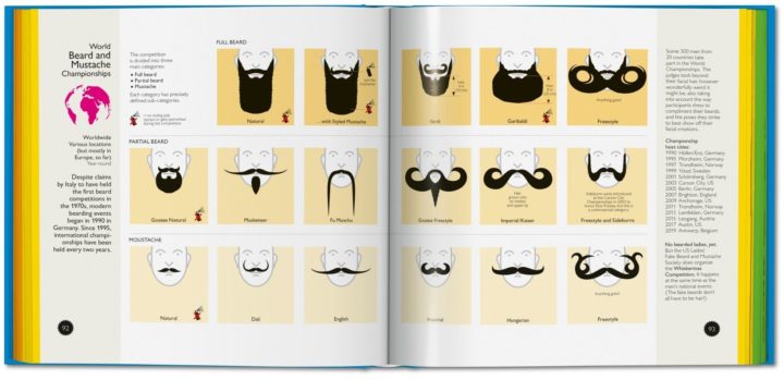
Visualize This: The FlowingData Guide to Design, Visualization, and Statistics (2nd Edition)

Order: Amazon / Bookshop

Browse by Chart Type See All →

Unit Chart Heatmap Gantt Chart Step Chart Radar Chart Barcode Chart Line Chart Calendar Slope Chart Treemap

Browse By Topic

  • Visualization

    Seeing data

  • Maps

    Seeing geographic data

  • Infographics

    Explaining data

  • Networks

    Connecting data

  • Statistics

    Analyzing data

  • Software

    Working with data

  • Sources

    Getting data

  • Design

    Making data readable

Made by FlowingData

  • The Process

  • Data Underload

  • Chart Everything

  • Guides

  • Books

  • Shop

  • About
  • Contact
  • Newsletter
  • LinkedIn
  • Instagram
  • Bluesky
  • RSS
Copyright © 2007-Present FlowingData. All rights reserved.