Basketball Stat Cherry Picking

Deep into the NBA playoffs, we are graced with stats-o-plenty before, during, and after every game. Some of the numbers are informative. Most of them are randomly used to illustrate a commentator’s point.
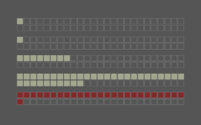
One of the most common stats is the conditional that says something like, “When player X scores at least Y points, the team wins 90 percent of their games.” It implies a cause-and-effect relationship.
The Cleveland Cavaliers won the most games when LeBron James scored 30 or more points. So James should just score that many points every time. Easy. I should be a coach.
It’s a bit of stat cherry picking, trying to find something in common among games won. So to make things easier, and for you to wow your friends during the games, I compiled winning percentages for several stats during the 2017-18 regular season. Select among the star players still in the playoffs.
We can do better than that though. Let’s consider two stats at a time for the same group of players. The Cavaliers are at their best when James takes a bunch of three-pointers and has a lot of assists. Like I said before, easy.
In the chart below, color represents the percentage increase or decrease relative to the overall win percentage. More blue means relatively more wins. More orange means relatively fewer wins.
I kid, but this view actually gives a sense of player roles and importance of a player to his team.
For example, Stephen Curry from the Golden State Warriors missed a lot of games this season, so you’re seeing his team’s win percentage improve when he did play. In contrast, Klay Thompson, also on the Warriors, serves a more focused role, and a high foul count is a good indicator of tough games. You can see similar patterns with the Boston Celtics players, as the team is without two of their star players.
At the end of the day though, I think it’s all about scoring more points than the other team. That is how you can win. Play hard. Put in 1,000%. I should be a coach.
Notes
- The data comes from Basketball-Reference.com.
- I used d3.js for the charts.
- See also Benjamin Schmidt’s baseball cherry picking.
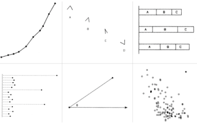
Chart Types Used


Become a member. Support an independent site. Get extra visualization goodness.
See What You Get