-
Members Only
-
Datasets are scattered across the web, tucked into cobwebbed corners where nobody can find them. Google Dataset Search aims to make the process easier:
Similar to how Google Scholar works, Dataset Search lets you find datasets wherever they’re hosted, whether it’s a publisher’s site, a digital library, or an author’s personal web page. To create Dataset search, we developed guidelines for dataset providers to describe their data in a way that Google (and other search engines) can better understand the content of their pages. These guidelines include salient information about datasets: who created the dataset, when it was published, how the data was collected, what the terms are for using the data, etc. We then collect and link this information, analyze where different versions of the same dataset might be, and find publications that may be describing or discussing the dataset.
I’m always a little wary of dataset search engines. They never seem to live up to their promises, because they always require that those with the data do a little bit of work, such as publish metadata that makes indexing easier. But this is Google. I’ll have to give it a go the next time a curiosity pops in.
-
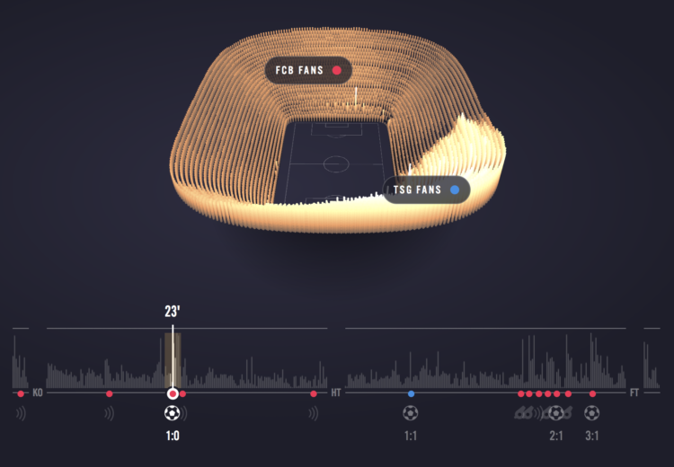
Sports visualization and analysis tends to focus on gameplay — where the players are, where the ball goes, etc. In Reimagine the Game, the focus in on crowd noise through the course of a game. Pick a game and see the waves of noise oscillate through the arena during significant events.
It’s an advertisement feature on The Economist, which is kind of interesting, but it’s still fun to watch the games play out.
-
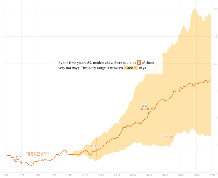
It’s getting hotter around the world. The New York Times zooms in on your hometown to show the average number of “very hot days” (at least 90 degrees) since you were born and then the projected count over the next decades. Then you zoom out to see how that relates to the rest of the world.
I’ve always found it interesting that visualization and analysis are typically “overview first, then details on demand”, whereas storytelling more often goes the opposite direction. Focus on an individual data point first and then zoom out after.
-
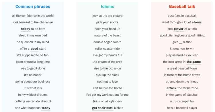
Post-game sports interviews tend to sound similar. And when you do say something out of pattern, the talk shows and the social media examine every word to find hidden meaning. It’s no wonder athletes talk in cliches. The Washington Post, using natural language processing, counted the phrases and idioms that baseball players use.
We grouped phrases that were variations of each other together (within a one- or two-word difference) into a list of roughly 20,000 possible cliches. Then came the subjective part. From that list, we chose the ones that were the most interesting, then grouped those with similar meanings. And voila — the phrases we considered to be the cream of the cliche crop.
I can’t decide if the word cloud to open the article is a fun hook or a distraction. I’m learning towards the former, but I think it would’ve been less the latter without the interaction.
-
When the web was relatively new, things were more of a free-for-all. Everything was an experiment, and it always felt like there were fewer consequences online, because not that many people really used the internet. Now a large portion of people’s lives are online. There is more at stake.
Tactical Tech focuses in on the (careless) design of systems that allows bad actors to thrive:
Design can also be weaponised through team apathy or inertia, where user feedback is ignored or invalidated by an arrogant, culturally homogenous or inexperienced team designing a platform. This is a notable criticism of Twitter’s product team, whose perceived lack of design-led response is seen as a core factor for enabling targeted, serious harassment of women by #Gamergate, from at least 2014 to present day.
Finally, design can be directly weaponised by the design team itself. Examples of this include Facebook’s designers conducting secret and non-consensual experiments on voter behaviour in 2012–2016, and emotional states of users in 2012, and Target, who in 2014 through surveillance ad tech and careful communications design, informed a father of his daughter’s unannounced pregnancy. In these examples, designers collaborate with other teams within an organisation, facilitating problematic outcomes whose impact scale exponentially in correlation with the quality of the design input.
-
Members Only
-
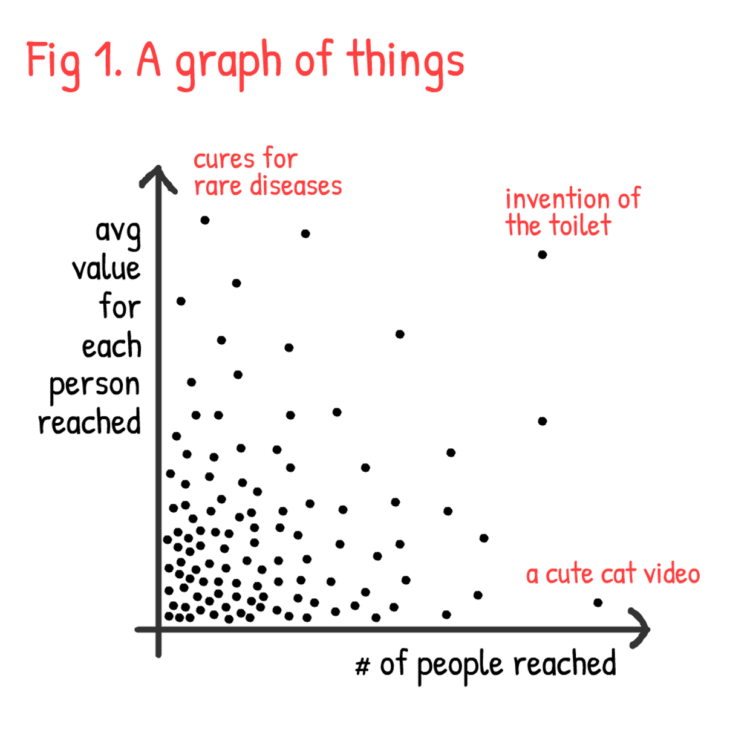
Nicky Case ponders the “valuable-ness” of the things he makes as the product of the number of people reached and the average value for each person reached. Finding the balance is tricky.
-
Tom White is an artist who uses neural networks to draw abstract pictures of objects. What looks blobby and fuzzy to us looks more concrete to the machine.
That “voice” is actually a series of algorithms that White has dubbed his “Perception Engines.” They take the data that machine vision algorithms are trained on — databases of thousands of pictures of objects — and distill it into abstract shapes. These shapes are then fed back into the same algorithms to see if they’re recognized. If not, the image is tweaked and sent back, again and again, until it is. It’s a trial and error process that essentially ends up reverse-engineering the algorithm’s understanding of the world.
-
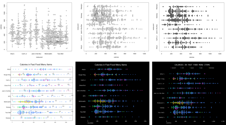
How to Make Better-Looking, More Readable Charts in R
Defaults are generalized settings to work with many datasets. This is fine for analysis, but data graphics for presentation benefit from context-specific design.
-
Pinball feels like a game of chance that is uncontrollable from any angle. In typical Vox fashion, the video explains the game and its predictability.
-
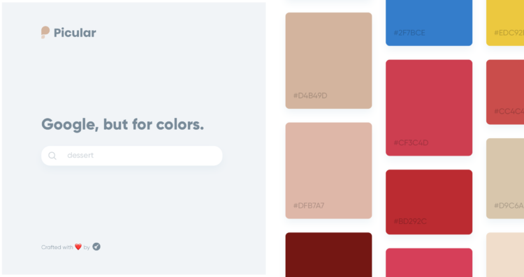
Picular is a simple tool that lets you search for a topic, and with Google Images as source, outputs a set of colors related to your query. This is going to be a great timesaver.
-
A research study on mortality and alcohol consumption is making the rounds. Its main conclusion is that all alcohol consumption is bad for you, because of increased risk. David Spiegelhalter, the chair of the Winton Centre for Risk and Evidence Communication, offers a different interpretation of the data:
Let’s consider one drink a day (10g, 1.25 UK units) compared to none, for which the authors estimated an extra 4 (918–914) in 100,000 people would experience a (serious) alcohol-related condition.
That means, to experience one extra problem, 25,000 people need to drink 10g alcohol a day for a year, that’s 3,650g a year each.
To put this in perspective, a standard 70cl bottle of gin contains 224 g of alcohol, so 3,650g a year is equivalent to around 16 bottles of gin per person. That’s a total of 400,000 bottles of gin among 25,000 people, being associated with one extra health problem. Which indicates a rather low level of harm in these occasional drinkers.
Therefore:
The paper argues that their conclusions should lead public health bodies “to consider recommendations for abstention”.
But claiming there is no ‘safe’ level does not seem an argument for abstention. There is no safe level of driving, but government do not recommend that people avoid driving.
Come to think of it, there is no safe level of living, but nobody would recommend abstention.
Burn.
See also Spiegelhalter talk about weighing risk against benefits in a video from 2010.
-
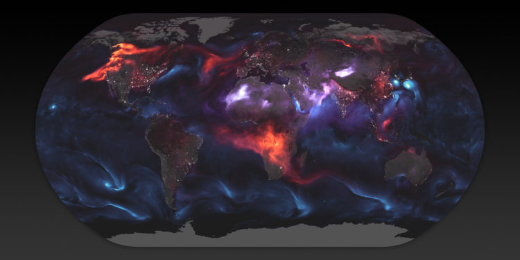
Using a mathematical model based on satellite data, NASA shows an estimate of aerosol in the atmosphere on August 23, 2018:
The visualization above highlights GEOS FP model output for aerosols on August 23, 2018. On that day, huge plumes of smoke drifted over North America and Africa, three different tropical cyclones churned in the Pacific Ocean, and large clouds of dust blew over deserts in Africa and Asia. The storms are visible within giant swirls of sea salt aerosol (blue), which winds loft into the air as part of sea spray. Black carbon particles (red) are among the particles emitted by fires; vehicle and factory emissions are another common source. Particles the model classified as dust are shown in purple. The visualization includes a layer of night light data collected by the day-night band of the Visible Infrared Imaging Radiometer Suite (VIIRS) on Suomi NPP that shows the locations of towns and cities.
Gnarly.
-
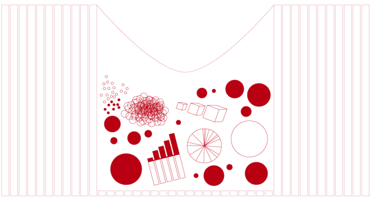
After seeing a 1950s physical visualization, I wondered if I could follow a similar process using modern techniques.
-
Members Only
-
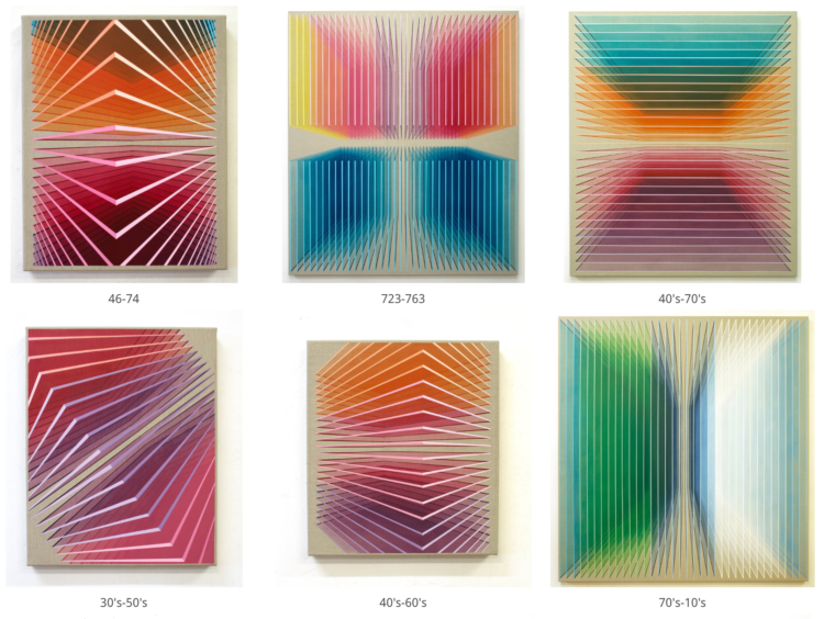
Lucy Engelman has synesthesia, which is a perceptual response where one sensory pathway is stimulated, and a secondary sense is triggered. Daniel Mullen, in collaboration with Engelman, paints what she sees through the secondary sense.
In Lucy’s case, when she sees or thinks about time and numbers (days of the week, months, hours, years) as well as letters/words ie a person’s name, she experiences a different colour sequence in her mind’s eye. Additionally, time is spatial and coloured related, as in the days of the week, months, years, all have a coloured location in space and a shifting orientation. Essentially, she has an ever changing complex and luminous filter to view the abstract concepts of our world.
[via @mariuswatz]
-
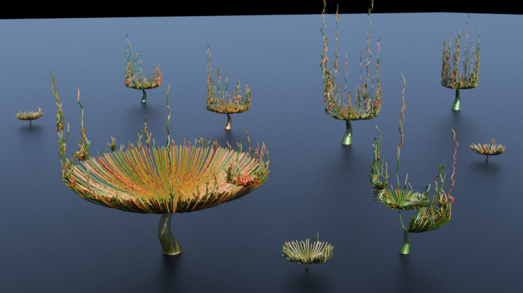
Peter Beshai was tasked with visualizing the toxicity in Twitter conversations. He arrived at this organic-looking model using 3-D visual effects software. Nice.
-
Statistics. I kid, I kid. Hugo Bowne-Anderson, host of the DataFramed podcast, culled some information together that he’s gathered from interviewing data scientists. This is what data scientists really do.
One result of this rapid change is that the vast majority of my guests tell us that the key skills for data scientists are not the abilities to build and use deep-learning infrastructures. Instead they are the abilities to learn on the fly and to communicate well in order to answer business questions, explaining complex results to nontechnical stakeholders. Aspiring data scientists, then, should focus less on techniques than on questions. New techniques come and go, but critical thinking and quantitative, domain-specific skills will remain in demand.
Other than the best spots to nap in between classes, this is one of the most important things I learned in (statistics) graduate school.
-
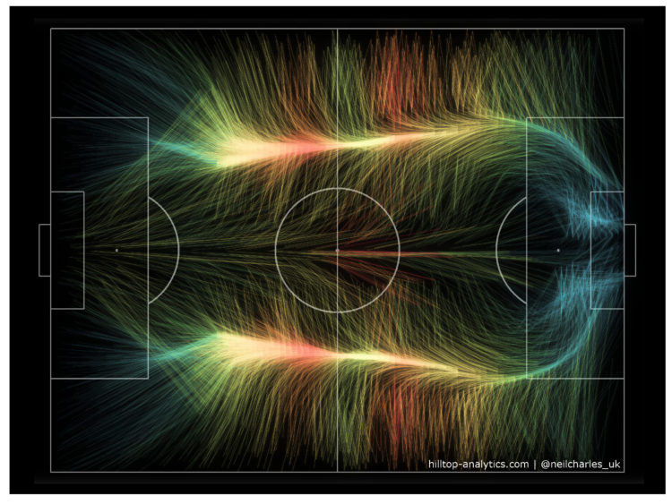
A fun experiment by Neil Charles that used the aesthetics of wind maps to represent World Cup 2018 play activity:
It looks like the familiar shape of an average football game, with the bulk of the play happening out wide and then converging onto the opponent’s area. Colour in this is example is by number of passes (hotter = more) and I’ve also drawn locations with fewer passes more faintly, but the aim is visual impact rather than strict best practice so I deliberately haven’t included a legend.
Clearly this has to be done for every other sport now.






 Visualize This: The FlowingData Guide to Design, Visualization, and Statistics (2nd Edition)


