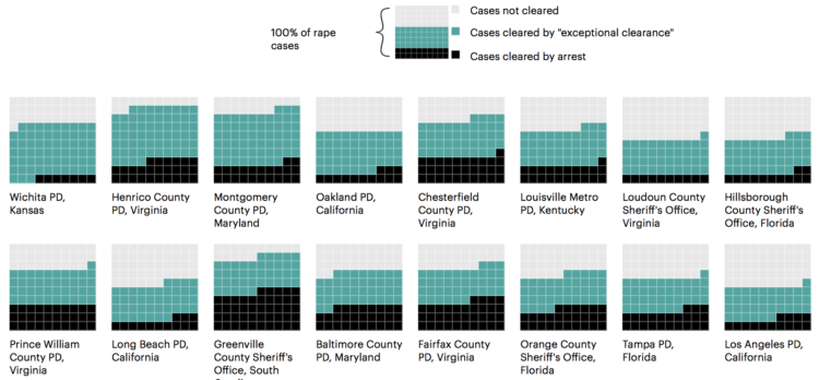
I’m behind on my podcast listening (well, behind in everything tbh), but Reply All covered the flaws of CompStat, a data system originally employed by the NYPD to track crime and hold officers accountable:
But some of these chiefs started to figure out, wait a minute, the person who’s in charge of actually keeping track of the crime in my neighborhood is me. And so if they couldn’t make crime go down, they just would stop reporting crime. And they found all these different ways to do it. You could refuse to take crime reports from victims, you could write down different things than what had actually happened. You could literally just throw paperwork away. And so that guy would survive that CompStat meeting, he’d get his promotion, and then when the next guy showed up, the number that he had to beat was the number that a cheater had set. And so he had to cheat a little bit more.
I sat in on a CompStat meeting years ago in Los Angeles. I went into it excited to see the data system that helped decrease crime, but I left skeptical after hearing the discussions over such small absolute numbers, which in turn made for a lot of fluctuations percentage-wise. Maybe things are different now a decade later, but I’m not surprised that some intentionally and unintentionally gamed the system.
See also: FiveThirtyEight’s CompStat story from 2015.


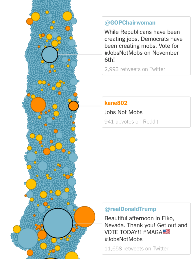 A meme that cried “jobs not mobs” began modestly, but a couple of weeks later it found its way into a slogan used by the President of the United States. Keith Collins and Kevin Roose for The New York Times

 Visualize This: The FlowingData Guide to Design, Visualization, and Statistics (2nd Edition)


