Sarah Leo, a visual journalist at The Economist, looked through the archives and found some charts that could use a re-design.
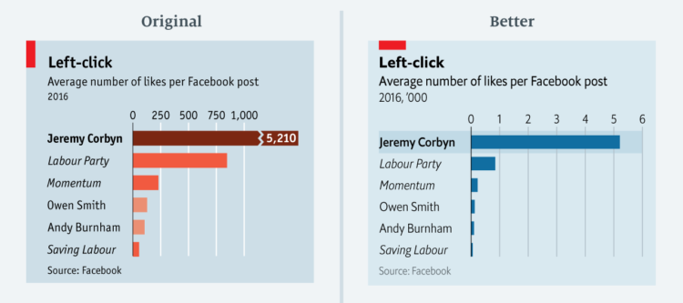
After a deep dive into our archive, I found several instructive examples. I grouped our crimes against data visualisation into three categories: charts that are (1) misleading, (2) confusing and (3) failing to make a point. For each, I suggest an improved version that requires a similar amount of space — an important consideration when drawing charts to be published in print.
Very nice. Archive lookups are often accompanied by “ooo, vintage, therefore good” but Leo takes it the other direction.
Found this tidbit interesting: “Until fairly recently, we were less comfortable with statistical software (like R) that allows more sophisticated visualisations.”


 Visualize This: The FlowingData Guide to Design, Visualization, and Statistics (2nd Edition)


