Past and current charts influence future charts. Should you credit the past work? At what point does homage become plagiarism? If you’re the original creator, are you pleased or annoyed?
Past and current charts influence future charts. Should you credit the past work? At what point does homage become plagiarism? If you’re the original creator, are you pleased or annoyed?
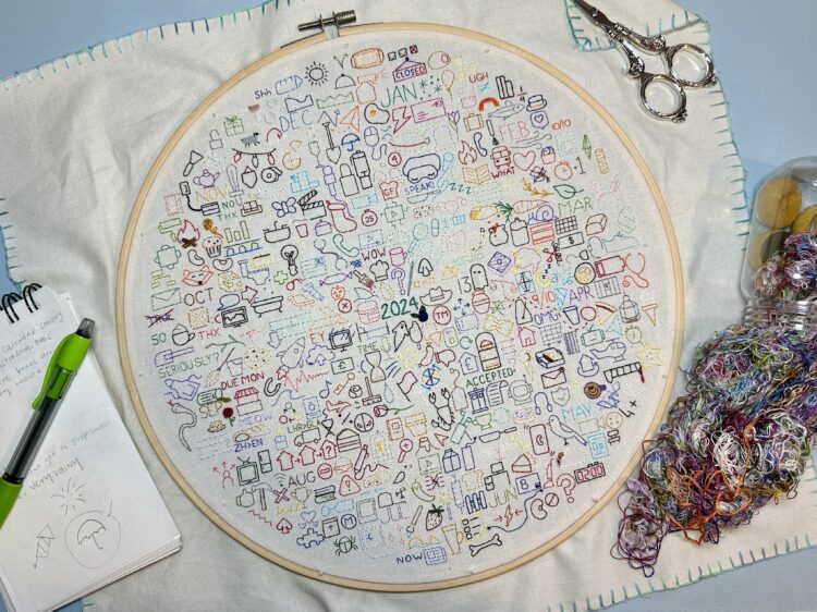
Those who keep a daily journal typically record with words, photos, and video. Since 2020, Sophie O’Neill has used embroidery as her medium. She embroiders an icon for each day to reflect an experience or memory. Each year gets a new journal. The above is the 2024 embroidery journal.
I guess this is kind of a thing? O’Neill shares others’ journals, and there is an active Facebook group.
I want to do this with data and charts, without falling into the personal annual report genre.
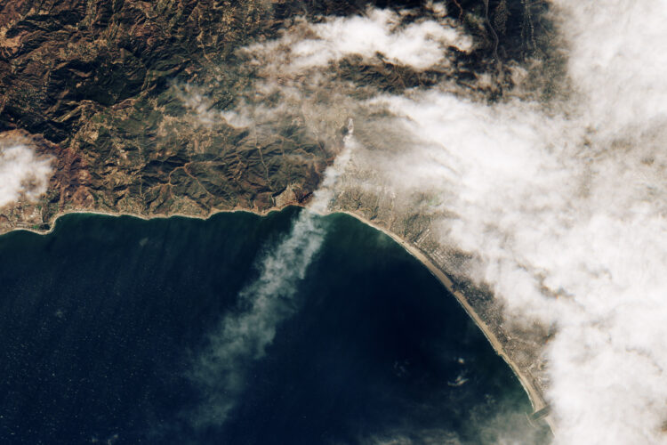
Sentinel-2 satellite of the European Space Agency captured an image of the Palisades fire when it began:
One of the wind-driven fires ignited during the morning of January 7, near the Pacific Palisades neighborhood. The image below, acquired by the European Space Agency’s Sentinel-2 satellite, shows the Palisades fire at 10:45 a.m. Pacific Time on January 7, soon after it ignited.
The Palisades is that area along the coast, right next to the narrow smoke plume in the middle.
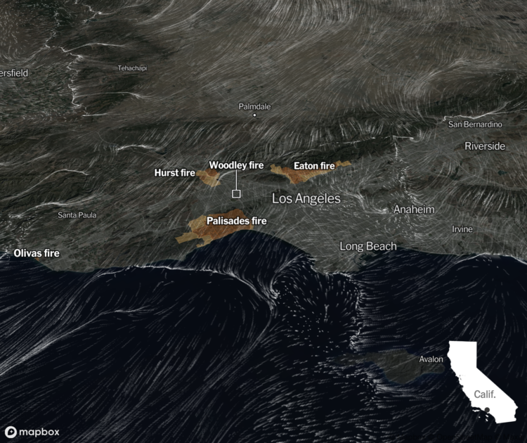
Based on data from NOAA, the New York Times shows the direction and speed of wind over Los Angeles with an animated map, as of January 8, 2025 at noon.
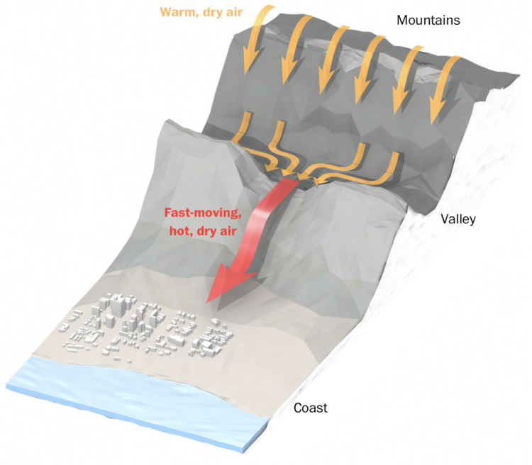
The Washington Post illustrates how air flows from the Great Basin, over the mountains, through the gaps, and into Los Angeles as the wind moves faster, hotter, and dryer.
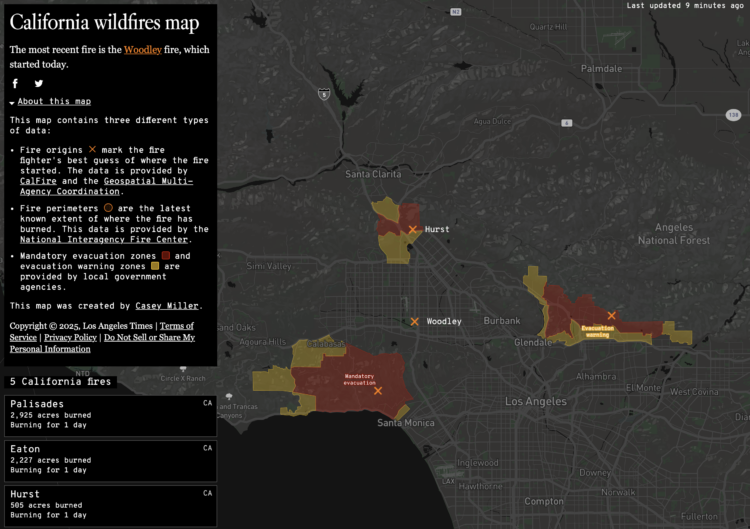
This California wildfires map from Los Angeles Times shows an up-to-date status in the Los Angeles area. It provides fire origin, perimeters, and evacuation areas. I hope everyone is keeping safe.
The original by Casey Miller was made in 2020, when a lot of California was burning. There were a couple more map layers for pollution and an aggregated view, but it’s good to see the app still running.
Incident data comes from Cal Fire, which makes the data available as CSV and via API. The data goes back to 2016. Props to them for running and maintaining a usable data feed for almost a decade.
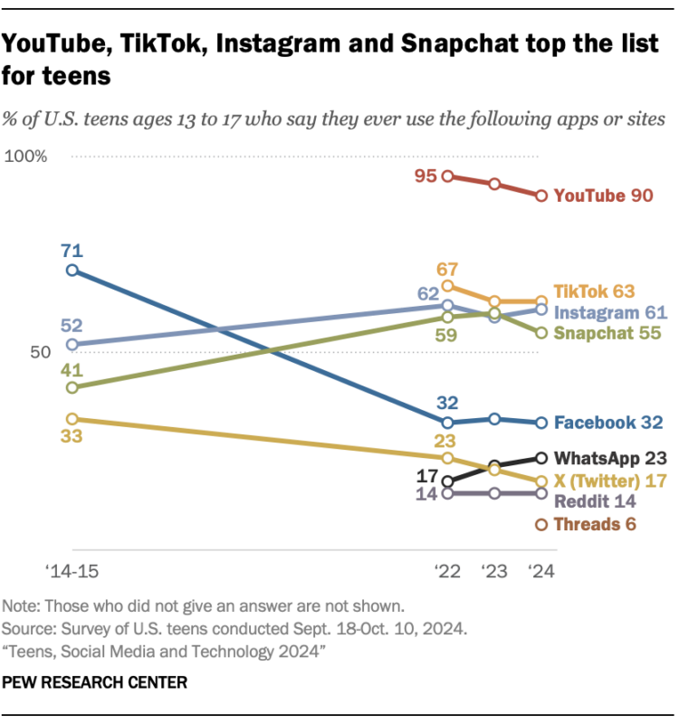
Pew Research published their annual report on what social media U.S. 13- to 17-year-olds are using these days. It looks like WhatsApp took some attention from Snapchat and X continued its downward trend. I would’ve expected Facebook to drop, but it flattened out the past couple years.
Areas represent total counts and the colors indicate categories. Together, the symbols show the distributions in a population.
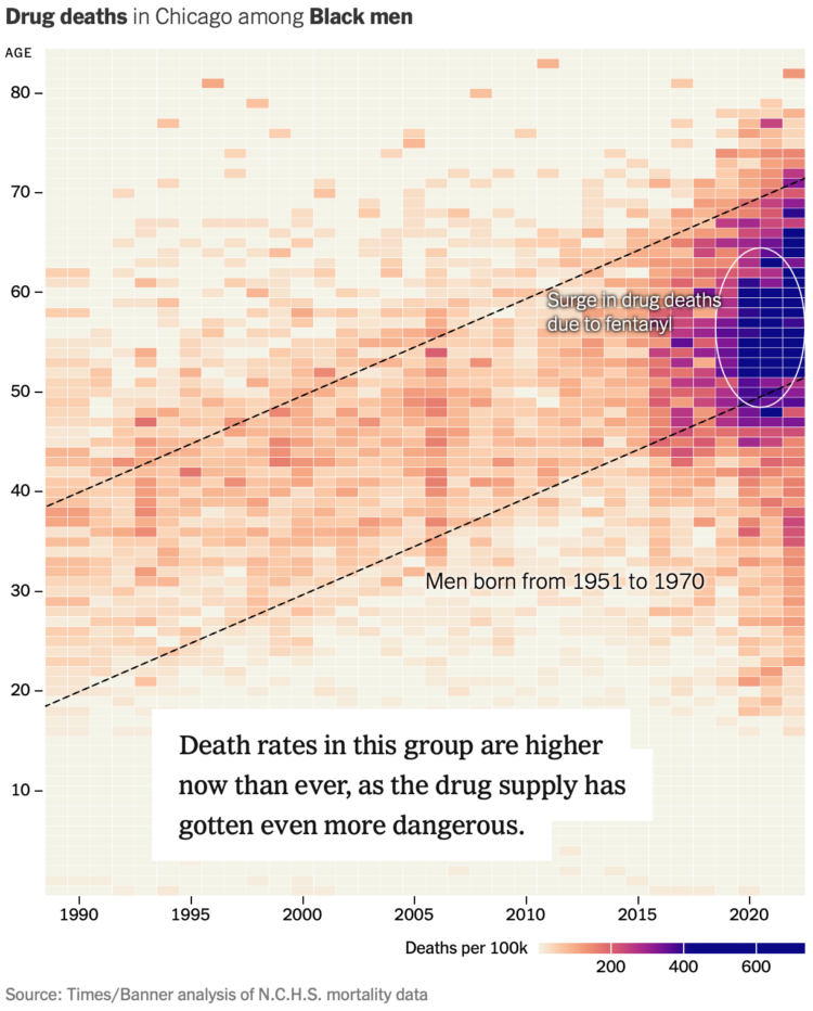
For NYT’s the Upshot, Josh Katz, Margot Sanger-Katz, and Nick Thieme report on the growing prevalence of drug overdose deaths among a generation of black men. This was a collaboration with Big Local News and The Baltimore Banner, who culled and analyzed overdose data to share with other newsrooms.
A heatmap with time on the x-axis and age on the y-axis provides a visual anchor. (Here’s a wideout view for different causes of death.) The first views setup how to read the patterns, which makes the trend among the cohort more obvious.
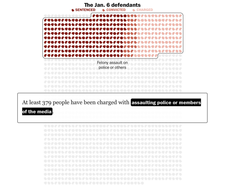
1,580 people were charged with federal crimes for the riot at the U.S. Capitol on January 6, 2021. The Washington Post shows the court status of each as of December 20, 2024. Many are expecting pardons.
I’m not sure what the icons are. Hair? Blobs for visual variation?
In an effort to reduce traffic, New York launched a program that charges a toll to enter defined areas that are often congested. To see if the program works, Joshua Moshes and Benjamin Moshes, as a student project, made a tracker that logs Google Maps traffic data at checkpoints. Current travel times are compared against average times before the program launch.
It looks like there’s a shift on this first day, and I am sure many other cities are watching.
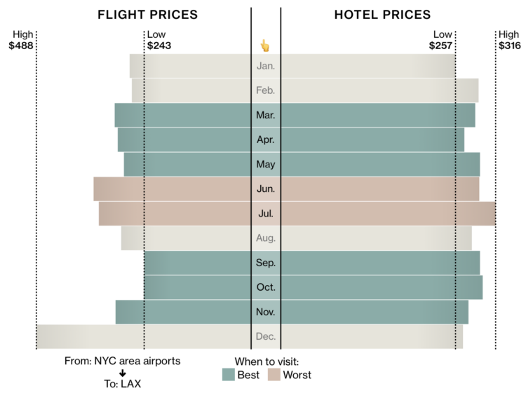
Bloomberg put together a list of places to visit in 2025. Most of my interest rested on the charts for each place that show the best month to go, based on your nearest origin for flights and hotel prices. Color-coding for best and worst times incorporate context such as holidays and weather.
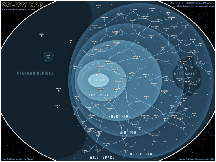
I can’t vouch for the accuracy of this Star Wars map, but I appreciate the spirit of visualizing fictional spaces.
As my father-in-law’s Facebook feed would suggest, the “algorithm” has a way of converging hard into your interests and everything starts to look familiar. For NYT Opinion, Kirby Ferguson ponders what that means for creativity.
In analysis, we often seek patterns in data. Convergence is an indicator that something is happening. However, convergence in our everyday lives might not be the best route.

I haven’t reviewed a year on FlowingData since 2020, which seems like a serious oversight in the system (me). I need to get this annual review out before my boss (also me) finds out. To my credit, I pushed out the picks for best data visualization projects of the year, but I guess it’s time to push the attention inwards.
Read More

Many datasets were analyzed and many charts were made this year. If I liked a project, it was on FlowingData. But only a handful can be the best. These are my favorite data visualization projects from 2024.
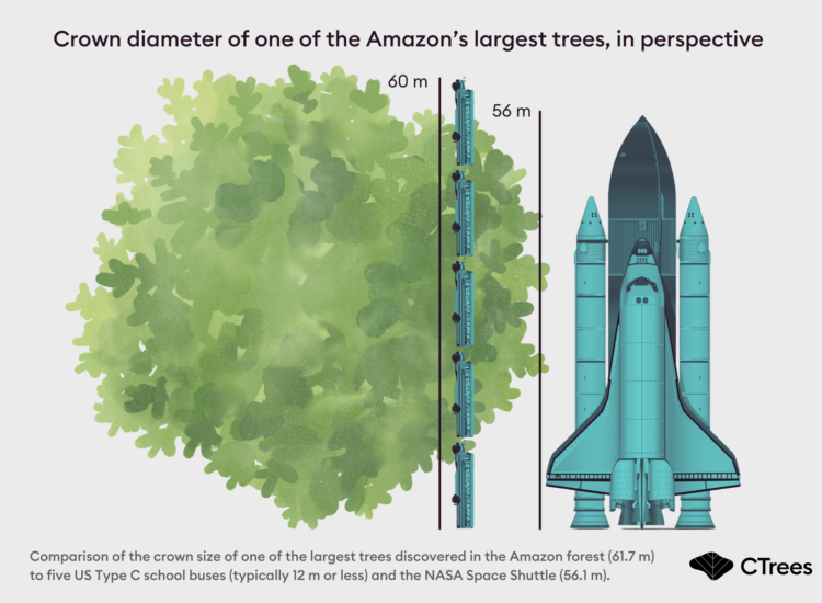
Fabien Wagner works with CTrees in an effort to map tree canopy height in the Amazon rainforest. In the process, he might have found the largest tree in the Amazon:
I am currently working on a model to map the tree canopy height of the entire Amazon forest using Planet NICFI images. The model can detect canopy height up to 45-50 meters. By inspecting the results, we can discover the tallest and largest trees in the entire Amazon.
For this tree, specifically: I had previously searched the data for individual trees with a crown diameter of 50-55 meters, which to my knowledge, is the largest possible crown size observed in the Amazon. After finding a few trees in this range, I realized that, statistically, an even larger tree could exist. That’s when I expanded my search, bringing me to this exceptional specimen.
Pretty big.
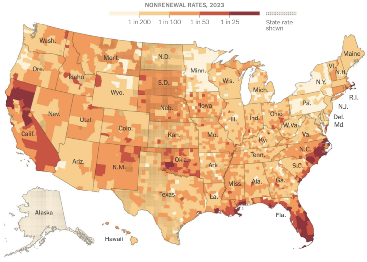
Because of a warming planet with more wildfires and hurricanes, it’s growing more common for insurance companies to stop insuring people with existing policies. For the New York Times, Christopher Flavelle, with analysis and graphics by Mira Rojanasakul, describes the coverage shift.
The consequences could be profound. Without insurance, you can’t get a mortgage; without a mortgage, most Americans can’t buy a home. Communities that are deemed too dangerous to insure face the risk of falling property values, which means less tax revenue for schools, police and other basic services. As insurers pull back, they can destabilize the communities left behind, making their decisions a predictor of the disruption to come.
Oh good.
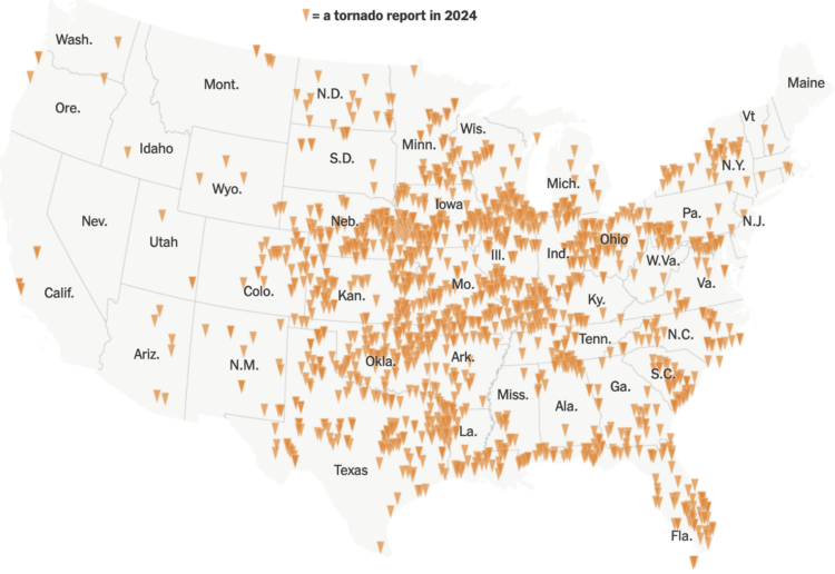
For the New York Times, Marco Hernandez visualized all the tornadoes in 2024, which amounted to more than the usual.
Not only were there more tornadoes reported, but 2024 is also on track to be one of the costliest years ever in terms of damage caused by severe storms, according to the National Center for Environmental Information. Severe weather and four tornado outbreaks from April to May in the central and southern United States alone cost $14 billion.
Oh good.
By just about every metric, flights are slower now than they were 30 years ago. However, the percentage of flights that arrive early is higher, based on an analysis by Ben Blatt for NYT’s Upshot.
Why do today’s flights arrive early more often, even though they’re slower? Airlines have extended their scheduled flight durations even more than the flights have lengthened in actual duration. The average scheduled duration from J.F.K. to Los Angeles has increased 23 minutes since 1995, according to an Upshot analysis of Bureau of Transportation Statistics data.
Publish a metric that involves money, and companies optimize for it somehow. In this case, the airlines lowered expectations to create a buffer.
 Visualize This: The FlowingData Guide to Design, Visualization, and Statistics (2nd Edition)
New tools, refined process.


