Stephen M. Stigler argues that data have a limited shelf life. The abstract:
Data, unlike some wines, do not improve with age. The contrary view, that data are immortal, a view that may underlie the often-observed tendency to recycle old examples in texts and presentations, is illustrated with three classical examples and rebutted by further examination. Some general lessons for data science are noted, as well as some history of statistical worries about the effect of data selection on induction and related themes in recent histories of science.
In a nutshell, while data itself doesn’t change, everything around it — the people who collected the data, the things that the data is about, and where the data came from — changes over time.


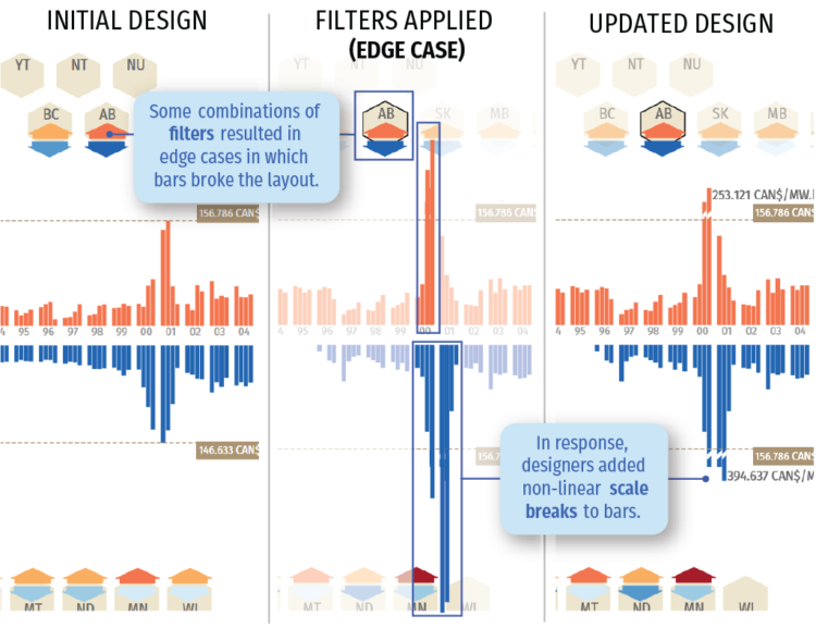
 Charts can reveal truths that we never would see otherwise, but they can also be misused to show us something in the data that doesn’t reflect reality.


 Visualize This: The FlowingData Guide to Design, Visualization, and Statistics (2nd Edition)


