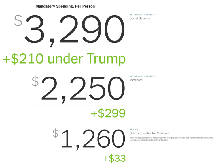
The redacted version (pdf) of the Mueller report was released today. Here’s the thumbnailed view for a sense of the redactions.
Read More
-
-
This week’s issue is public.
Hi,
Warning: This week’s issue talks about sexual harassment at DataCamp.
Read More -
Feeding off the words of John Tukey, Roger Peng proposes a search for better questions in analysis:
The goal in this picture is to get to the upper right corner, where you have a high quality question and very strong evidence. In my experience, most people assume that they are starting in the bottom right corner, where the quality of the question is at its highest. In that case, the only thing left to do is to choose the optimal procedure so that you can squeeze as much information out of your data. The reality is that we almost always start in the bottom left corner, with a vague and poorly defined question and a similarly vague sense of what procedure to use. In that case, what’s a data scientist to do?
Story of my life.
-
Notre-Dame in Paris, France was on fire. The New York Times describes what happened in a detailed yet concise information graphic. Made in only a day, a 3-D model provides the imagery, and rotation and zooming highlight the relevant points.
-
For The New York Times, Sahil Chinoy on privacy and how easy it is now to automate surveillance through public video feeds:
To demonstrate how easy it is to track people without their knowledge, we collected public images of people who worked near Bryant Park (available on their employers’ websites, for the most part) and ran one day of footage through Amazon’s commercial facial recognition service. Our system detected 2,750 faces from a nine-hour period (not necessarily unique people, since a person could be captured in multiple frames). It returned several possible identifications, including one frame matched to a head shot of Richard Madonna, a professor at the SUNY College of Optometry, with an 89 percent similarity score. The total cost: about $60.
A part of me finds this creepy. The other part wants to try out the system.
-
What percentage of households fall into lower-, middle-, and upper-income levels when you adjust for household size?
-
For The Upshot, Josh Katz, Kevin Quealy, and Margot Sanger-Katz, consulted economists to ask what the cost of Medicare for all might look like:
The proposals themselves are vague on crucial points. More broadly, any Medicare for all system would be influenced by the decisions and actions of parties concerned — patients, health care providers and political actors — in complex, hard-to-predict ways. But seeing the range of responses, and the things that all the experts agree on, can give us some ideas about what Medicare for all could mean for the country’s budget and economy.
The treemap shows the categories of spending, and the overall size of the treemap changes based on the total cost. Blast from the past.
-
The meaning of “middle-income” changes a lot depending on where you live and your household size.
-
Members Only
-
As many know (I hope), what we see on social media often doesn’t mirror real life. It’s a filtered and algorithmically-driven point of view. This grows problematic when people make decisions based solely on what they see through their feeds. For The Upshot, Nate Cohn and Kevin Quealy look at the contrasts between the filtered view and the real life view and how it factors into voting.
-
A few years back, The Washington Post illustrated every death in Game of Thrones. With the new season on the way, the death count is up and the graphics updated.
-
For the Washington Post, Kevin Schaul and Kevin Uhrmacher parsed the social media of Democrats:
A Washington Post analysis of more than 5,600 social media posts from March found significant differences in the issues that each candidate emphasized. While most candidates discussed social justice and health care, only a few talked much about foreign policy or immigration. No candidate made gun control a first or second priority in their social media strategy during the month.
I hope the Post explores how the issues change over time.
-
The New York Times illustrated what likely happened in the Ethiopian Airlines and Lion Air crashes. The walkthrough uses a picture of a plane, simple and clear annotation, and animation to help readers understand the dangers of a faulty sensor.
-
FiveThirtyEight uses forecasts to attach probabilities to politics and sports, and they get most of their attention before the events. After all, we don’t need a forecast after something happened. But forecasts aren’t useful if they don’t represent reality. So, FiveThirtyEight evaluated all of their projections.
-
Context makes data useful. Without it, it’s easy to get lost in numbers that mean little, but finding the context of data isn’t especially straightforward. Catherine D’Ignazio explains why it’s so hard and what data journalists (or anyone trying to understand data) can do about it:
First of all, data are typically collected by institutions for internal purposes and they’re not intended to be used by others. As veteran data reporter Tim Henderson, quoting Drew Sullivan, said to the NICAR community, “Data exists to serve the bureaucracy, not the journalist”. The naming, structure and organisation of most datasets are done from the perspective of the institution, not from the perspective of a journalist looking for a story. For example, one semester my students spent several weeks trying to figure out the difference between the columns ‘PROD.WASTE(8.1_THRU_8.7)’ and ‘8.8_ONE-TIME_RELEASE’ in a dataset tracking the release of toxic chemicals into to the environment by certain corporations. This is not an uncommon occurrence!
-
The Economist charted the divisions within political parties using Brexit votes as proxy. I’m here for the bubbles.
-
There is a lot of Census data. You can grab most of the recent aggregates through the American FactFinder or via FTP or some obscure Census page that hasn’t been updated in a decade. It’s, uh, not always the best experience. The Census Data Downloader from the Los Angeles Times data desk is a Python library that streamlines the download process, if just a little bit.
The main added value comes from a way to use existing definitions or make your own to download tables as CSV. That way you get readable headers instead of meaningless table codes.
-
Using estimates from a study on regional bias in tax audits, ProPublica mapped the likelihood of getting audited by the IRS. They then turn their attention to Humphreys County, Mississippi:
In a baffling twist of logic, the intense IRS focus on Humphreys County is actually because so many of its taxpayers are poor. More than half of the county’s taxpayers claim the earned income tax credit, a program designed to help boost low-income workers out of poverty. As we reported last year, the IRS audits EITC recipients at higher rates than all but the richest Americans, a response to pressure from congressional Republicans to root out incorrect payments of the credit.
-
Matt Hong used a stacked bar chart over time as the frame for a data comic about American time use. Each row represents a 2-hour window during the day, and each stack represents the percentage of Americans doing an activity: sleep, work, free, and other. The activity with the highest percentage gets a highlight.
As a fan of time use data, this is totally my jam. Also, the data comic space is underutilized.
-
Everyone’s story is a little different. Alyssa Fowers tracked her long-distance relationship in the context of the temperature between two locations and the travel to and from.