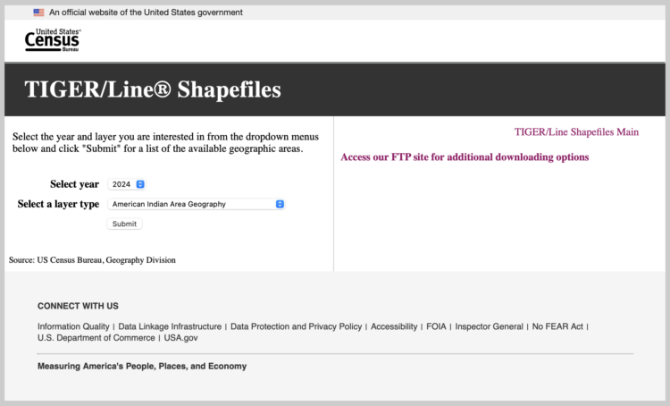
• Membership
  • Newsletter
  • Projects
  • Learning
  • About
  • Member Login
  • Year of tornadoes

    December 26, 2024

    Topic

    Maps  /  New York Times, tornado

    For the New York Times, Marco Hernandez visualized all the tornadoes in 2024, which amounted to more than the usual.

    Not only were there more tornadoes reported, but 2024 is also on track to be one of the costliest years ever in terms of damage caused by severe storms, according to the National Center for Environmental Information. Severe weather and four tornado outbreaks from April to May in the central and southern United States alone cost $14 billion.

    Oh good.

  • More time on the plane, but more flights arriving early

    December 24, 2024

    Topic

    Statistics  /  airlines, schedule, Upshot

    By just about every metric, flights are slower now than they were 30 years ago. However, the percentage of flights that arrive early is higher, based on an analysis by Ben Blatt for NYT’s Upshot.

    Why do today’s flights arrive early more often, even though they’re slower? Airlines have extended their scheduled flight durations even more than the flights have lengthened in actual duration. The average scheduled duration from J.F.K. to Los Angeles has increased 23 minutes since 1995, according to an Upshot analysis of Bureau of Transportation Statistics data.

    Publish a metric that involves money, and companies optimize for it somehow. In this case, the airlines lowered expectations to create a buffer.

  • When cities last saw snow on Christmas

    December 23, 2024

    Topic

    Maps  /  Bloomberg, Christmas, climate, snow

    Christmas is coming. For some, that means snow on the ground, but as areas get less snow than in previous years, that means more regular Christmases than White Christmases in the United States. For Bloomberg, Denise Lu mapped the last time cities had at least one inch of snow fall or accumulation.

    Compared to Christmases since 1970, last year’s holiday had the lowest average snow on the ground across the continental US. The chance for a white Christmas this year may be higher than last year, according to AccuWeather, but many areas will likely still not see any snow.

    Bonus points for the shoveler with a Santa hat that doubles as a progress bar:

    This is in contrast to the Washington Post piece from last week. WaPo used similar data from NOAA but highlighted cumulative snowfall instead of the lack of it.

  • Data Advent Calendar

    December 23, 2024

    Topic

    Data Art  /  Advent, embroidery, Jordan Cunliffe

    Jordan Cunliffe uses embroidery to explore and visualize data. This year, headed towards Christmas, he’s been posting one stitch per day for a Data Advent Calendar.

  • Counting the Christmas days with snow

    December 20, 2024

    Topic

    Maps  /  Christmas, snow, Washington Post, weather

    This is a fun one by Dylan Moriarty for the Washington Post. Punch in your city to see the percentage of Christmas days (or Hanukkah, New Year’s Eve, or Winter Solstice) since 1940 when it snowed.

    It’s nice and corny like it should be, with holiday illustrations and snow falling on the screen. There’s even a data postcard that you can download and share with all your friends and family, because they will most definitely be interested.

    Maybe it’s just the movies telling me so, but there’s something special about snow falling, holiday lights, Christmas music playing in the background, and a warm drink in hand.

  • Map of walkable neighborhoods

    December 20, 2024

    Topic

    Maps  /  city, local, walking

    Researchers at Sony Computer Science Laboratories in Rome estimated the time it takes to walk to places for amenities such as education, healthcare, and restaurants:

    Proximity-based cities have attracted much attention in recent years. The ‘15-minute city’, in particular, heralded a new vision for cities where essential services must be easily accessible. Despite its undoubted merit in stimulating discussion on new organization of cities, the 15-minute city cannot be applicable everywhere, and its very definition raises a few concerns. Here we tackle the feasibility and practicability of the 15-minute city model in many cities worldwide. We provide a worldwide quantification of how close cities are to the ideal of the 15-minute city. To this end, we measure the accessibility times to resources and services, and we reveal strong heterogeneity of accessibility within and across cities, with a pivotal role played by local population densities.

    Check your city on the interactive map. The Washington Post has a version that is easier to use, but it only shows the data for a subset of cities in the United States, whereas the Sony map shows cities around the world with more granular breakdowns.

  • Members Only

    Visualization Tools and Resources, December 2024 Roundup

    December 19, 2024

    Topic

    The Process  /  roundup

    Here’s the good stuff for the month: things to use, things to poke at, and things to learn from.

  • Probability does not exist

    December 19, 2024

    Topic

    Statistics  /  David Spiegelhalter, probability, uncertainty

    Probability itself is an expression of uncertainty, but the calculations behind the percentages can seem objective. David Spiegelhalter argues that this is impossible:

    My argument is that any practical use of probability involves subjective judgements. This doesn’t mean that I can put any old numbers on my thoughts — I would be proved a poor probability assessor if I claimed with 99.9% certainty that I can fly off my roof, for example. The objective world comes into play when probabilities, and their underlying assumptions, are tested against reality (see ‘How ignorant am I?’); but that doesn’t mean the probabilities themselves are objective.

    Some assumptions that people use to assess probabilities will have stronger justifications than others. If I have examined a coin carefully before it is flipped, and it lands on a hard surface and bounces chaotically, I will feel more justified with my 50–50 judgement than if some shady character pulls out a coin and gives it a few desultory turns. But these same strictures apply anywhere that probabilities are used — including in scientific contexts, in which we might be more naturally convinced of their supposed objectivity.

    Riffing off George E. P. Box’s “All models are wrong, but some are useful”, Spiegelhalter concludes, “In our everyday world, probability probably does not exist — but it is often useful to act as if it does.”

  • Elon Musk’s posting (and sleep) schedule

    December 19, 2024

    Topic

    Statistical Visualization  /  Economist, Elon Musk, Twitter

    Not to dwell on Musk, but I was reminded of this dot plot by the Economist that shows when he posted on Twitter/X and how much. The volume picked up a bit post-acquisition.

  • Online reach of Elon Musk on X

    December 19, 2024

    Topic

    Statistical Visualization  /  Elon Musk, social media, Washington Post, X

    As you can imagine, Elon Musk, the owner of X, has a prominent influence on the social media platform. For the Washington Post, Jeremy B. Merrill, Trisha Thadani, and Kevin Schaul show the scale through view counts (on the x-axis) and time since posting (on the y-axis).

    I’m not sure how much I trust view count accuracy on X, but you can at least see the relative weights of what the company wants you to see.

    Mostly, I put this here for the flaming data point at the beginning of the piece and to highlight how it reminds me of the interactive by Periscopic a few years back. It starts with a single point for the anecdote and then multiplies for the patterns.

  • Data Underload  /  chains, grocery

    Network of Supermarket Chains

    Here’s the current landscape of supermarket parent companies and their subsidiaries — national chains, regional, local, co-ops, specialty, ethnic, and discount.

    Read More
  • Multiplication mistake leads to exaggerated plastic cautions

    December 17, 2024

    Topic

    Mistaken Data  /  baseline, plastic, research

    There was a brouhaha a couple months ago over research that suggested black plastic spatulas spew poison into our food. The problem is that there was a basic arithmetic mistake that made the results seem a lot worse than they actually were. For National Post, Joseph Brean reports:

    The paper correctly gives the reference dose for BDE-209 as 7,000 nanograms per kilogram of body weight per day, but calculates this into a limit for a 60-kilogram adult of 42,000 nanograms per day. So, as the paper claims, the estimated actual exposure from kitchen utensils of 34,700 nanograms per day is more than 80 per cent of the EPA limit of 42,000.

    That sounds bad. But 60 times 7,000 is not 42,000. It is 420,000. This is what Joe Schwarcz noticed. The estimated exposure is not even a tenth of the reference dose. That does not sound as bad.

    They had a per-unit baseline they could compare against to gauge if their estimates were good, bad, or dangerous. To scale up to typical human body weight, they had to multiply, but they missed a zero somewhere.

    Red flags should’ve flown immediately when they saw 80% of the safe limit. Just a quick double check to see if they made a mistake. The researchers said they made a typo, but I wonder where and when they made that typo. While writing the paper? While calculating? While recording the data?

    The irony is that a bunch of people probably tossed their black kitchenware and will now go buy more plastic after finding out it wasn’t so bad after all. The researchers were trying to communicate the opposite.

  • Military location data that anyone can buy legally

    December 16, 2024

    Topic

    Data Sharing  /  location, military, privacy, Wired

    For Wired, Dhruv Mehrotra and Dell Cameron, in collaboration with Bayerischer Rundfunk and Netzpolitik.org, check out location data for overseas military personnel that is probably too easy to buy. The data from a broker is primarily meant for marketing purposes so that companies can better target ads, but there isn’t exactly a strict vetting process for where the money comes from.

    Sooo, this seems not very good.

  • More milk, fewer cows

    December 13, 2024

    Topic

    Statistical Visualization  /  cows, milk, Works in Progress

    For Works in Progress, Jared Hutchins explains how milk production increased per cow, a combination of artificial insemination, cryogenic preservation, and more data.

    Note the dual axes in the chart above. The left y-axis shows total dairy cows, and the right shows average yield per cow. The natural next question: Did total milk production also increase with fewer cows? Yes.

    In 1945, there were over 25 million dairy cattle in the United States; by 1980, the number had dropped by more than half to just over ten million. And the dairy industry as a whole became more productive. Between 1940 and 1982, the total supply of milk increased by a third, even as the number of dairy cows in the US halved.

    I’m going to assume that we’d see similar patterns with other livestock and crops. Which has been moneyballed the hardest?

  • Members Only

    Exploring Empty Spaces

    December 12, 2024

    Topic

    The Process  /  missing data

    Usually we focus on actual data points for insights, but we can also highlight the spaces between for a flipped point of view.

  • How mpox virus spreads

    December 12, 2024

    Topic

    Statistical Visualization  /  mpox, Reuters, virus

    For Reuters, Arathy J Aluckal, Jitesh Chowdhury, and Vijdan Mohammad Kawoosa illustrate how the mpox virus spreads, its variants, and who it affects.

    The last chart in the article, shown above, struck me as familiar but took me a second. It’s a pyramid chart that puts women on the left and men on the right. The y-axis represents age groups. You can see the contrast between those infected in the African region (men and women somewhat evenly) and the rest of the world (almost all men). The variant in Africa can spread through close contact.

  • “All I Want for Christmas Is You” spreads to earlier months

    December 11, 2024

    Topic

    Statistical Visualization  /  Christmas, Mariah Carey, NBC News, song

    For NBC News, Joe Murphy shows the play rate on Last.fm for Mariah Carey’s “All I Want for Christmas Is You” as a set of calendar heatmaps, since 2006.

    The song was released in October 1994. The data doesn’t go back that far, but I’d wager it played mostly in December, and then plays kept shifting earlier until leaking in to August. I’m looking forward to a couple decades from now when I can remind the young folks that this wasn’t always an Easter song.

  • Data Underload  /  healthcare, insurance

    Where Health Insurance Comes From in the United States

    About half of people have private health insurance through an employer. However, the other half get their insurance from elsewhere or through a combination of sources. This is where everyone gets their coverage from.

    Read More
  • Words that do not appear in literature

    December 10, 2024

    Topic

    Statistical Visualization  /  literature, Martin Wattenberg

    Word clouds show key terms or phrases that appear in a body of text. Everyone loves them. Martin Wattenberg turned it around to show the words that do not appear, with words sized by how often they appear in other text. This is the anti-tag cloud for Winnie the Pooh:

    Fun. I wonder if the same logic can apply to other types of missing data.

  • Sitting vs. standing jobs

    December 9, 2024

    Topic

    Infographics  /  Alvin Chang, Pudding, sitting, standing, work

    Some jobs require a lot of standing, crouching, and climbing, whereas other jobs require little movement and you sit all day, turning into a sloth-like creature that gets up sometimes to eat and go to the toilet. I’m not projecting, you are.

    For the Pudding, Alvin Chang visualized the spectrum of sitting and standing jobs. The interactive version lets you zoom in to pixel art characters working their jobs within force-directed capsules. While the interactive is fun and good for exploration, the video version provides a more narrative tone with Chang narrating:

    [arve url=”https://www.youtube.com/watch?v=sE_Ew0Be4qE” /]

    I think I like the video version better for the clear direction. I’m a nerd and get distracted by the interaction too easily.

    Check out the data yourself. It’s from the Occupational Requirements Survey by the Bureau of Labor Statistics.

  • Page 12 of 391
  • <
  • 1
  • ...
  • 9
  • 10
  • 11
  • 12
  • 13
  • 14
  • ...
  • 391
  • >

Analyze, visualize, and communicate data usefully, beyond the defaults.

Become a member →

Recently for Members

May 8, 2025
When the data is not what it seems

May 1, 2025
Finding the Right Charts

April 24, 2025
Visualization Tools, Datasets, and Resources – April 2025 Roundup

April 17, 2025
Breaking Out of Chart Software Defaults

April 15, 2025
Line Chart with Decorative Neon Accents

Browse by Chart Type See All →

Line Map Moving Bubbles Donut Chart Network Graph Spiral Chart Stacked Area Chart Chord Diagram Timeline Beeswarm

Browse By Topic

  • Visualization

    Seeing data

  • Maps

    Seeing geographic data

  • Infographics

    Explaining data

  • Networks

    Connecting data

  • Statistics

    Analyzing data

  • Software

    Working with data

  • Sources

    Getting data

  • Design

    Making data readable

Get the Book

Visualize This: The FlowingData Guide to Design, Visualization, and Statistics

Available now.

Order: Amazon / Bookshop

Made by FlowingData

  • The Process

  • Data Underload

  • Chart Everything

  • Guides

  • Books

  • Shop

  • About
  • Contact
  • Newsletter
  • LinkedIn
  • Instagram
  • Bluesky
  • RSS
Copyright © 2007-Present FlowingData. All rights reserved.