Will Chase, who specialized in visualization for epidemiological studies in grad school, outlined why he won’t make charts showing Covid-19 data:
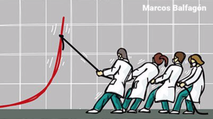
So why haven’t I joined the throng of folks making charts, maps, dashboards, trackers, and models of COVID19? Two reasons: (1) I dislike reporting breaking news, and (2) I believe this is a case of “the more you know, the more you realize you don’t know” (a.k.a. the Dunning-Kruger effect, see chart below). So, I decided to watch and wait. Over the past couple of months I’ve carefully observed reporting of the outbreak through scientific, governmental, and public (journalism and individual) channels. Here’s what I’ve seen, and why I’m hoping you will join me in abstaining from analyzing or visualizing COVID19 data.
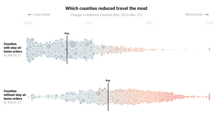
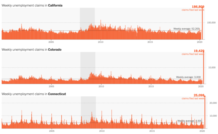
There’s so much uncertainty attached to the data around number of deaths and cases that it’s hard to understand what it actually means. This takes a high level of context in other areas on the ground. On top of that, people are making real life decisions based on the data and charts they’re seeing.
So while I think a lot of the charts out there are well-meaning — people under stay-at-home trying to help the best way they know how — it’s best to avoid certain datasets. As Chase describes, there are other areas of the pandemic to point your charting skills towards.
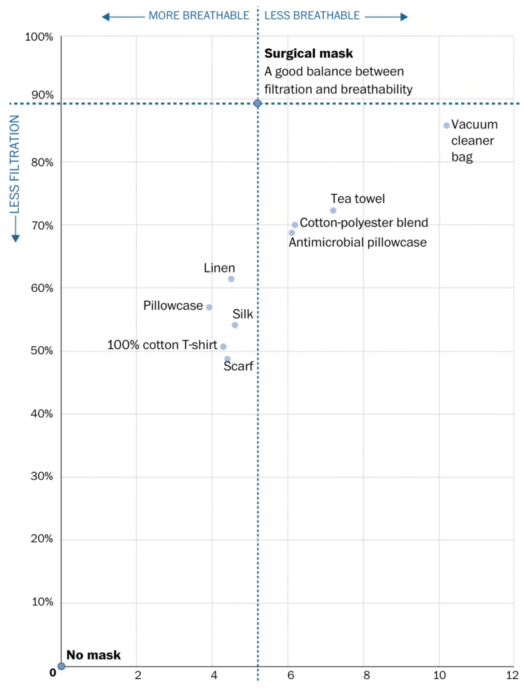
See also: responsible coronavirus charts and responsible mapping.
 Visualize This: The FlowingData Guide to Design, Visualization, and Statistics (2nd Edition)


