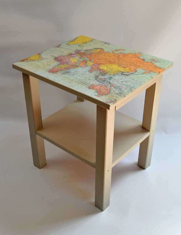
All you need is an old table, gift wrapping paper, and some varnish. I’m gonna have to do this. [via @datavisFriendly]
All you need is an old table, gift wrapping paper, and some varnish. I’m gonna have to do this. [via @datavisFriendly]
In April 2020, the Bureau of Labor Statistics estimated a national unemployment rate of 14.7%. It wasn’t just the rate itself but how fast it spiked.

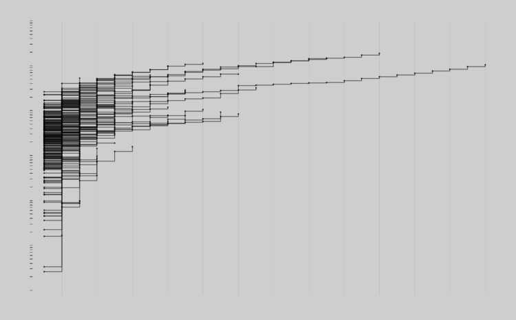
As a 100-day project, Alli Torban has been imagining what a data visualization designer’s wallpaper might look like through the years. She started in 1920, and with one design per year, she’s up to 1989.
The focus on aesthetics shows slow shifts in colors and patterns through time. Although I feel like the early 1980s, when The Visual Display of Quantitative Information was first published, should look super minimalist with a lot of space.
Good stuff.

Robert Hodgin built a procedural system he calls Meander to generate the beauty above, among several others:
My all-time favorite map-based data visualization was created in 1944. Harold Fisk, working with the US Army Corp. of Engineers, mapped the length of the Mississippi River. What sets his visualization apart from others is that he maps the river through time, and manages to do so in a way that is both beautiful and surprisingly effective. I want to pay homage to his series of maps by creating my own system for procedurally generating maps of meandering rivers.
Great.
Not only is the winding path imaginary, but so is the terrain, the place names, and the built-up lakes.
See also: the 1944 Fisk map that inspired Hodgin’s work, which is an interesting contrast against modern satellite imagery animations.
The right baseline provides a way to compare everything else in a useful way. The wrong baseline makes the rest of the data useless.
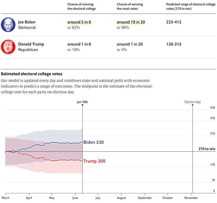
The Economist launched their 2020 elections forecast. Right now a part of my brain is telling me to avoid election forecasts this year, but the other part of me is like, don’t fight it, you know you’re going to look.
At least The Economist put their modeling code up on GitHub (implemented in R and Stan) and is publishing their polling data (linked at the bottom of the forecast page as a Google sheet).
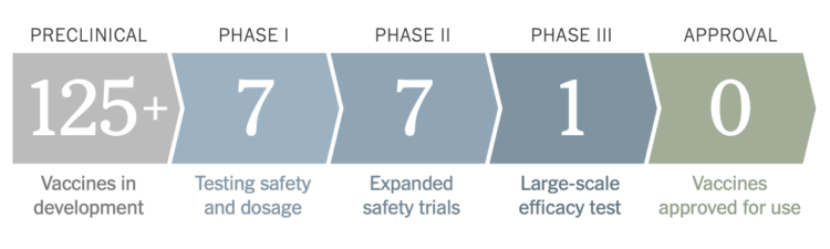
As we know, it typically takes years to develop a vaccine that is approved for wide scale use. For the coronavirus, researchers are trying to speed up that timeline. Jonathan Corum and Carl Zimmer for The New York Times have started a vaccine tracker to keep watch.
They’ve categorized the vaccines by phase and those that are part of Operation Warp Speed. (Earmarked for later: a closer look at government program names.)
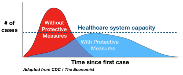
I know it seems like ages ago when we were talking about flattening the curve, but it was a rallying cry at some point. The charts that started it all weren’t particularly fancy or something to admire. For Mother Jones, Abigail Weinberg wondered why it still worked:
There were axes and legends, and Drew Harris, a professor of population health, would later add a line representing the capacity of the health care system, but in truth there was nothing particularly rigorous about the chart. It was a work of the imagination, too artless to be art but lacking the hard empiricism we expect of science. That in-betweenness is what made it so effective.
At the time, there were so many unknowns that projections seemed hard to grasp onto. But the visual concreteness of a chart, even though it was abstract and not based on actual data, seemed to be just enough certainty.
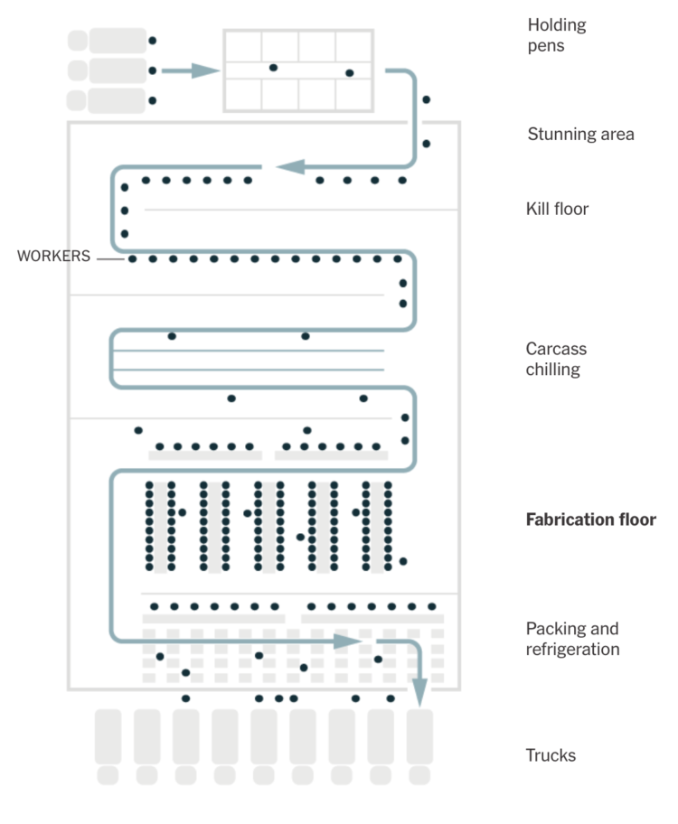
To reopen safely, meatpacking plants have to take precautions to provide space and separation for workers. But the process typically involves a lot of people working close together. The New York Times illustrates the process and the challenges moving forward.
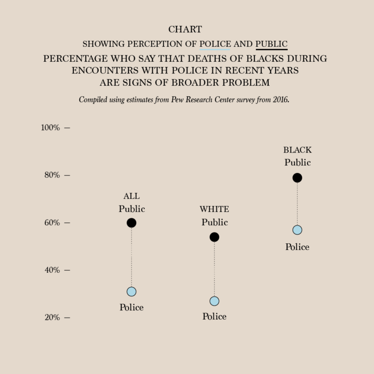
The numbers are from a survey by the Pew Research Center conducted in 2016. I suspect the percentages are higher right now, but the gaps between police and public perception seem to say a lot. It’s easy to see where “one bad apple” comes from.
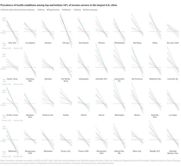
A large proportion of those who died from Covid-19 had pre-existing medical conditions. The percentage of those who have pre-existing medical conditions changes a lot by income group. Based on estimates from the Centers for Disease Control and Prevention, we can see by how much. For New York Times Opinion, Yaryna Serkez charted the difference for the largest cities in the United States.
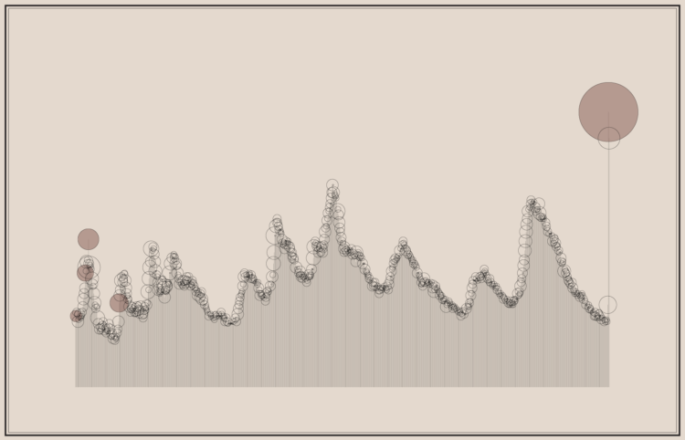
Pen plotters slowly draw out a picture line-by-line, so when you watch a chart plot out, it shows up on the paper one piece at a time. Silfa Huttner and Duncan Geere’s use this unraveling “feature” in Plottervision. In the video above, they describe fluctuating oil prices.
Pen plotters are all the rage these days. I think it must be some combination of pressure and time. That’s all it takes really. Pressure and time.
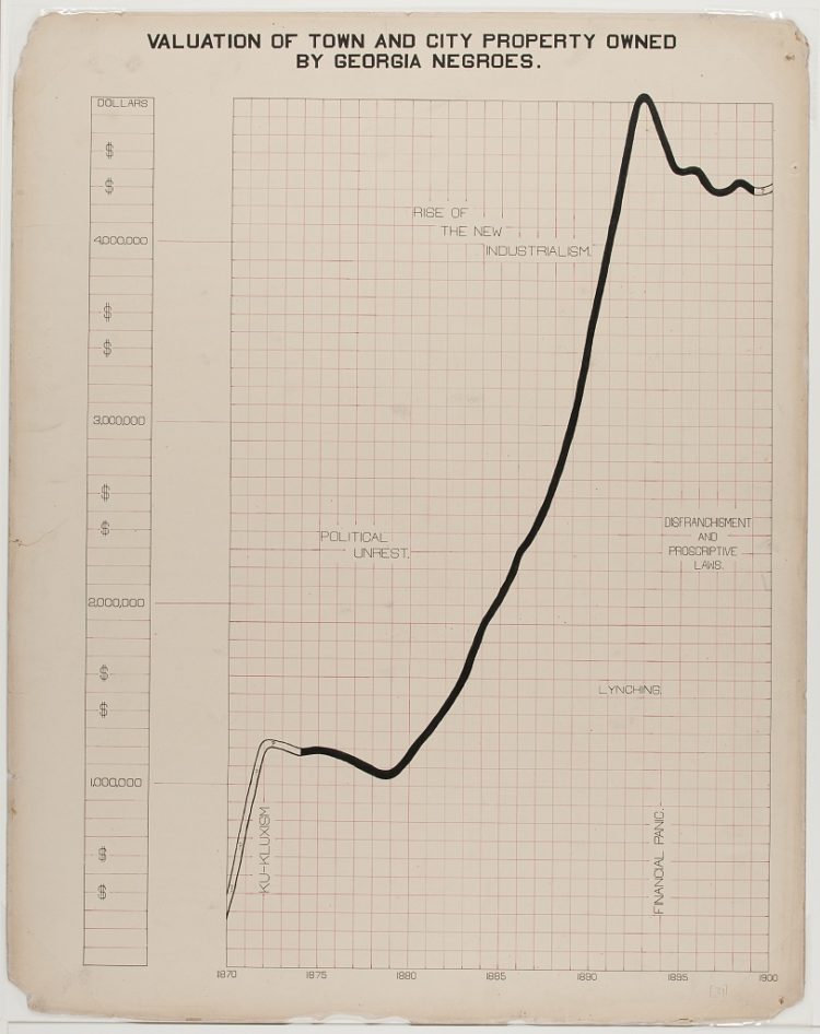
The visualization work of W.E.B. Du Bois and his students has been on FD before, but it’s worth another look. In 1900, they put together a series of charts for a Paris exhibition visualizing black America. You can access the collection via the Library of Congress.
If you’re looking for more context for the charts and the times, Whitney Battle-Baptiste and Britt Rusert wrote about the history and motivations in W.E.B. Du Bois’s Data Portraits: Visualizing Black America. On the line chart above:
What appears to be another straightforward line chart is one of the most overtly political charts in the Georgia study. An undulating black line shows extrapolated property values in outline and actual property values in solid black crossing a red grid of squares. Tucked into the grid is a series of disquieting socioeconomic and political trends: the rise of the Ku Klux Klan and political unrest in the 1870s; new industrialism in the 1880s; followed by lynching, financial panic, disenfranchisement, and proscriptive laws in the 1890s. The diagram powerfully links the economic progress of black Georgians to larger regimes of violence against African Americans, pointing to the widespread disenfranchisement and dispossession of black people in the post-Reconstruction era.
Again, this is from 1900.
Maddy Varner reporting for The Markup:
“All protesting and all marches are a series of balancing acts of different priorities and acceptable risks,” said Mason Donahue, a member of Lucy Parsons Labs, a Chicago-based group of technologists and activists that run digital security training classes and have investigated the Chicago Police Department’s use of surveillance technology. “There is a lot of communication ability that goes away if you don’t bring a phone period,” he said.
So if you’re going to take your phone, you might want to do some of the following things to minimize risk.
These are straightforward items like installing an app or changing a setting on your phone, so it should only take a few minutes before you step out.
The New York Times reports on how the CDC struggled and failed on many levels. On the data front, where it was so important in the beginnings to gauge what was about to happen, the CDC failed to get accurate data to the people who needed to make decisions quickly:
The C.D.C. could not produce accurate counts of how many people were being tested, compile complete demographic information on confirmed cases or even keep timely tallies of deaths. Backups on at least some of these systems are made on recordable DVDs, a technology that was state-of-the-art in the late 1990s.
The result is an agency that had blind spots at just the wrong moment, limited in its ability to gather and process information about the pathogen or share it with those who needed it most: front-line medical workers, government health officials and policymakers.
Painful.
Also, a little too familiar.
In 2014, I wrote a guide on how to make government data sites better. I used the CDC data offerings as my running example.
I criticized how hard it was to get data in a usable format, how the extraction tools were a chore to use, the lack of context to go with the data, and the challenge of just finding the data on a sprawling website.
The kicker at the end:
There’s plenty more stuff to update, especially once you start to work with the details, but this should be a good place to start. It’s a lot easier to point out what you can do to improve government data sharing than it is to actually do it of course. There are so many people, policies, and oh yes, politics, that it can be hard to change.
Maybe give it a try anyway.
Seek out the people who care.
Maybe start with an area you are already strong, improve on it, and branch from there. In the case of CDC, a start with WONDER or Data.CDC might be where it’s at. Or maybe start by unifying the topic pages and all those spreadsheets.
As an outsider looking in, I can’t say for sure the best place to start. I don’t know all the administrative baggage that comes with updating these sites. I would just hate to come back to this five years from now and see that nothing changed or worsened because of age.
Nothing changed. And it worsened with age.

There’s a lot of misinformation passing through the internets right now. A lot. Connie Jin, for NPR, made a comic that explains how to spot it.
I suspect FD readers are better than average at staying skeptical, but maybe pass this along to the family members who aren’t so good and picking out what is real and not.
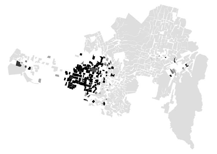
It’s hard to think of much else. These maps show the racial divide between black and white people in major cities.

We like to complain about how data is messy, not in the right format, and how parts don’t make sense. Reality is complicated though.

The Census Bureau has been running the Household Pulse Survey since April 23, 2020 to get some gauge for how the pandemic is changing things at home. Here’s how things look so far.
 Visualize This: The FlowingData Guide to Design, Visualization, and Statistics (2nd Edition)
New tools, refined process.