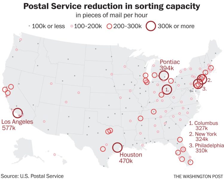
Reporting for The New York Times, Giovanni Russonello on the decennial census during these times:
If households can’t be reached, even by enumerators, then census takers rely on a process known as imputation — that is, they use data from demographically similar respondents to take a best guess at what the missing data ought to say.
“This year I can imagine imputation being much higher, and that will itself be a source of controversy — because imputation involves assumptions,” Dr. Miller said. “No matter what you do at that point, you’re going to have a bunch of places around the country that are unhappy with the numbers, and are going to sue. So there’s going to be a lot of controversy around this.”
Where more imputation is needed, Dr. Miller said, the door opens a bit wider for statistical wrangling — and, potentially, more political influence.
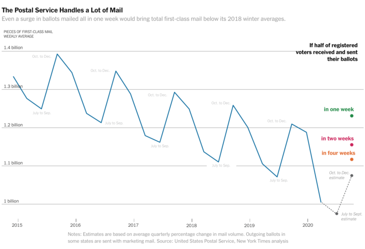
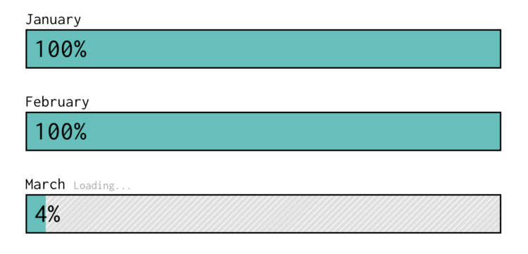
In 2010, 74 percent of households responded. This year, with only about a month left, 63 percent have responded.
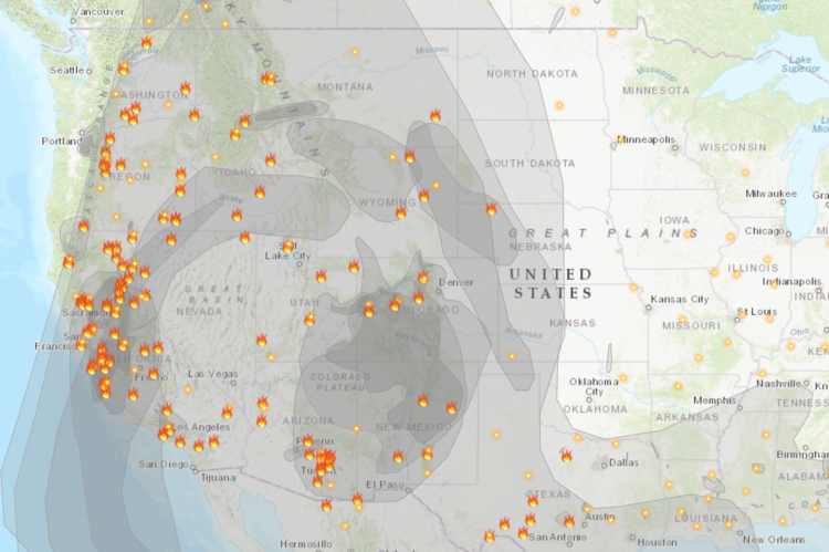
In a time when data is ubiquitous and affects so many things that we do, the census count grows more uncertain. Strange.


 Visualize This: The FlowingData Guide to Design, Visualization, and Statistics (2nd Edition)


