
Here are some useful distractions for you as you stay-at-home and wait for an unknown amount of time.
Here are some useful distractions for you as you stay-at-home and wait for an unknown amount of time.
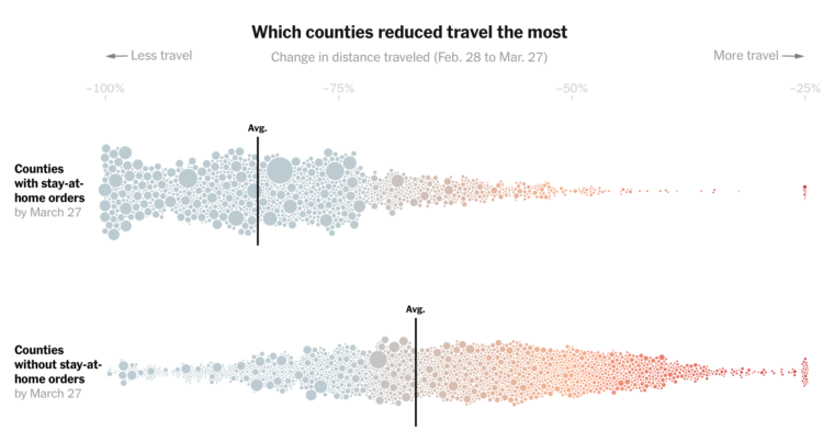
Based on cellphone data from Cuebiq, The New York Times looked at how different parts of the country reduced their travel between the end of February and the end of March. Some counties really stayed at home. Some not so much:
In areas where public officials have resisted or delayed stay-at-home orders, people changed their habits far less. Though travel distances in those places have fallen drastically, last week they were still typically more than three times those in areas that had imposed lockdown orders, the analysis shows.
The streets are quiet here in northern California, so this is pretty shocking for me. If you can, stay at home, folks. It’s inconvenient, but it’s a small sacrifice for something much bigger.
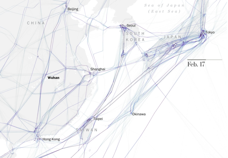
As you would expect, not many people are flying these days. The Washington Post mapped the halts around the world:
On Tuesday, the TSA screened just over 146,000 passengers at U.S. airports, a 94 percent plunge from 2.4 million on the same day last year. By the end of March, the TSA screened just over 35 million passengers at U.S. airports during the month, a 50 percent decrease from more than 70 million at the end of March last year.
At this point, I would gladly wait a couple of hours in a security line for just a taste of normalcy.
Fatalities from Covid-19 range from the hundreds of thousands to the millions. Nobody knows for sure. These predictions are based on statistical models, which are based on data, which aren’t consistent and reliable yet. FiveThirtyEight, whose bread and butter is models and forecasts, breaks down the challenges of making a model and why they haven’t provided any.
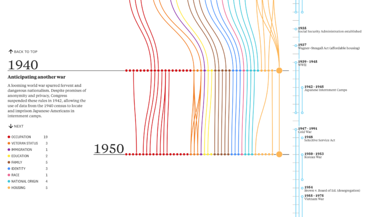
On the surface, the decennial census seems straightforward. Count everyone in the country and you’re done. But the way we’ve done that has changed over the decades. The Pudding and Alec Barrett of TWO-N looked at the changes through the lens of questions asked:
We looked at every question on every census from 1790 to 2020. The questions—over 600 in total—tell us a lot about the country’s priorities, norms, and biases in each decade. They depict an evolving country: a modernizing economy, a diversifying population, an imperfect but expanding set of civil and human rights, and a growing list of armed conflicts in its memory. What themes and trends will you notice?
3Blue1Brown goes into more of the math of SIR models — which drive many of the simulations you’ve seen so far — that assume people are susceptible, infectious, or recovered.

Maybe you’re starting to run low. Here’s how much you’ll need when you go to restock.
Comprehensive national data on Covid-19 has been hard to come by through government agencies. The New York Times released their own dataset and will be updating regularly:
The tracking effort grew from a handful of Times correspondents to a large team of journalists that includes experts in data and graphics, staff news assistants and freelance reporters, as well as journalism students from Northwestern University, the University of Missouri and the University of Nebraska-Lincoln. The reporting continues nearly all day and night, seven days a week, across U.S. time zones, to record as many details as possible about every case in real time. The Times is committed to collecting as much data as possible in connection with the outbreak and is collaborating with the University of California, Berkeley, on an effort in that state.
You can download the state- and county-level aggregates on GitHub.

A comic by Marcos Balfagón attaches action to the curve.

Every month I collect useful visualization tools and resources to help you work better or more efficiently. Here’s the good stuff for March.
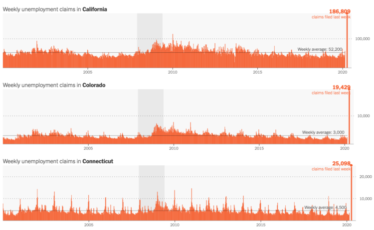
The Department of Labor released the numbers for last week’s unemployment filings. 3.28 million for the country. For The New York Times, Quocktrung Bui and Justin Wolfers show the numbers relative to the past and a breakdown by state:
This downturn is different because it’s a direct result of relatively synchronized government directives that forced millions of stores, schools and government offices to close. It’s as if an economic umpire had blown the whistle to signal the end of playing time, forcing competitors from the economic playing field to recuperate. The result is an unusual downturn in which the first round of job losses will be intensely concentrated into just a few weeks.
You can find the recent data here.
The numbers are fuzzy. You take them at face value, and you end up with fuzzy interpretations. Starting at the end of this month, Johns Hopkins is providing a two-week epidemiology course on understanding these numbers better:
This free Teach-Out is for anyone who has been curious about how we identify and measure outbreaks like the COVID-19 epidemic and wants to understand the epidemiology of these infections.
The COVID-19 epidemic has made many people want to understand the science behind pressing questions like: “How many people have been infected?” “How do we measure who is infected?” “How infectious is the virus?” “What can we do?” Epidemiology has the tools to tell us how to collect and analyze the right data to answer these questions.
Yes.
Wade Fagen-Ulmschneider made a set of interactive charts to track confirmed coronavirus cases. Switch between regions and scales. See the data normalized for population or not. See trends for active cases, confirmed cases, deaths, and recoveries.
Usually this much chartage and menu options would seem overwhelming. But by now, many of us have probably seen enough trackers that we’re ready to shift away from consumption into exploratory mode.
The data behind this tracker, like many others, is from the Johns Hopkins University Center for Systems Science and Engineering (JHU CSSE). They’ve been updating their repository daily on GitHub.
I read and read and read and read. But almost everything I read about is out of my control, so I’m turning more energy towards things that I can control. I’m keeping my distance. Supporting local. Writing. Poking at data. Making charts.
It’s going to get better, and we will get through this.
A chart from Business Insider makes a poor attempt to compare the death rates, by age, for the common flu against Covid-19:
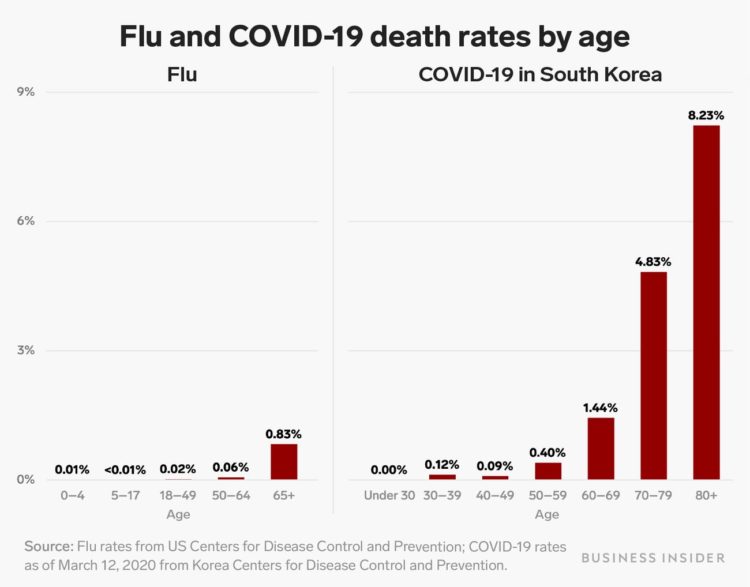
The age groups on the horizontal axes are different, so you can’t make a fair side-by-side comparison. For example, the flu chart has a 50-64 age group. The Covid-19 chart has a 50-59 group and a 60-69 group.
Ann Coulter’s interpretation of the chart might be worse than the chart itself:
For people under 60, coronavirus is LESS dangerous than the seasonal flu: pic.twitter.com/3EFzUSaOVo
— Ann Coulter (@AnnCoulter) March 24, 2020
No.
The values for people under 60, other than for the “under 30” group, are greater for Covid-19 than for the flu. Coulter’s interpretation is wrong no matter which way you cut it. Also, the article that the chart comes from points out the opposite.
I get it. It’s Twitter. There will be mistakes. But at least correct or delete them, instead of dangling it out there for people to spread.
For those making charts, please think about how others will interpret them. These are weird times and we don’t need to add more confusion. For those sharing charts, please think for a second before you put it out there.
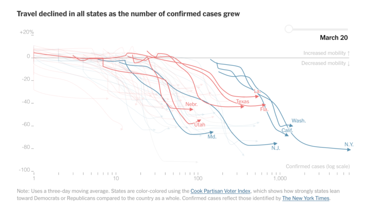
Stuart A. Thompson and Yaryna Serkez for New York Times Opinion on decreasing movement, based on mobile phone data:
The impact of social distancing and work-from-home measures has been captured using data on smartphone movements, an analysis of which was provided to the Times Opinion section by Descartes Labs, a geospatial analysis company.
The data shows how states hit hard by the virus, like New York, California and Washington, have seen travel plummet. But other states with fewer confirmed infections have seen smaller declines, presenting challenges for controlling the spread of the virus.
If you can: stay at home, stay at home, stay at home. Keep going.
As an aside, this is an interesting juxtaposition to privacy concerns over mobile data used for less than honorable purposes. From Descartes Labs, who analyzed the data for NYT:
Location data, as reported by mobile devices, is a powerful resource to understand our world and monitor aggregate change in human behavior in times of crisis. While there are legitimate privacy concerns associated with location data, Coronavirus demonstrates that there are important applications for this data to address some of the more vexing challenges we face in a world where society and economies are more complicated than ever before. Consistent with industry norms, we source data that is de-identified, and we do not use it to identify an individual. All resulting analysis is then statistically aggregated, removing the ability to characterize the behavior of any single device.
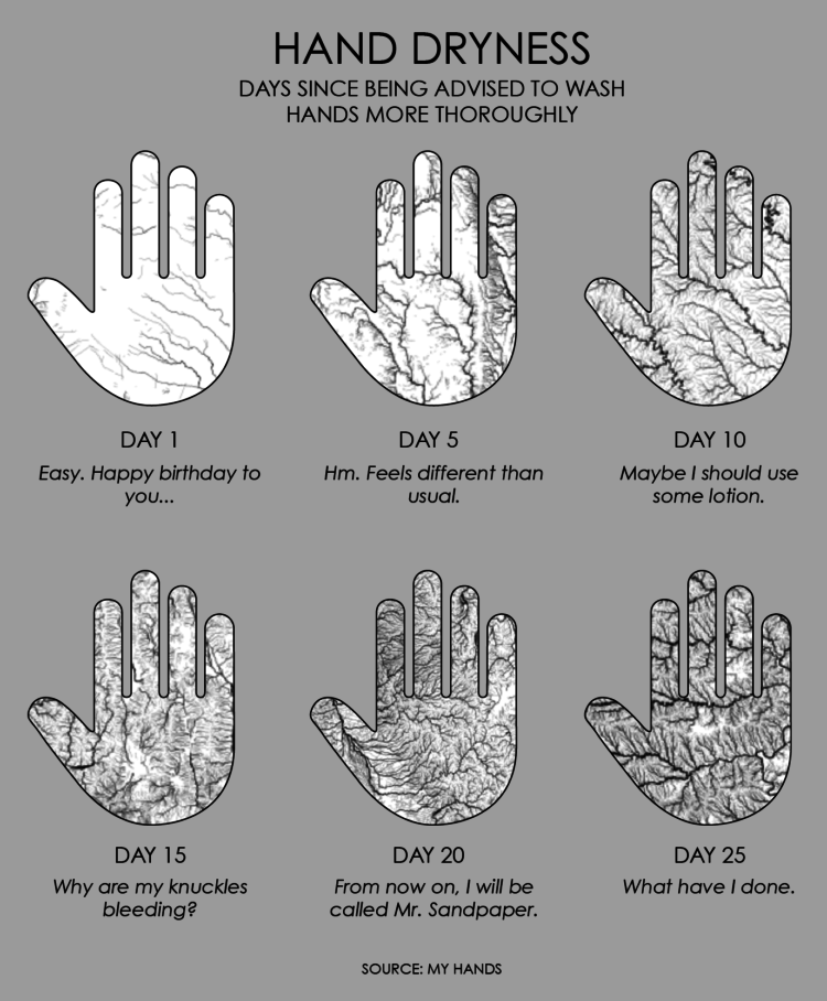
I spend 50% of my waking hours washing my hands. I spend the other 50% trying not to touch my face.
David Spiegelhalter on communicating a crisis:
There are some basic principles, which I learnt from John Krebs, former Chair of the Food Standard Agency, who had to deal with many crises. The first thing is that you should be communicating a lot, consistently and with trusted sources. You have to be open and transparent. You have to say what you do know and then you have to say what you don’t know. You have to emphasise, and keep emphasising, the uncertainty, the fact that there is much we don’t know. Then you have to say what you are planning to do and why. Finally, you have to say what people themselves can do, how they should act. The crucial thing to say is that this will change as we learn more.
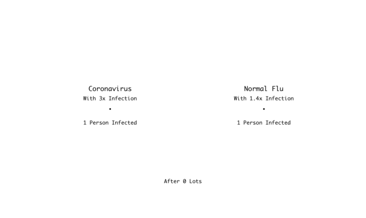
In a Channel 4 clip, Hugh Montgomery does some back-of-the-napkin math contrasting the normal flu against the coronavirus. Here’s a chart version.
For The Spinoff, Toby Morris illustrates how individuals can break a chain of events:
The good news is, we can do things that will reduce the chances of us spreading the virus. That means we can break these chains and potentially stop hundreds or even thousands of people getting Covid-19. Check out The Spinoff cartoonist Toby Morris’ excellent illustration to understand how individual discipline can have an outsize impact.
Of course infection between people in a community is more complex. Just because one chain is broken doesn’t mean people further down won’t be infected by others in some other way. The goal though is to break as many chains as possible.


 Visualize This: The FlowingData Guide to Design, Visualization, and Statistics
Available now.