It’s election day here in the United States, but millions of votes have already been mailed or dropped off. In some states, the number of early votes already surpassed the total in 2016. The New York Times provides a state-by-state breakdown.
It’s election day here in the United States, but millions of votes have already been mailed or dropped off. In some states, the number of early votes already surpassed the total in 2016. The New York Times provides a state-by-state breakdown.
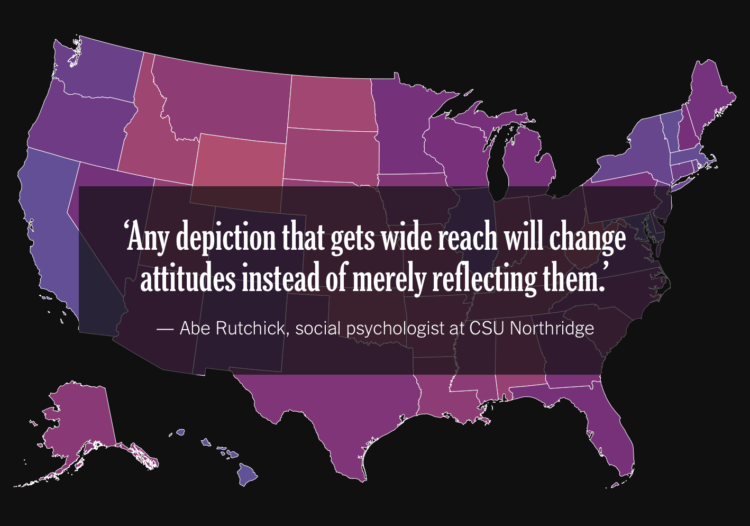
For NYT Opinion, Betsy Mason outlines the design challenges behind election maps. Do you show geography? Do you focus on scale? What colors should you use? For every choice, there’s always tradeoffs, which is why there are so many views.
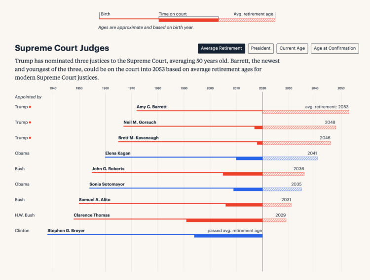
Federal judge appointments are for a lifetime, so the younger a judge is appointed, the more potential years they can serve. For ProPublica, Moiz Syed charted age, time of appointment, and average retirement age to show how current appointments can make impact for decades.

Masks are effective in slowing down the spread of the coronavirus. The New York Times zoomed in at the particle level to show how masks do this.
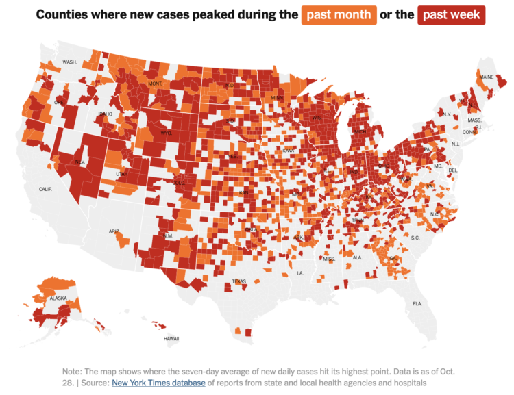
With this simple choropleth map, Lauren Leatherby for The New York Times shows where coronavirus cases peaked in the past month or week. It appears the United States still has a way to go:
With case counts trending upward in almost every state — and 21 of those states adding more cases in the last week than in any other seven-day stretch — officials in parts of the country are once again implementing control measures. Residents of El Paso are under a two-week stay-at-home order, and indoor dining will be halted in Chicago beginning Friday, Oct. 30. Other officials are considering new restrictions in an effort to curb the virus’s rapid spread.
Oh.
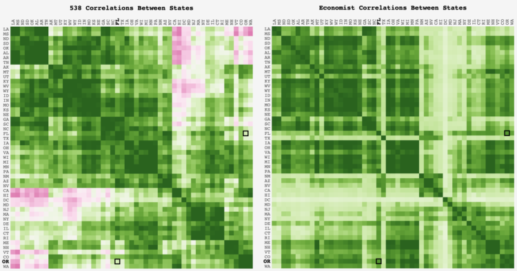
FiveThirtyEight and The Economist take similar inputs but output different forecasts. Adam Pearce was curious about how the state-by-state correlations differed between the two models:
Outside of the CA-DC-VT-WA and LA-MS-ND-KY clusters, where the 538 correlation dips below 0, the models are mostly aligned. Glancing over the outliers, it looks like the Economist might not have an equivalent to 538’s regional regression that groups states in the same geographic region together; the Economist has HI at 0.2 correlation with WA & OR while 538 has it around 0.7.
Here’s the good stuff for October.

Risk of coronavirus infection changes depending on the amount of contagious particles you breathe in. El Pais illustrated the differences when you take certain measures, namely wearing masks, ventilation, and decreased exposure time.
The suggestions are based on statistical models, so there is more uncertainty than I think the explanations provide, but the sequence of illustrations provides a clear picture of what we can do — if you must do things indoors.
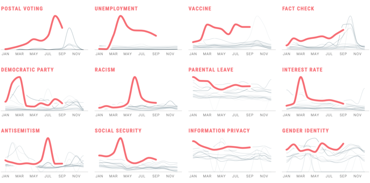
In Waves of Interest, a collaboration between the Google News Initiative and Truth & Beauty, see the defining search trends of 2020. See trends over time. See trends over geography. See trends over past election seasons.
See also how the work came together.
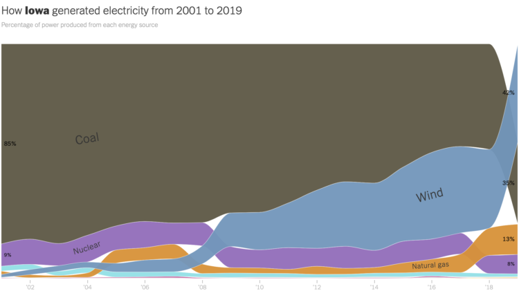
The way we make electricity in America is changing. For The New York Times, Nadja Popovich and Brad Plumer used ribbon charts, which I think are a NYT staple now, to show the shift between 2001 to 2019.
The width of each ribbon represents percentage of power produced by a source, and the vertical order shows highest percentage to lowest over time. Each state gets a chart and an explanation.
Wind power in Iowa, shown above, is up at 42 percent. Impressive.
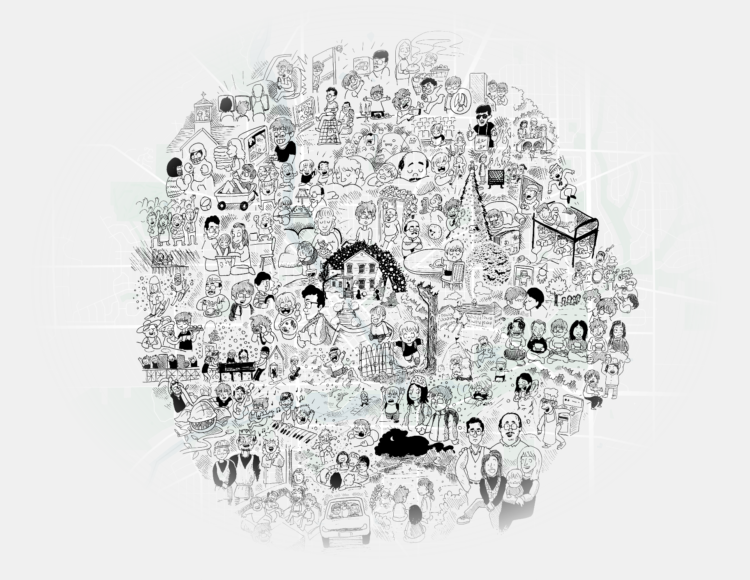
Dots on a map can feel like, well, just a bunch of dots. Dylan Moriarty zoomed in on the dot of his hometown, making the dot feel more real:
The map concept at the top of this piece has been kicking in my head for a long while. Came from a dream: Meandering in a museum space, from far, far away you see a map introducing a new exhibit on New York City. Walking closer, the standard .NEW YORK CITY dot became more detailed until you’d get to up close and discovered that each inch had a drawing detailing that block’s history. A historical illustration with the energy and detail of a Where’s Waldo page. No doubt inspired by the wonderful 1981 illustrated map of Chicago gangs.
This is very good.
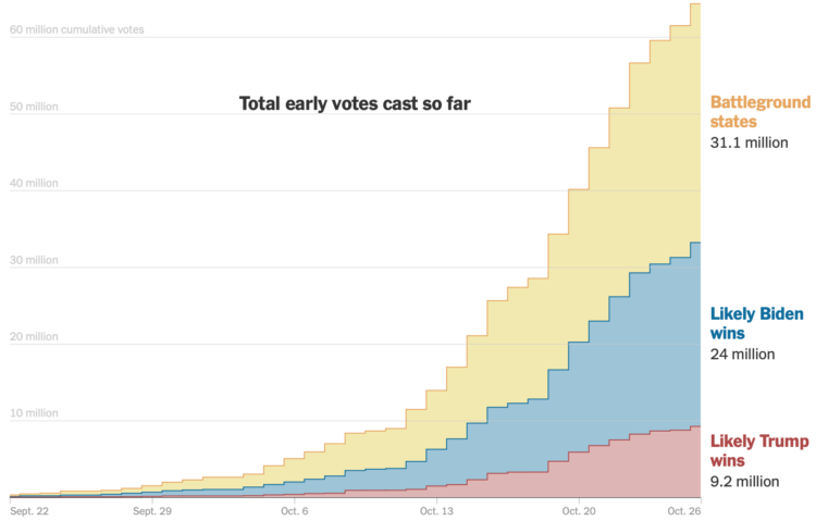
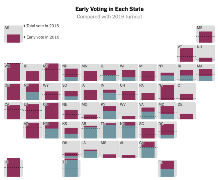
As you might expect, early voting volume is high across the country. In many states, one week until election day, the early voting count is already more than half of the total 2016 counts. For The New York Times, Denise Lu and Karen Yourish provide the breakdown with cumulative charts by state.
See also how long it might take to count all the votes.
And you can download the count data from the United States Election Project.
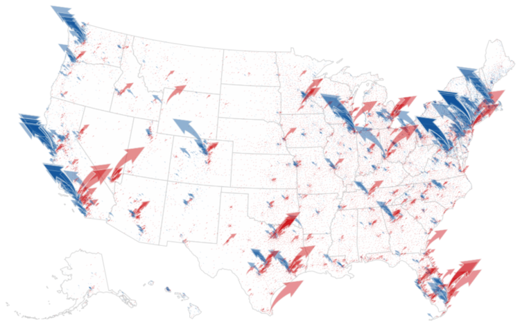
The New York Times analyzed campaign finance data from April to October, mapping and charting their results by different segments:
The findings paint a portrait of two candidates who are, in many ways, financing their campaigns from two different Americas.
It is not just that much of Mr. Biden’s strongest support comes overwhelmingly from the two coasts, which it does. Or that Mr. Trump’s financial base is in Texas, which it is. It is that across the country, down to the ZIP code level, some of the same cleavages that are driving the 2020 election — along class and education lines — are also fundamentally reshaping how the two parties pay for their campaigns.

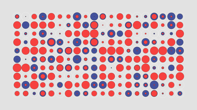
From Kaz Miyamol, these Venn diagrams present very important information about Halloween.

Muir Way updates vintage relief maps with a third dimension. Pretty. The above is a geologic map of the United States, based on a 1932 print.
Scott Reinhard made similar maps last year, but Muir Way leaned a little more into it with more geographic areas and prints to buy.

Look around. Take it in.

Using geometric shapes as an encoding can provide another dimension to your charts.
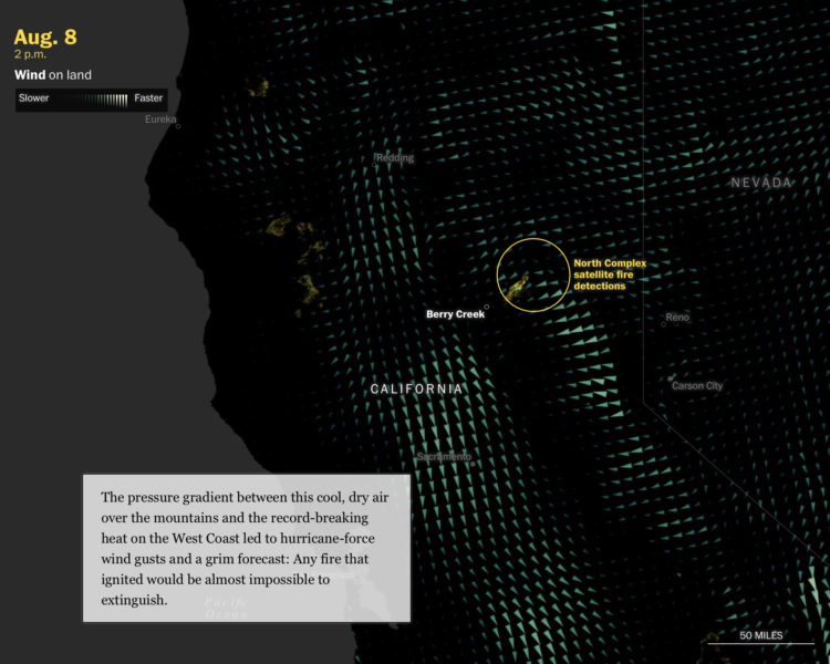
This is some advanced mapping and scrollytelling from the Washington Post. The piece examines climate change in the context of the fires in the western United States.
Starting in the beginning of August, the piece takes you through the timeline of events as your scroll. Maps of temperature, wind, lightning, and fire serve as the backdrop. Berry Creek, California, a mountain town that burned to the ground, provides an anchor to show how large climate shifts can affect the individual.
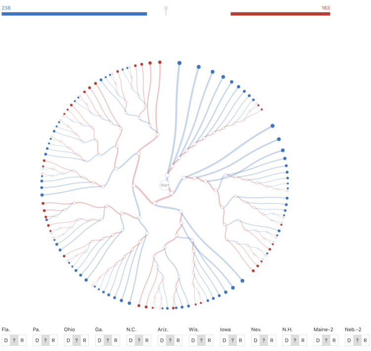
While we’re on the topic of election scenarios, Kerry Rodden provides a radial decision tree to show possible outcomes. Select paths or specify state wins to see what might happen.
It’s based on the New York Times piece by Mike Bostock and Shan Carter from 2012(!).
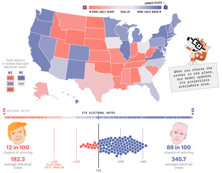
With each model update, FiveThirtyEight runs 40,000 simulations, or what-ifs, to calculate the odds for who will win the election. Their new interactive lets you experiment with all of the what-ifs to see how the odds shift when a candidate wins a state.
It answers the question, “If ______ wins in ______ and in ______, etc., what are the chances of him winning the whole thing?”
So if Trump wins a very red state or Biden wins a very blue state, the overall odds don’t change that much. But if a very red goes blue, or a very blue goes red, then the odds swing dramatically.
There’s a good lesson on conditional probability somewhere in there.
 Visualize This: The FlowingData Guide to Design, Visualization, and Statistics (2nd Edition)
New tools, refined process.


