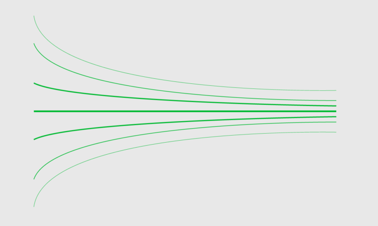
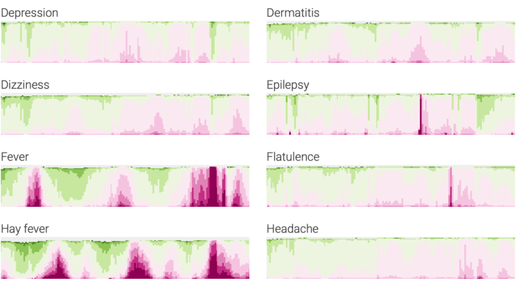
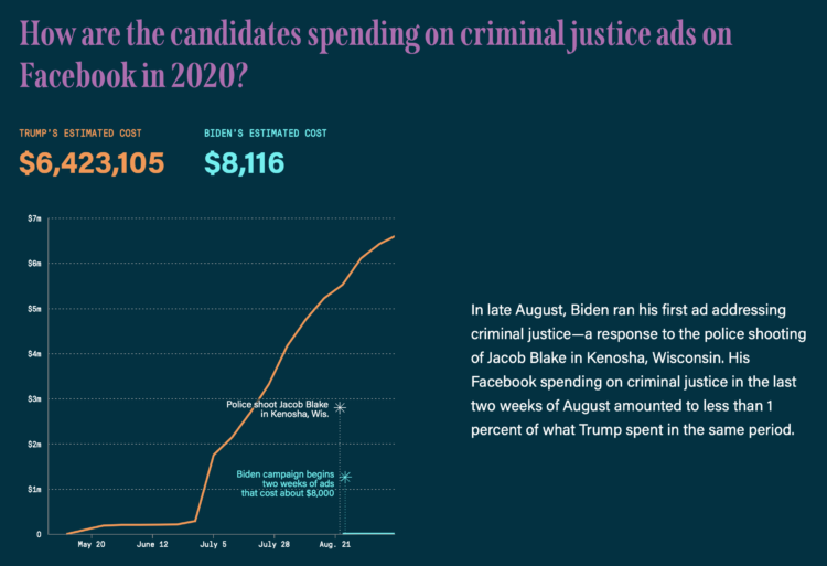
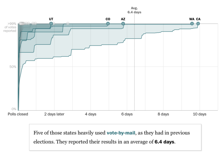
Lauren Tierney and William Neff for The Washington Post used a rotating globe to show how connections between countries quickly shut down as the coronavirus spread.
I’m looking forward to when we get to watch the map in reverse.
Lauren Tierney and William Neff for The Washington Post used a rotating globe to show how connections between countries quickly shut down as the coronavirus spread.
I’m looking forward to when we get to watch the map in reverse.
Dan Kois walked all of the blocks in his ZIP Code and collected data on whether houses used serif or sans serif fonts for their house numbers:
Between March 10 and May 25, I walked every street in Arlington, Virginia’s 22207, a total distance of about 200 miles, according to my Fitbit. The ZIP code covers a lot of territory, 6.37 fairly densely populated square miles, from the Potomac River and the Washington border at the east to East Falls Church and the McLean border at the west. It includes some of Virginia’s richest and whitest neighborhoods, but also a number of apartment buildings and townhouses along Lee Highway and the historically Black middle-class neighborhood of Hall’s Hill.
Here’s the final result in a Google map. There doesn’t seem to be much of a pattern in Kois’ ZIP code, but it’s a good walking exercise. I wonder what other types of data one might collect while walking a large area.
Using a spiral might not be the best way to encode data. But here’s how to do it anyway. Just in case.
Axios provides a straightforward state map showing the percentage change in the 7-day average for confirmed Covid-19 cases. Numbers are up in a lot of places.
Increased testing does not explain away these numbers. Other data points make clear that we’re seeing a worsening outbreak, not simply getting better data.
So frustrating.
Cameron Bennett made a relief map of Idaho, completely out of LEGO bricks:
In March, the COVID-induced quarantine sent me home, but more importantly, to my childhood Legos. What resulted was too much time, money, and effort spent entertaining some combination of my childhood and young adult self. By building a map. Out of Legos.
What have I even been doing with my time.
Using a wide array of sources, The New York Times shows how the virus spread at a granular level. The foundation is a map with moving dots, and the piece takes you through movements based on cell phone data and air travel in concert with known coronavirus cases.
Your jaw might drop a few times as you go through it.
Back in March, NYT published a similar work for how the spread started in China. We were talking about washing hands and restaurants closing. Thinking back to then and seeing where we are now stings.
Even though there was supposedly a person in the decision-making process and a surveillance photo wasn’t actually Robert Julian-Borchak Williams, he still ended up handcuffed in front of his own home. Kashmir Hill reporting for The New York Times:
This is what technology providers and law enforcement always emphasize when defending facial recognition: It is only supposed to be a clue in the case, not a smoking gun. Before arresting Mr. Williams, investigators might have sought other evidence that he committed the theft, such as eyewitness testimony, location data from his phone or proof that he owned the clothing that the suspect was wearing.
In this case, however, according to the Detroit police report, investigators simply included Mr. Williams’s picture in a “6-pack photo lineup” they created and showed to Ms. Johnston, Shinola’s loss-prevention contractor, and she identified him. (Ms. Johnston declined to comment.)
In crime shows, they often have this amazing tool that turns a low-resolution, pixelated image of a person’s face to a high-resolution, highly accurate picture of the perp. Face Depixelizer is a step towards that with machine learning — except it seems to assume that everyone looks the same.
Welcome to whose bar chart is it anyway: where the geometries are made up and the numbers don’t matter. [via @dannypage]
Kurzgesagt, in collaboration with Our World in Data, tackle the question of who is responsible for climate change and who should fix it. As you might imagine, the answer is not always straightforward.
Based on estimates from the United States Census Bureau released for July 2019, Millennials are the largest living generation in the country now.
Maybe you’ve seen a chart and wished you could look at the data yourself. Maybe you want to see it from a different angle. But the underlying dataset is nowhere to be found. The WebPlotDigitizer by Ankit Rohatgi lets you load an image and it will attempt to pull out the dataset. Amazing.
I can’t believe this has been around since 2010, and I’m just now hearing about it. [via @jburnmurdoch]
New York Times Opinion compared several demographics, such as unemployment and income, between majority-black and majority-white neighborhoods in the United States.
They come back to the zipper chart technique where the dots start together and then separate to emphasize the gaps. Horizontally, dots are sorted by smallest to largest difference.
Dylan Tallchief recreated “Take On Me” by a-ha in Excel.
It’s not the tools. It’s how you use them. Something something blah blah. It’s in Excel!
Here is the breakdown for each state in the United States, based on estimates from the American Community Survey.
The name Karen. It’s not a common baby name these days. It peaked in the 1960s. The Pudding looked for other names in US history that followed similar trends:
To put this question to the test, we checked baby names from the last 100 years and eliminated those that: 1) never made it into the Top 20 most popular names in any year and 2) were not present in the top list for at least 50 out of 100 years. That left us with 129 female names and 76 male names (yes, we’re going there too!). We tested each of these names, looking for the ones that most closely matched Karen’s rise and fall in popularity.
You can also search for your own name to see if it’s a “future Karen.”
All you need is an old table, gift wrapping paper, and some varnish. I’m gonna have to do this. [via @datavisFriendly]