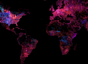
OpenStreetMap, the free wiki world map that offers up high quality geographic data,…
Maps
Intuitive to look at spatial patterns and great for distributing geographic data.
-
State of the OpenStreetMap
-
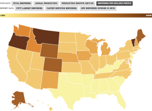
Rise of craft beer
The Brewers Association just released data for 2012 on craft beer production and…
-
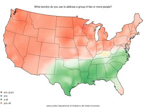
Map: Vernacular across America
When you talk to different people across the United States, you notice small…
-
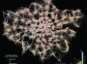
Map of London fire engine callouts
Using data from the London Fire Brigade, James Cheshire mapped 144,000 incidents in…
-
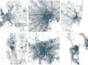
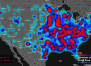
Geography of tweets
Twitter mapped all the geotagged tweets since 2009. There’s billions of them, so…
-
Link
Vector tiles
MapBox implemented vector tiles for both scalability and flexibility. “MapBox has developed an open source vector format to power the future of our web maps. Vector tiles rethink web maps from the ground up, providing a single efficient format to power raster tiles, interactive features, geojson streams, mobile renderers, and much more.” Be sure to scroll down to the examples.
-
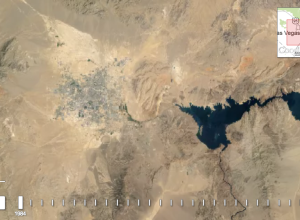
A quarter century of satellite imagery
In collaboration between USGS, NASA and TIME, Google released a quarter century of…
-
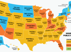
Coaches are highest paid public employees
Deadspin made a straightforward map that shows the highest paid public employee in…
-
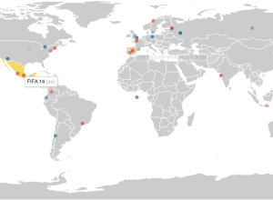
Map of live Wikipedia changes
On Wikipedia, there are constant edits by people around the world. You can…
-
Geography of hate against gays, races, and the disabled
In a follow-up to their map of racist tweets towards Barack Obama, the…
-
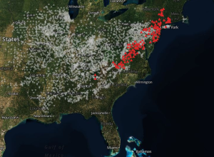
Cicada insects out to play after 17 years
This is my first time hearing about this, probably because it only happens…
-
Link
Geoguessr
GeoGuessr is a game of location. It plops you somewhere in the world via Google street view, and you figure out where you ara. The closer you are, the more points you get.
-
Link
Creating a hexagonal cartogram
How to create a hexagonal cartogram using a combination of ArcGIS, Python, and D3.
-
Exploration of how much geography is needed in metro maps
Terrence Fradet of Fathom Information Design ponders whether metro maps suffer or benefit…
-
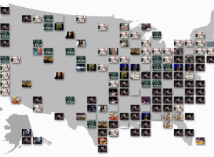
YouTube Trends map shows most popular videos by region
I don’t know about you, but when I go to YouTube, I check…
-
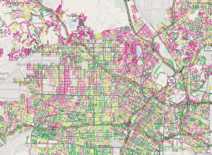
Map shows street quality in Los Angeles →
Nevermind the horrible traffic in Los Angeles, where it takes a several hours…
-
Link
Geographic Bounding Boxes
Geographic Bounding Boxes. A trivial task in a 2-D space, but tricker on sphere.
-
Fixing bus routes using mobile data
In parts of the world where there are few smartphones and GPS-enabled devices,…


 Visualize This: The FlowingData Guide to Design, Visualization, and Statistics (2nd Edition)


