You’ve likely seen the classic globe image that shows Earth at night. It’s…
Maps
Intuitive to look at spatial patterns and great for distributing geographic data.
-
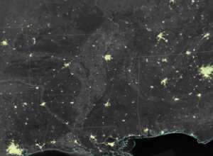
Holiday lights from space
-
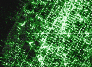
Make your own detailed tweet maps
Eric Fischer, known around these parts for his detailed dot maps, describes his…
-

Map print clothing
Monochome, a new service brought to you by Rachel Binx, lets you make…
-
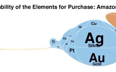
Elemental cartograms
Along the same lines as the scaled Periodic Table, Elemental Cartograms by chemistry…
-
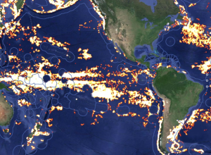
Tracking global fishing through satellite data
Global Fishing Watch is an initiative to place some accountability on global fishing,…
-
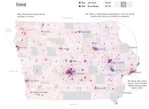
Senate results maps →
The New York Times pushed out super-detailed, precinct-level maps for the Senate election.…
-

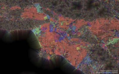
New York Times mapmakers
When news breaks, maps often accompany stories (or the maps are the story),…
-
Cynthia Brewer profile
Wired wrote a short profile for Cynthia Brewer, best known for Color Brewer,…
-
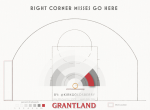
How basketball rebounds work
Kirk Goldsberry, with help from Andy Woodruff, looked at how rebounds work in…
-
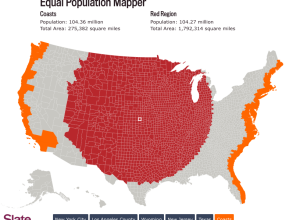
Equal population mapper
We know that there are more people per square mile in some places…
-
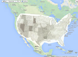
Road grid orientation in major cities
This is what you get when you group streets by their geographic orientation…
-
10,000 League of Legends matches, all at once
League of Legends is an online, free-to-play game that pits two teams of…
-
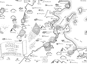
Real cities drawn as fantasy maps
Remember that time you were sitting by the fire reading The Lord of…
-
Open source mapping lab
Mapzen focuses on building open source mapping components for developers.…
-
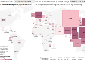
Flooding risk cartogram
As you may or may not know, climate change could bring with it…
-
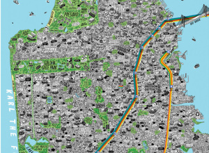
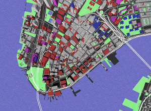
Hand-drawn, detailed city maps
Maps can be about a lot of things, from strictly geography and location…
-
Old maps overlaid on Google Maps
The British Library georeferencing project places old maps, as far back as the…
-
Cosmic map shows Milky Way at the edge of a supercluster
Nature highlights the research of R. Brent Tully et al, which defines a…
Recently for Members
Second Edition
 Visualize This: The FlowingData Guide to Design, Visualization, and Statistics (2nd Edition)
 Visualize This: The FlowingData Guide to Design, Visualization, and Statistics (2nd Edition)
New tools, refined process.
Browse by Chart Type See All →


