For The Spinoff, Toby Morris illustrates how individuals can break a chain of…
Infographics
Telling stories with data and graphics.
-

Break the chain
-
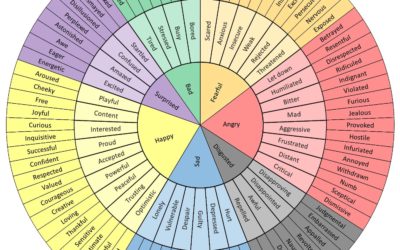
Wheel of emotional words, in case you’re having trouble finding the words these days
You’re probably feeling a range of emotions these days. It helps if you…
-

Coronavirus Explained and What You Should Do
Kurzgesagt, which make videos to explain complex and abstract concepts in an understandable…
-

How washing your hands for 20 seconds does the trick
Vox used a lotion that mimics viruses to demonstrate the power of washing…
-
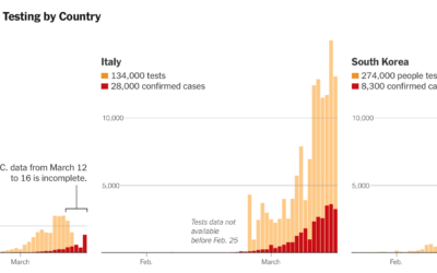
Lagging coronavirus testing in the US
Coronavirus testing in the United States has been a slow process to say…
-

Simulations for virus spread with social distancing
Social distancing is the game plan these days. Try to stay at home…
-

Change in foot traffic in outbreak cities
From The Economist, this chart shows the (mostly) decrease in foot traffic in…
-

How gears work
Bartosz Ciechanowski took a deep dive into how gears work and the physics…
-

Coronavirus life cycle
For The New York Times, Jonathan Corum and Carl Zimmer describe how the…
-

Visual explanation of exponential growth and epidemics
3Blue1Brown explains exponential growth and epidemics and answers the question of when the…
-

How different groups voted on Super Tuesday
The New York Times has a rundown of what happened on Super Tuesday,…
-

Small multiples pizza baby
For each month in her child’s first year, Amanda Makulec took a picture…
-
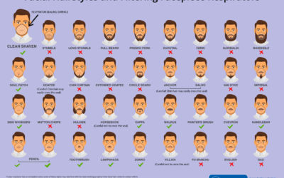
Face mask respirator and its usefulness with different beard styles
The Centers for Disease Control and Prevention made this graphic to show what…
-

Grandpa Chad distribution
xkcd crossed a rough age distribution of people becoming grandparents with people named…
-

Map of mathematics
The Map of Mathematics from Quanta Magazine explains key concepts with animated visualizations:…
-

Scale of Bloomberg net worth
While we’re on the topic of Mike Bloomberg’s money, here’s another view from…
-

Bloomberg ad spending, relative to other candidates’
Mike Bloomberg’s ad spending might not be that much relative to his own…
-

Most often missed areas while washing hands
This graphic from WakeMed shows the areas most often missed while washing hands.…
Recently for Members
Second Edition
 Visualize This: The FlowingData Guide to Design, Visualization, and Statistics (2nd Edition)
 Visualize This: The FlowingData Guide to Design, Visualization, and Statistics (2nd Edition)
New tools, refined process.
Browse by Chart Type See All →


