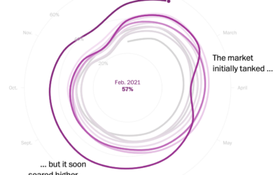
I heard you like spiral charts when the data is seasonal. I think…
Statistical Visualization
Finding patterns, distributions, and anomalies.
-
Housing market cooldown
-
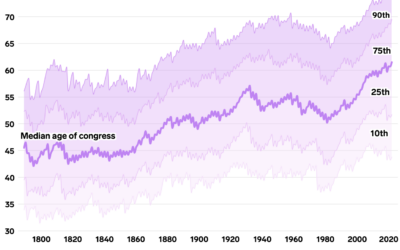
Oldest U.S. government
Annie Fu, Walt Hickey, and Shayanne Gal, for Insider, show the disproportionately aging…
-
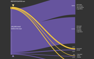
Untraced orphans in Ukraine since the war
Sarah Slobin and Joanna Plucinska, for Reuters, report on the challenges of counting…
-
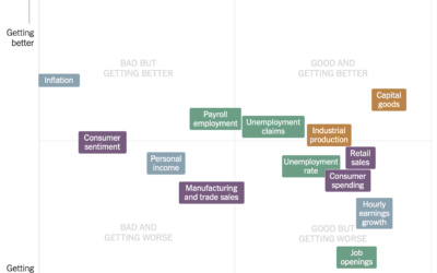
Estimating the condition of the economy
Measuring the condition of the economy is tricky, because there are many parts…
-
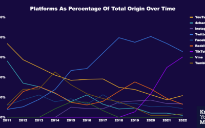
Where memes from the past decade came from
Know Your Meme analyzed a decade of meme data to see where the…
-
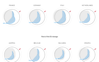
How much gas European sites have stored for the winter
Reuters goes with the radar chart to show gas supplies, as European countries…
-
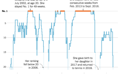
Serena Williams’ career rankings
Serena Williams announced her retirement from professional tennis. As is required for any…
-
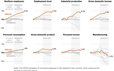
Indicators for a recession
People disagree whether the United States is in a recession or not, because…
-
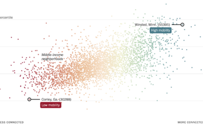
More friendships between rich and poor might mean less poverty
Recently published in Nature, research by Chetty, R., Jackson, M.O., Kuchler, T. et…
-
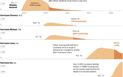
Housing displacement after disasters
Christopher Flavelle, for The New York Times, reported on the lack of support…
-
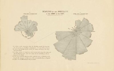
Florence Nightingale’s use of data visualization to persuade in the 19th century
For Scientific American, RJ Andrews looks back at the visualization work of Florence…
-
Visualizing Delaunay Triangulation
Delaunay triangulations have applications in computer graphics, spatial analysis, and visualization. They “maximize…
-
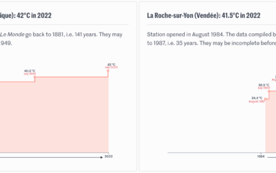
Timelines for record temperatures
Speaking of the heat wave in Europe, Pierre Breteau for Le Monde charted…
-
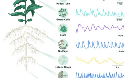
Rhythm in plant cells
Researchers are studying the electrical rhythms in plant cells. I’m not sure what…
-
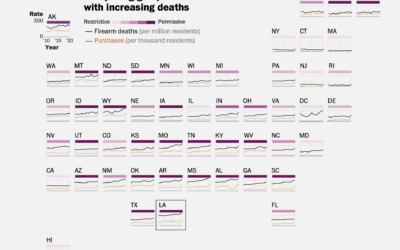
Full scope of gun deaths in the U.S.
As I’m sure you know, mass shootings, which gain attention because the scale…
-
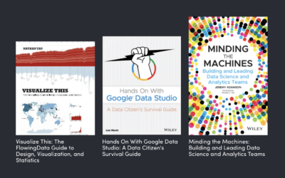
Data Visualization Humble Bundle
There’s a data visualization book bundle on Humble Bundle this month. Get twenty-two…
-
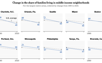
Shrinking middle-class
Income distribution continues to stretch on the high end and squish on the…
-
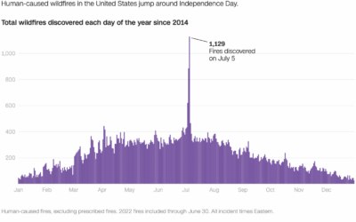
Wildfires caused by fireworks
It’s Independence Day here in the United States, which means there will be…


 Visualize This: The FlowingData Guide to Design, Visualization, and Statistics (2nd Edition)


