Use basic statistical methods to move you towards fancier things.
Nathan Yau
-
Members Only

Analyzing Data, General to More Specific – The Process 148
-
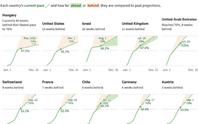
Slowing and then renewed interest in getting vaccinated
When countries gained access to vaccines, there was an initial burst of vaccinations,…
-

Noah Kalina’s averaged face over 7,777 days
Noah Kalina has been taking a picture of himself every day since January…
-
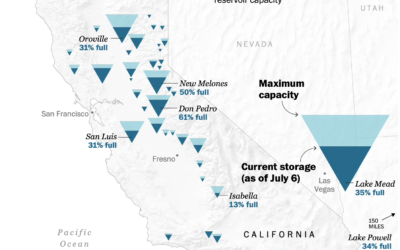
Map of drying reservoirs in the west
To show water levels in California’s drying reservoirs, The Washington Post used upside…
-
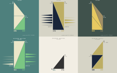
UEFA Euro 2020 matches visualized with triangle sets
Krisztina Szűcs used sets of animated triangles to show how each match played…
-
Value of R, the Statistics-specific language
Paul Ford has been learning R to better understand the field of Statistics.…
-
Members Only
Retired Minard – The Process 147
Maybe it’s better to focus on the present to do the best with what we have, which moves us towards the future.
-
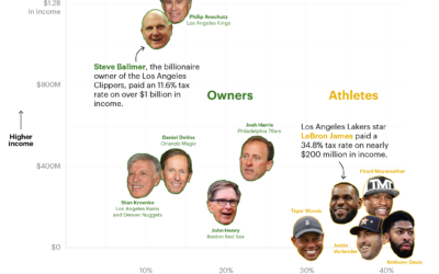
How sports owners pay less taxes than athletes
ProPublica continues their analysis of an anonymous dump of tax records, this time…
-
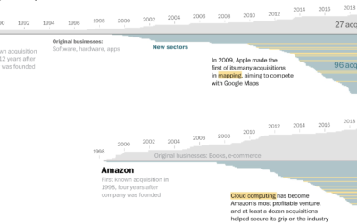
How big tech grew by acquiring small tech
Big tech — Amazon, Apple, Google, and Facebook — got big and then…
-
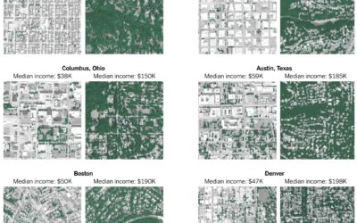
Tree canopy and income
Ian Leahy and Yaryna Serkez for NYT Opinion look at income and tree…
-

Find a color palette based on words
PhotoChrome is a straightforward tool that lets you use search terms to find…
-
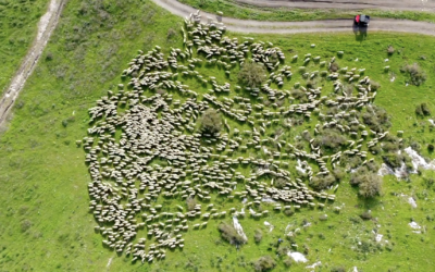
Sheep herding movements from above
Aerial photographer Lior Patel followed a herd of sheep in Yokneam. The results…
-
Members Only
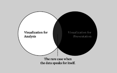
Analytical Stand-in – The Process 146
There’s visualization for analysis. There’s visualization for presentation. There’s overlap between the groups, but the differences require a varied approach.
-

Joy Generator
NPR put together a set of stories, videos, and interactives about bringing more…
-
Still Flowing at 14
FlowingData turned 14 years old last week. Is that old? It feels old.…
-
Introduction to Modern Statistics
Introduction to Modern Statistics by Mine Cetinkaya-Rundel and Johanna Hardin is a free-to-download…
-
Historical context for the heat in the Pacific Northwest
It’s been hot in the Pacific Northwest the past few days. NYT’s The…
-
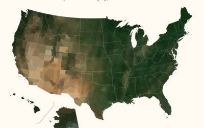
Average color of geographic areas
Based on satellite imagery, Erin Davis found the average color of places around…
-
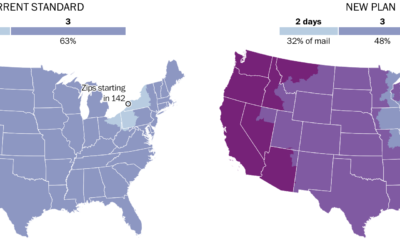
Mail slowdown
Postmaster General Louis DeJoy proposed new standards for first-class mail, which would slow…
-
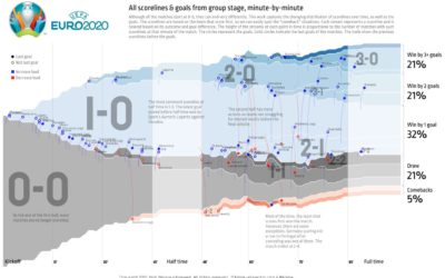
All the matches from Euro 2020 in one chart
To see all the matches from the group stage of Euro 2020 in…
Recently for Members
Second Edition
 Visualize This: The FlowingData Guide to Design, Visualization, and Statistics (2nd Edition)
 Visualize This: The FlowingData Guide to Design, Visualization, and Statistics (2nd Edition)
New tools, refined process.
Browse by Chart Type See All →


