AI-based image generation is having a moment. Time some text and you can…
Nathan Yau
-
AI-based image generation ethics
-
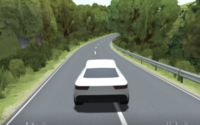
Procedurally generated driving game
Sometimes you need to slow down and go on a drive with no…
-
Members Only
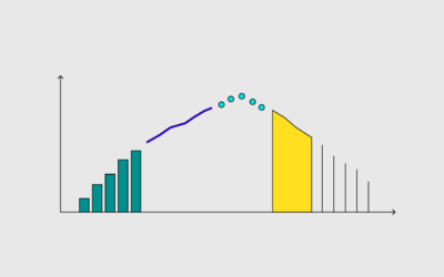
The Process of Choosing the Better Chart
This is how I pick charts.
-
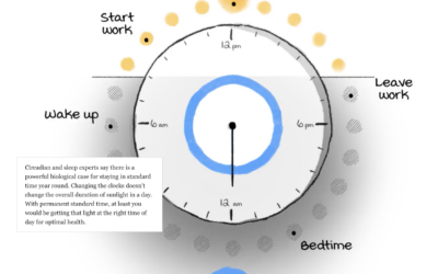
Daylight saving time and circadian rhythms
Daylight saving time ends in the United States this weekend and ended already…
-
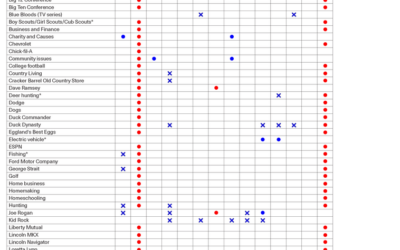
How you might vote based on what you like
By Angie Waller, this table shows how Facebook thinks you’ll vote based on…
-

What hearing loss sounds (and looks) like
Using an audiogram as a backdrop, Amanda Morris and Aaron Steckelberg, for The…
-
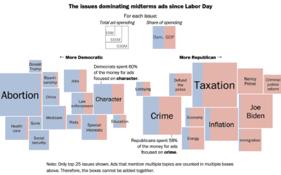
Election ad topics
Midterm election day is just about here in the U.S., so the political…
-
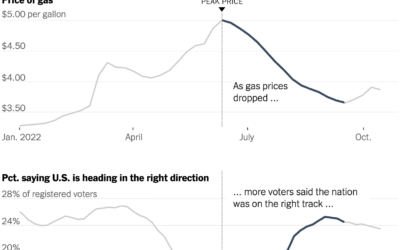
Gas prices and confidence
Everywhere you go, gas prices show up on big boards, like a proxy…
-
Members Only
Visualization Tools and Learning Resources, October 2022 Roundup
Here’s the good stuff for October.
-
Feelings at Work
We spend a lot of time working. It seems worth thinking about how we feel during all those hours.
-
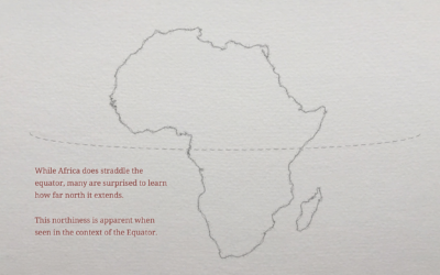
Geographic misconceptions about the location of continents
When you’re used to looking at the world through a certain lens, such…
-
Luxury surveillance
Chris Gilliard, for The Atlantic, describes self-surveillance that people pay for in exchange…
-
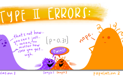
Educational statistics illustrations
Allison Horst often illustrates data science concepts and tools with anthropomorphized shapes and…
-
Word cloud + Streamgraph = WordStream
I hear it all the time from chart purists. “I love the streamgraph!”…
-
Members Only
The Process of Finding Data
You need data to visualize. Luckily, it’s not too complicated.
-
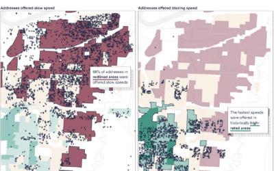
Slow internet for the same price as fast internet
When you pay for internet, it seems like a reasonable expectation that if…
-
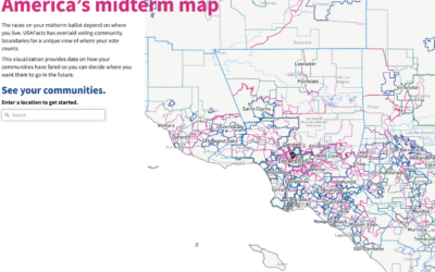
All the elections where you live
We tend to talk about elections as this uniform thing. People vote for…
-
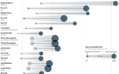
Less rich Covid billionaires
With Covid came sudden shifts in daily life and work, which gave rise…
-

Chartball is sports data visualized in a playful way
With Chartball, Andrew Garcia Phillips has visualized sports data for a while, publishing…
-
Algorithmic rent increase
It’s growing more common for landlords to use software to set the rental…
Recently for Members
Second Edition
 Visualize This: The FlowingData Guide to Design, Visualization, and Statistics (2nd Edition)
 Visualize This: The FlowingData Guide to Design, Visualization, and Statistics (2nd Edition)
New tools, refined process.
Browse by Chart Type See All →


