Doug McCune maps San Francisco crime in 2009 as if it were elevation.…
Nathan Yau
-
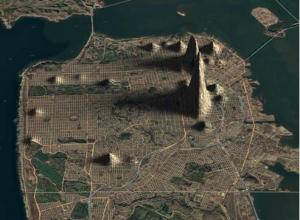
San Francisco crime mapped as elevation
-
Data and its impact on journalism
In regards to the UK’s recent boom in open data, Simon Rogers of…
-
Protovis 3.2 released – more examples and layouts
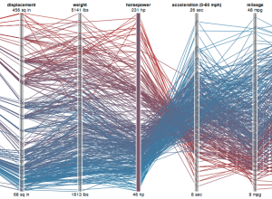
The most recent version of Protovis, the open-source visualization library that uses JavaScript…
-
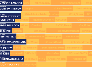
Track the 2010 MTV Movie Awards
Excited about the 2010 MTV Movie Awards? Yeah, me neither. But if you…
-
Egregious Citations Issued to BP
BP processes about 1.5 million barrels of crude oil per day, across six…
-
How little musicians earn online
You’ve heard about the struggling musician. It’s a tough business. How tough is…
-
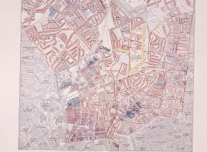
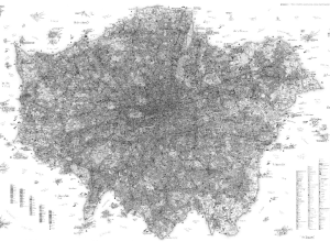
Poverty in late 19th century London
Alice Rawsthorn for The New York Times reports on Charles Booth’s London poverty…
-

R for enterprise?
Norman Nie, co-creator of SPSS (acquired by IBM for $1.2 billion last summer),…
-
BP oil spill if it were where you live
If it Was My Home is a simple but effective concept. Enter your…
-
Data Life of the Future
It’s fun to imagine the future. Every few months, someone takes a stab…
-
Uber detailed London map satire
Stephen Walter’s The Island looks like an ordinary map of London from afar.…
-
Data Science is catching on
Maybe there’s something to this whole data science thing after all. Mike Loukides…
-

Live webcast: Community Health Data Initiative
Health and Human Services (HHS) is about to announce the launch of their…
-
Charting the radio top 40
BBC Radio 1 takes a shot at displaying the top 40 chart visually…
-
How our laws are made
It takes a lot of work for a bill to become a law.…
-
Best of FlowingData – May 2010
Another great month of FlowingData. Thanks, everyone for the retweets, likes, stumbles, etc.…
-
Pulp Fiction timeline
In case you were confused by the Pulp Fiction storyline, dehahs has plotted…
-
Overhaul of New York subway map
The ever-popular New York subway map is getting some work done, and will…
-

Junk food equivalents of sugary drinks
Men’s Health takes a look at America’s most sugary drinks and their junk…
-
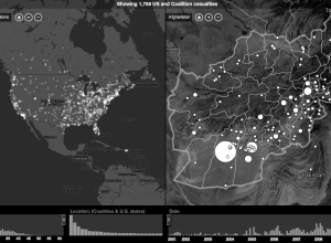
Iraq and Afghanistan casualities, home and away
In a collaboration between CNN and Stamen Design, Home and Away offers a…
Recently for Members
Second Edition
 Visualize This: The FlowingData Guide to Design, Visualization, and Statistics (2nd Edition)
 Visualize This: The FlowingData Guide to Design, Visualization, and Statistics (2nd Edition)
New tools, refined process.
Browse by Chart Type See All →


