1,580 people were charged with federal crimes for the riot at the U.S.…
Nathan Yau
-
January 6 defendants, a breakdown
-
Tracking the effects of Congestion Pricing in New York
In an effort to reduce traffic, New York launched a program that charges…
-
Where and when to travel
Bloomberg put together a list of places to visit in 2025. Most of…
-
Star Wars galaxy map
I can’t vouch for the accuracy of this Star Wars map, but I…
-
Convergence to sameness in the algorithm
As my father-in-law’s Facebook feed would suggest, the “algorithm” has a way of…
-
2024.
I haven’t reviewed a year on FlowingData since 2020, which seems like a…
-
Best Data Visualization Projects of 2024
Many datasets were analyzed and many charts were made this year. These are my favorite data visualization projects from 2024.
-
Seeing the single largest tree in the forest of 400 billion
Fabien Wagner works with CTrees in an effort to map tree canopy height…
-
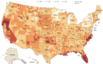
Home insurance companies dropping customers
Because of a warming planet with more wildfires and hurricanes, it’s growing more…
-
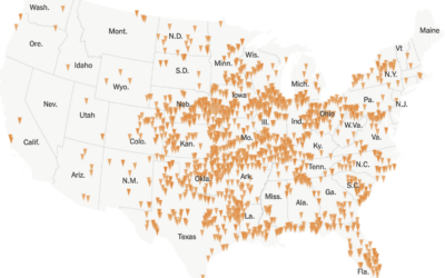
Year of tornadoes
For the New York Times, Marco Hernandez visualized all the tornadoes in 2024,…
-
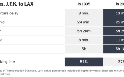
More time on the plane, but more flights arriving early
By just about every metric, flights are slower now than they were 30…
-
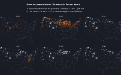
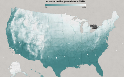
When cities last saw snow on Christmas
Christmas is coming. For some, that means snow on the ground, but as…
-
Data Advent Calendar
Jordan Cunliffe uses embroidery to explore and visualize data. This year, headed towards…
-
Counting the Christmas days with snow
This is a fun one by Dylan Moriarty for the Washington Post. Punch…
-
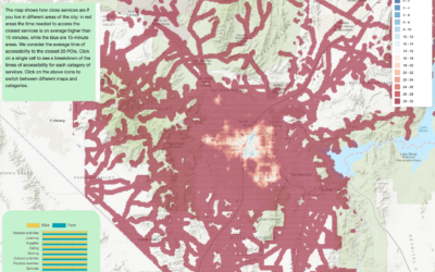
Map of walkable neighborhoods
Researchers at Sony Computer Science Laboratories in Rome estimated the time it takes…
-
Members Only
Visualization Tools and Resources, December 2024 Roundup
Here’s the good stuff for the month: things to use, things to poke at, and things to learn from.
-
Probability does not exist
Probability itself is an expression of uncertainty, but the calculations behind the percentages…
-
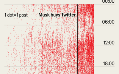
Elon Musk’s posting (and sleep) schedule
Not to dwell on Musk, but I was reminded of this dot plot…
-
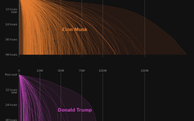
Online reach of Elon Musk on X
As you can imagine, Elon Musk, the owner of X, has a prominent…
-
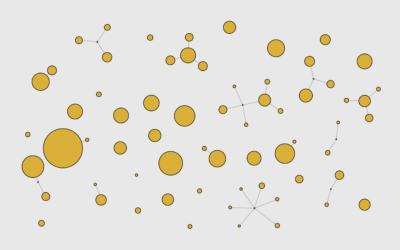
Network of Supermarket Chains
Here’s the current landscape of supermarket parent companies and their subsidiaries — national chains, regional, local, co-ops, specialty, ethnic, and discount.





 Visualize This: The FlowingData Guide to Design, Visualization, and Statistics (2nd Edition)


