The nice thing about animated GIFs for visualization is that they can get…
Nathan Yau
-
Data visualization GIFs
-
Making annotation easier with d3.js
There are two main reasons annotation is often a challenge. The first is…
-
Prophet for forecasting with a lot of data
Facebook released Prophet, which is a procedure to quickly forecast with time series…
-
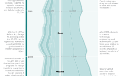
Visa restrictions and possible impact on innovation
The Washington Post talked to three experts on the American workforce and innovation…
-
Link
How to implement scrollytelling with six different libraries →
A brief look at six libraries to make your charts move as you scroll.
-

Bomb threats to Jewish Community Centers
Ken Schwencke and Al Shaw from ProPublica with a set of straightforward maps…
-
Participate in the Data Visualization Community Survey
Elijah Meeks is running a detailed survey about data visualization people to gain…
-

The range of Meryl Streep
Here’s a fun piece from Stephanie Merry and Shelly Tan for The Washington…
-
Apple vs. Google company structure, as seen through patents
For Co.Design, Periscopic compared patent ownership between Apple and Google, which ends up…
-

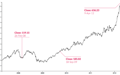
Bill Paxton tribute through storm spotters’ GPS coordinates
Bill Paxton, who played a storm chaser in Twister, died on Sunday. To…
-
Easily download large-ish survey datasets
Many government organizations release microdata for surveys every year. It comes as anonymized…
-
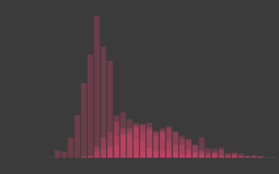
Relationships: The First Time…
When Americans had sex, moved in with someone, and so on. Often not average. Far from normal.
-
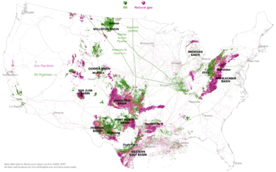
Oil and gas wells in the United States
Tim Meko and Laris Karklis for The Washington Post take a dive into…
-
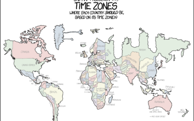
xkcd: Projecting country borders by time zone
Time zones are odd sometimes.…
-
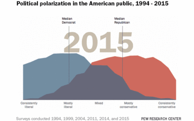
States most similar to the US overall
“Normal America.” I’m not sure what that means anymore, but at some point…
-

Evolution of The New York Times front page
From Josh Begley, this quickfire flip book shows every New York Times front…
-

Forest of Numbers
To celebrate the ten-year anniversary of the National Art Center in Tokyo, Emmanuelle…
-
Annotate charts with a few clicks using ChartAccent
Some say annotation is the most important layer for charts meant for public…
-
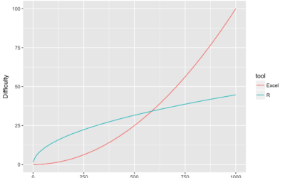
R for Excel users
For Excel users getting started with R, pain oftentimes finds its way into…
-

Open data from The White House returns no results
When you search for datasets on The White House site, you get nothing.…
Recently for Members
Second Edition
 Visualize This: The FlowingData Guide to Design, Visualization, and Statistics (2nd Edition)
 Visualize This: The FlowingData Guide to Design, Visualization, and Statistics (2nd Edition)
New tools, refined process.
Browse by Chart Type See All →


