After the crackdown on performance-enhancing drugs, home runs in professional baseball dipped the…
Nathan Yau
-
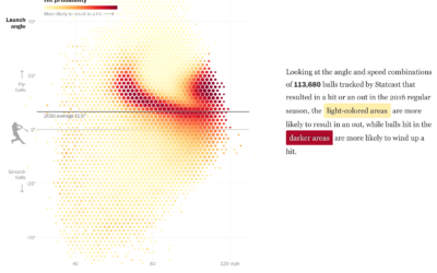
Baseball hitting angles on the rise
-
Chances it’s a Friend’s Birthday Every Single Day of the Year
If it seems like every day you log in to Facebook, it’s someone’s birthday, you’re probably not that far off.
-
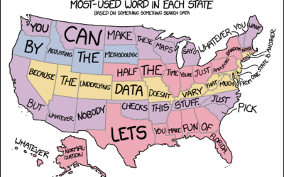
xkcd: Words in every state map
xkcd reading my mind somehow as usual. Not all state word maps are…
-
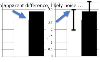
Common statistical interpretation mistakes
Statistics is a game of subtleties, and you lose when you don’t pay…
-
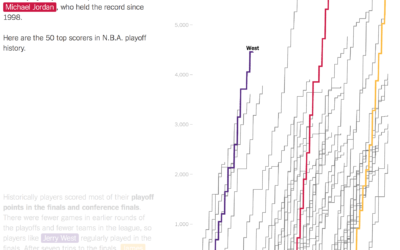
LeBron James passed Michael Jordan in playoff points
As a Golden State Warriors fan, I am obligated to dislike LeBron James,…
-

Giving Up Time as a Parent
There is a fixed number of minutes during the day. Where do parents usually draw the time from?
-

Multiplayer stock market game with real money
Twitch launched Stock Stream, which is a multiplayer stock market game that uses…
-

Comparing Google Maps and Apple Maps Over a Year
Google collects much of their own data to construct their maps, whereas Apple…
-

Obi-Wan saying “Hello there” 67 million times
This clip of Obi-Wan saying “Hello there” 67 million times amused me too…
-
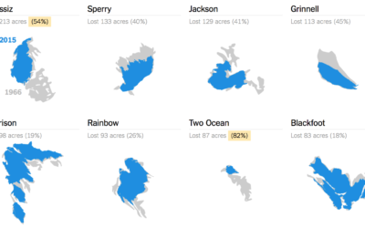
Melting glaciers
Glaciers at Glacier National Park in Montana are melting. Using data from the…
-

Past and future of data analysis
Roger Peng, a biostatistics professor at John Hopkins University, talks about the past…
-
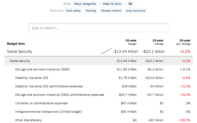
Searchable budget proposal and the 10-year change
The administration released a budget proposal yesterday, which as you’d expect contains some…
-

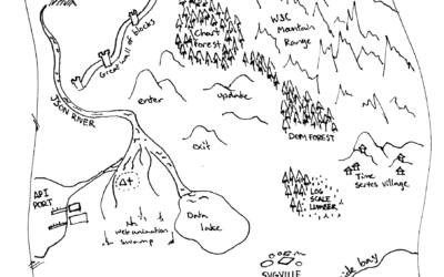
Medieval fantasy city generator
Game developer Oleg Dolya made a medieval fantasy city generator. Select the size…
-
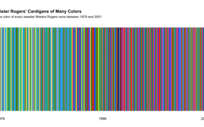
All of Mister Rogers’ cardigan colors
While watching a Mister Rogers’ Neighborhood marathon, Owen Phillips for The Awl wondered…
-
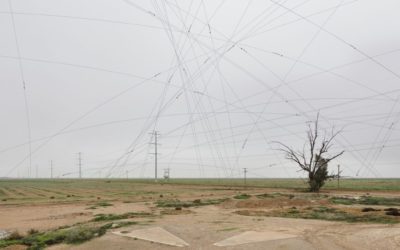
Satellites from the ground
There is a 16-by-16 mile grid of big X’s in the Sonoran Desert…
-
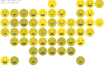
Chernoff emoji
Lazaro Gamio for Axios used Chernoff Faces that look like emojis.
This visualization… -
A Day in the Life: Work and Home
I simulated a day for employed Americans to see when and where they work.
-

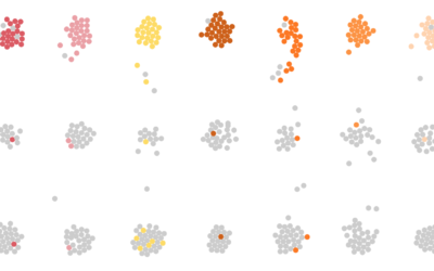
Breathing Earth of vegetation
Using data from NOAA STAR, Nadieh Bremer creates a breathing Earth that shows…
-
The Hitchhiker’s Guide to d3.js
Ian Johnson provides some good direction for those looking to get their feet…
-

Gerrymandering game shows you how it works
Gerrymandering is the practice of manipulating boundaries in such a way that favors…
Recently for Members
Second Edition
 Visualize This: The FlowingData Guide to Design, Visualization, and Statistics (2nd Edition)
 Visualize This: The FlowingData Guide to Design, Visualization, and Statistics (2nd Edition)
New tools, refined process.
Browse by Chart Type See All →


