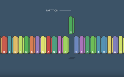
Sorting algorithms. Apparently there are an endless number of ways to visualize them…
Nathan Yau
-
Fastest way to alphabetize your bookshelf
-
Towards simple visualization
Irene Ros, the Director of Data Visualization at Bocoup, talks about her path…
-
Catching a real ball in virtual reality
Man wears virtual reality headset. Another man throws a ball to headset-wearing man.…
-
Economics of airline class
Wendover Productions explains basic economics of airline classes. The passengers in first class…
-
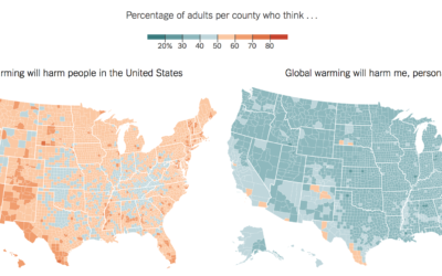
Conflicted public opinion about global warming
Based on estimates from the Yale Program on Climate Change Communication, The New…
-
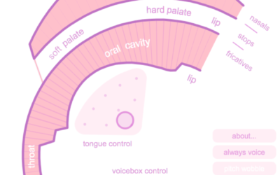
Simulation shows how your mouth works when you talk
You have a mouth with a bunch of tissue in it and manipulate…
-
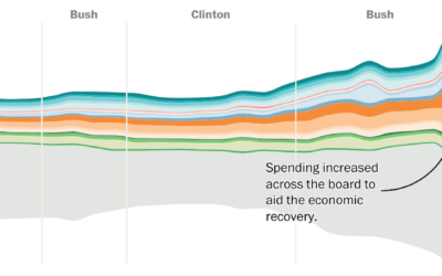
Shifting national budget
The Washington Post looks at the shifting national budget over the past 40…
-
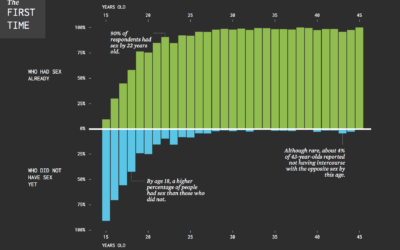
When Straight Americans Lost Their Virginity
Everyone has his or her own timeline, but here it is in general for Americans.
-
Penrose map binning
Cartographer Daniel Huffman tried out Penrose tiling for binning in maps:
A Penrose… -
Interactive or not to interactive visualization?
In a recent talk, New York Times graphics editor Gregor Aisch noted that…
-
Visualization choice depends on the data and the questions
When you don’t know where to start with a dataset, try to come…
-
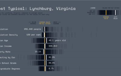
Most typical city in America
Here’s a fun piece by Karl Sluis. He looked at eight demographic metrics,…
-
Scale of Aleppo against Berlin and London
A lot of people around the world including myself don’t quite understand the…
-
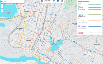
Find a safe bike route with this map
Spring is in the air in a lot of places, and that means…
-
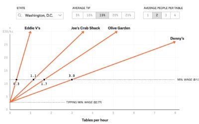
How many tables restaurant servers have to wait on to earn minimum wage
In most states, there is minimum wage and there is tipping minimum wage.…
-
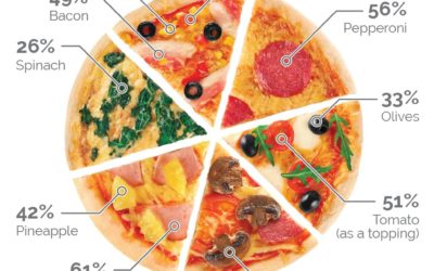
Pie charts are okay
There were some ripples in the space time continuum recently about a pizza…
-
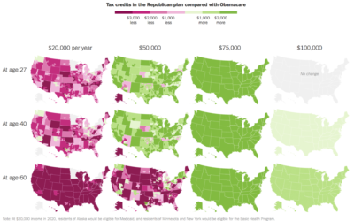
Republicans’ health care plan compared against Obamacare
Based on estimates from the Kaiser Family Foundation, Kevin Quealy and Margot Sanger-Katz…
-
Infographic tools before the computer
There was a time when charts and infographics were drawn by hand, because…
-
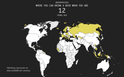
Legal Drinking Age Around the World
As you probably know, different countries have different legal age limits for drinking…
-
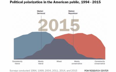
Data visualization GIFs
The nice thing about animated GIFs for visualization is that they can get…







 Visualize This: The FlowingData Guide to Design, Visualization, and Statistics (2nd Edition)


