Oliver Roeder for FiveThirtyEight:
FiveThirtyEight has obtained nearly 3 million tweets from accounts…
Nathan Yau
-
Download 3 million Russian troll tweets
-
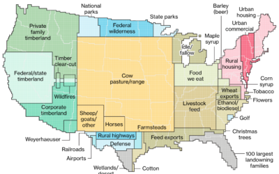
How America uses its land
Dave Merrill and Lauren Leatherby for Bloomberg visualized land use for the conterminous…
-
Finding the Beatle who wrote each song using statistical models
There’s been some disagreement about who wrote “In My Life” by The Beatles,…
-
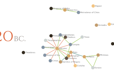
Relationships between philosophers over time
Maximilian Noichl visualized the relationships between philosophers from 600 B.C. to 160 B.C.:…
-

Searching for education deserts
The Chronicle of Higher Education looked for education deserts — places where people…
-
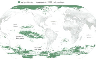
Mapping the ocean undisturbed by humans
Researchers recently published estimates for the amount of area undisturbed by humans —…
-
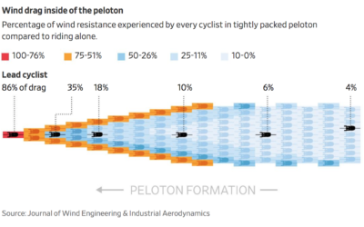
Calculating wind drag in the cycling peloton
When cyclists ride in that big pack during a race — the peloton…
-
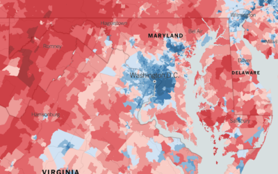
Extremely detailed election map
The Upshot returns to 2016 election results mapped at the precinct level. Because…
-
Members Only

How to Visualize Ranges of Data in R
When you want to focus on the magnitude of differences between low and high values, use visual cues that highlight distance.
-
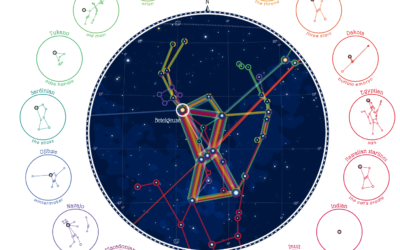
Same stars, different constellations
Cultures have formed different stories and pieced together different constellations from the stars,…
-
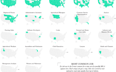
Most Common Jobs, By State
Instead of looking at only the most common job in each state, I found the top five for a slightly wider view.
-
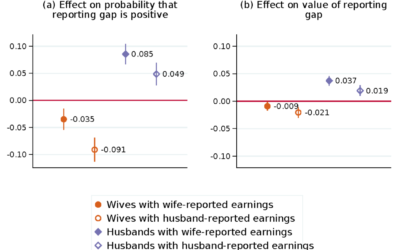
When wife earns more than husband, they report a lesser gap
Marta Murray-Close and Misty L. Heggeness for the Census Bureau compared income responses…
-
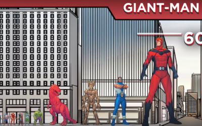
Marvel size chart
The logistics of being a 60-foot man must be a pain.…
-
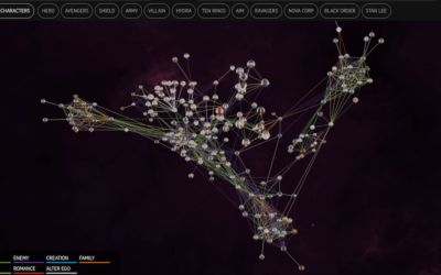
Marvel Cinematic Universe as a 3-D network
The Straits Times visualized the Marvel Cinematic Universe with a 3-D browsable network.…
-

Warranty Expiration
With almost absolute certainty, every product dies a quick death once its warranty…
-

Analysis: Do the shoes matter in marathon running?
Kevin Quealy and Josh Katz for The Upshot analyzed shoe and running data…
-
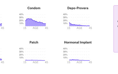
Data-centric view of birth control
Birth control is one of those topics often saved for private conversations, so…
-

Interactive to see street orientation everywhere
After seeing polar charts of street orientation in major cities, Vladimir Agafonkin, an…
-
Millions of internet-connected TVs track viewing habits
Sapna Maheshwari for The New York Times on Samba TV software running on…
-
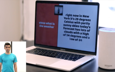
Neural networks to communicate with Alexa devices using sign language
Many have found Amazon’s Alexa devices to be helpful in their homes, but…
Recently for Members
Second Edition
 Visualize This: The FlowingData Guide to Design, Visualization, and Statistics (2nd Edition)
 Visualize This: The FlowingData Guide to Design, Visualization, and Statistics (2nd Edition)
New tools, refined process.
Browse by Chart Type See All →


