Michael Keller released a new version of Layer Cake:
Layer Cake is a…
Nathan Yau
-
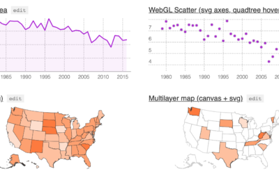
Layer Cake, a graphics framework for more flexible web graphics
-

Presidential Hopefuls screensaver bounces heads around based on polling data
I know you don’t get enough election coverage these days and are probably…
-
Members Only

Visualization Tools, Datasets, and Resources — January 2020 Roundup (The Process #74)
Every month I collect resources and tools to help you better visualize data. Here’s the good stuff for January 2020.
-
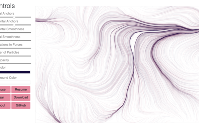
Flow Fields, a generative art tool
Flow Fields, a generative art tool by Michael Freeman, lets you adjust various…
-
Nationwide database of credibly accused Catholic clergy
For ProPublica, Ellis Simani and Ken Schwencke compiled an interactive database that you…
-
Dataset for rejected license plate applications
Noah Veltman just posted a dataset of 23,463 personalized license plate applications that…
-

Questionable science diagrams
Sometimes illustrating scientific findings is a challenge. Sometimes the illustrations are published anyways,…
-
Google Dataset Search moves out of beta
Over a year ago, Google released Dataset Search in public beta. The goal…
-
Members Only

Making the Name Guesser (The Process #73)
Using one of my recent projects as an example, I describe my non-elegant process of making a quick chart.
-
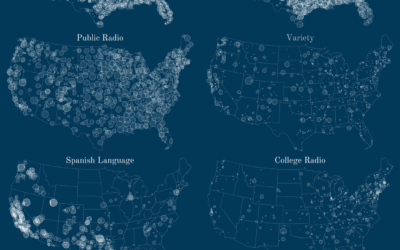
Geography of FM radio
So get this. There are these things called radio stations that broadcast music…
-
To get your personal data, provide more personal data
File another one under the sounds-good-on-paper-but-really-challenging-in-practice. Kashmir Hill, for The New York Times,…
-
How police use facial recogntion
For The New York Times, Jennifer Valentino-DeVries looked at the current state of…
-

Guessing Names Based on What They Start With
I’m terrible at names, but maybe data can help. Put in your sex, the decade when you were born, and start putting in your name. I’ll try to guess before you’re done.
-
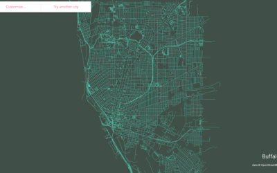
Make a streets map of anywhere in the world
Following up on his mini-app to draw ridgeline maps for elevation, Andrei Kashcha…
-
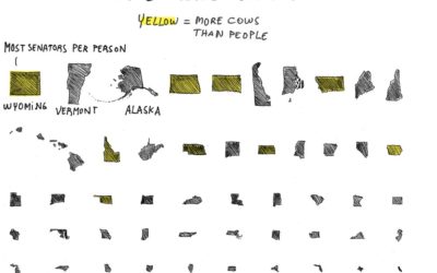
Cow representation in the Senate
For the Absurd America section of The Washington Post, Sergio Peçanha asks the…
-
Members Only
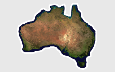
Misleading Map, or Misinterpreted? (The Process #72)
A 3-D rendered map of Australia depicting a month of bushfires grew popular last week. Some thought it misleading. Others thought it was okay. It’s probably somewhere in the middle of that.
-
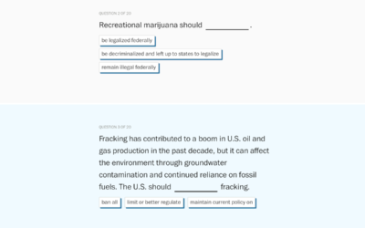
Quiz to see which Democratic candidate agrees with you most
The Washington Post asked Democratic candidates a series of policy questions. To see…
-
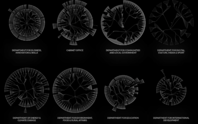
UK government org charts
When I think government structure, I tend to think in general overviews where…
-

Best Directors Who Were Not White Men
From 1928, the year of the first Academy Awards, to 2019, there have been 455 nominations for Best Director. Of those, 18 of them went to non-white men.
-

Man takes picture of himself every day for 20 years
In 2007, Noah Kalina posted a time-lapse video showing a picture of himself…
Recently for Members
Second Edition
 Visualize This: The FlowingData Guide to Design, Visualization, and Statistics (2nd Edition)
 Visualize This: The FlowingData Guide to Design, Visualization, and Statistics (2nd Edition)
New tools, refined process.
Browse by Chart Type See All →


