As you would imagine, what we search for online shifted over the past…
Nathan Yau
-
Search trends during the pandemic
-
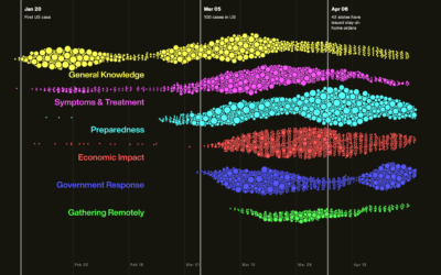
Visualization helping us during the pandemic
Hayleigh Moore for the College of Information Studies at the University of Maryland…
-

Testing the infinite monkey theorem
If you have a room of monkeys hitting keys on typewriters for an…
-
Members Only

Charting for Others (The Process 086)
There’s a new tool-agnostic course now available for members. Check it out now.
-

How We Reopen
Vi Hart, along with a group of experts from different political backgrounds and…
-
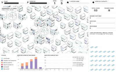
People of the Pandemic, a game that simulates social distancing in your ZIP Code
People of the Pandemic is a game that lets you choose how many…
-
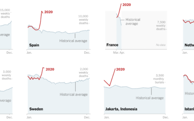
Missing deaths
The daily counts for coronavirus deaths rely on reporting, testing, and available estimates,…
-
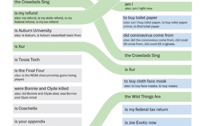
Change in Google searches since the virus
The coronavirus changed what information we search for. Has anyone been more interested…
-

Game of Distraction
They say a watched pot never boils. So here’s a game where you try to make the pot boiling by looking somewhere else.
-
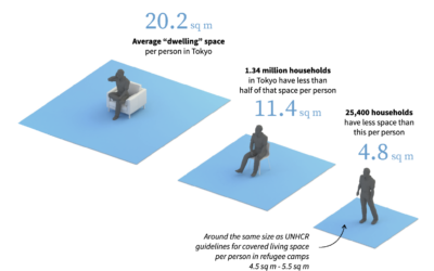
Sheltering in small places
For many, sheltering in place means sheltering in relatively small places. Reuters zoomed…
-
Members Only

Wide View (The Process 085)
The data might exist on a single page or in a single file, but there’s always more to it. Take a step outside for a better view.
-
Historical data visualization panel
Manuel Lima hosted a free online panel with Michale Friendly and Sandra Rendgen…
-

BTS dance formations
BTS, the South Korean boy band, is apparently really good at dancing. Ketchup…
-
Curves for the 1918 flu pandemic
For National Geographic, Nina Strochlic and Riley D. Champine look back at the…
-

Simulation of droplets while social distancing
Using 3-D simulation data from the Kyoto Institute of Technology, The New York…
-

Social distancing demonstrated with balls and mousetraps
The Ohio Department of Health released this video to show the advantages of…
-
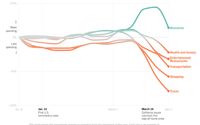
Change in consumer spending since the virus
Consumer spending has shifted dramatically since most people have to stay at home.…
-
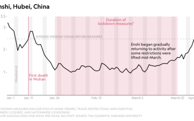
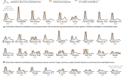
Stay-at-home orders seen through decreased seismic activity
The pandemic has affected all parts of life, which can be seen from…
-
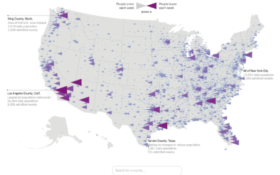
Flow of prison population
In a collaboration between The Marshall Project and The Upshot, Anna Flagg and…
-

How to sew a mask, with a template
The Washington Post provides clear instructions on how to sew your own mask.…
Recently for Members
Second Edition
 Visualize This: The FlowingData Guide to Design, Visualization, and Statistics (2nd Edition)
 Visualize This: The FlowingData Guide to Design, Visualization, and Statistics (2nd Edition)
New tools, refined process.
Browse by Chart Type See All →


