The Economist launched their 2020 elections forecast. Right now a part of my…
Nathan Yau
-
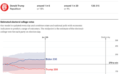
2020 election forecast
-
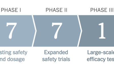
Vaccine tracker
As we know, it typically takes years to develop a vaccine that is…
-
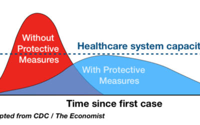
Why the “flatten the curve” chart worked
I know it seems like ages ago when we were talking about flattening…
-
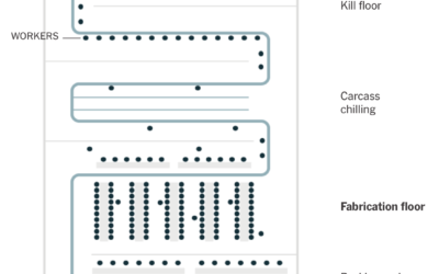
Challenges of reopening the meatpacking plant
To reopen safely, meatpacking plants have to take precautions to provide space and…
-
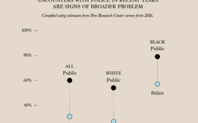
Police Perception vs. Public Perception
The numbers are from a survey by the Pew Research Center conducted in…
-
Health conditions and income
A large proportion of those who died from Covid-19 had pre-existing medical conditions.…
-
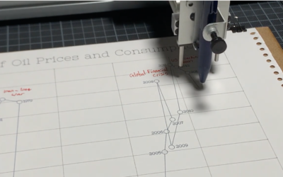
Pen plotter used as storytelling device
Pen plotters slowly draw out a picture line-by-line, so when you watch a…
-
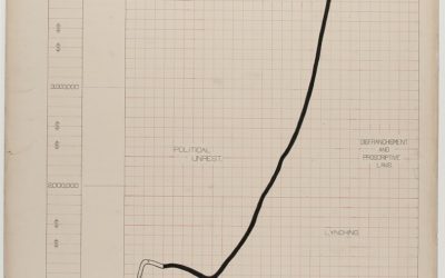
Visualizing black America in 1900
The visualization work of W.E.B. Du Bois and his students has been on…
-
Members Only

Seeing the Dust (The Process 092)
Keep your eyes open.
-
Protecting your mobile data and privacy while at a protest
Maddy Varner reporting for The Markup:
“All protesting and all marches are a… -
Failed CDC data pipeline
The New York Times reports on how the CDC struggled and failed on…
-

A comic on spotting misinformation
There’s a lot of misinformation passing through the internets right now. A lot.…
-
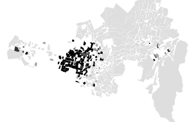
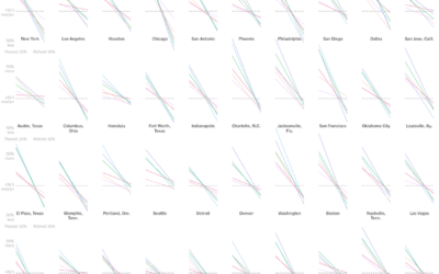
Racial Divide
It’s hard to think of much else. These maps show the racial divide between black and white people in major cities.
-

Guides for Visualizing Reality
We like to complain about how data is messy, not in the right format, and how parts don’t make sense. Reality is complicated though.
-

Impact on Households in the United States
The Census Bureau has been running the Household Pulse Survey since April 23, 2020 to get some gauge for how the pandemic is changing things at home. Here’s how things look so far.
-
Members Only

Visualization Tools and Resources – May 2020 Roundup
Every month I collect useful visualization tools and resources to make better charts. Here’s the good stuff for May.
-
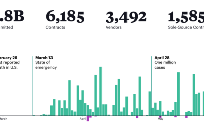
What the federal government has been buying and where from
The Federal Procurement Data System tracks federal contracts of $10,000 or more. For…
-
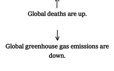
54 ways coronavirus changed the world
The coronavirus has changed everything. Larry Buchanan, for The New York Times, goes…
-
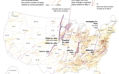
Map shows increasing confirmed cases in rural areas
This map by Tim Meko for The Washington Post uses time series lines…
-
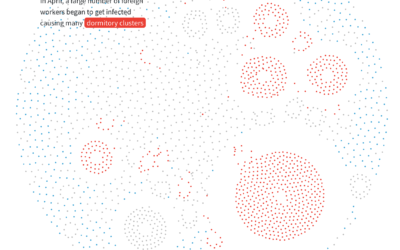
Anatomy of an outbreak
For Reuters, Manas Sharma and Simon Scarr animated a coronavirus outbreak in Singapore…
Recently for Members
Second Edition
 Visualize This: The FlowingData Guide to Design, Visualization, and Statistics (2nd Edition)
 Visualize This: The FlowingData Guide to Design, Visualization, and Statistics (2nd Edition)
New tools, refined process.
Browse by Chart Type See All →


