As more people are detained, they are sent to detention centers in the…
Nathan Yau
-
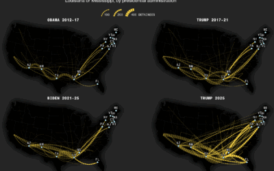
ICE detainees shuttled to further away facilities
-
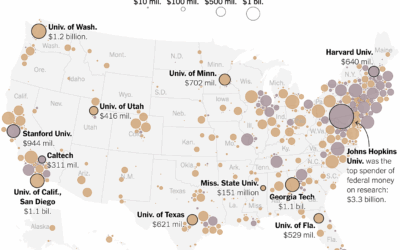
Universities that received federal funding for research
Big universities more often make the news, but the freeze in federal funding…
-

Mark Zuckerberg on making AI chatbot friends
Mark Zuckerberg, in a podcast with Dwarkesh Patel, envisions a future where we…
-
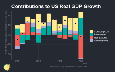
Shrinking U.S. economy after tariffs
Joseph Palitano breaks down the contribution of tariffs to the shrinking economy.
The… -
Members Only
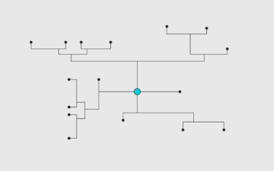
Finding the Right Charts
Chart selection can be a mechanical process that fits into a simple flow chart, but this limits your possibilities.
-
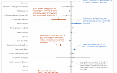
Measles vaccine effectiveness
Despite what some say, the measles vaccine saves lives and is not associated…
-
Charts for Trump’s first 100 days
News outlets tend to highlight the first 100 days of a new administration,…
-
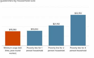
Federal minimum wage falls below poverty lines
Each year, poverty thresholds are calculated based on the cost of living, so…
-
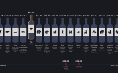
Wine bottles with animals on the label vs. price and quality
You have to pick up a bottle of wine but don’t know what…
-
Towards a distorted perception of reality
For the Guardian, Nesrine Malik warns of generative AI leading towards a reality…
-
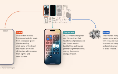
Deconstructed iPhone to show where the parts are manufactured
iPhone parts are manufactured and assembled by different countries, which makes it tricky…
-

American floor plan from China
Many household items in the United States are almost entirely from China, making…
-
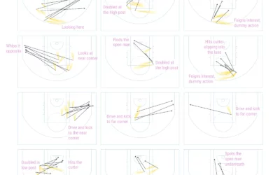
Charting no-look passes by Nikola Jokic
Nikola Jokic of the Denver Nuggets has been showing up in highlight reels…
-
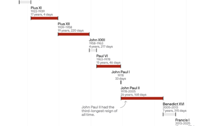
Length of pontificates
Pope Francis’ papacy started in 2013 and lasted 12 years and 39 days.…
-
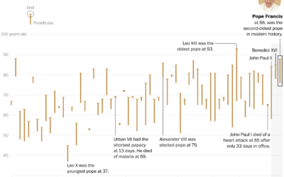
Pope age comparisons
With the passing of Pope Francis, the Washington Post charted the ages of…
-
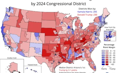
Complete 2024 election data, for congressional districts
Election data should be publicly available and easy to access at high granularity,…
-
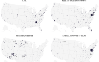
Maps of where federal employees work
When you think about people who work for the U.S. federal government, you…
-
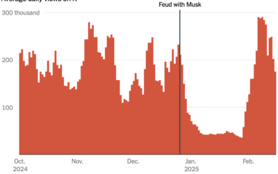
Users’ engagement declined on X after they argued with Musk
This will shock many. There are influencers on X who had high engagement…
-
Members Only
Visualization Tools, Datasets, and Resources – April 2025 Roundup
The good stuff from April: Here are tools you can use, data to play with, and resources to learn from.
-
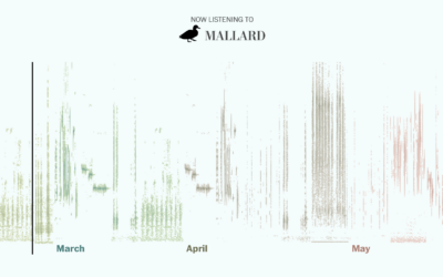
Bird songs of spring
The other morning, my eyes opened about an hour earlier than usual to…
Recently for Members
Second Edition
 Visualize This: The FlowingData Guide to Design, Visualization, and Statistics (2nd Edition)
 Visualize This: The FlowingData Guide to Design, Visualization, and Statistics (2nd Edition)
New tools, refined process.
Browse by Chart Type See All →


